Upload date
All time
Last hour
Today
This week
This month
This year
Type
All
Video
Channel
Playlist
Movie
Duration
Short (< 4 minutes)
Medium (4-20 minutes)
Long (> 20 minutes)
Sort by
Relevance
Rating
View count
Features
HD
Subtitles/CC
Creative Commons
3D
Live
4K
360°
VR180
HDR
175,241,821 results
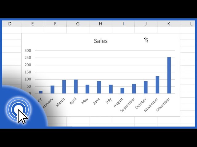
In this beginning level Excel tutorial, learn how to make quick and simple Excel charts that show off your data in attractive and ...
3,522,703 views
8y ago
Top 40 UK Songs Of The Week October 10th 2026 Top 40 Songs Of The Week October 10th 2026, according to the Official UK ...
11,161 views
2d ago
In this video tutorial for beginners, I will show you how to make charts and graphs in Microsoft Excel. Using data, I will show you ...
417,484 views
4y ago
Why is the Smith Chart one of the scariest charts in electrical engineering? Sponsored by Incogni - use code veritasium at ...
6,080,698 views
2mo ago
Learn Excel in just 2 hours: https://kevinstratvert.thinkific.com In this step-by-step tutorial, learn how to pull together charts in Excel.
1,490,782 views
3y ago
Learn Excel in just 2 hours: https://kevinstratvert.thinkific.com In this step-by-step tutorial, learn how to make a Gannt Chart in Excel ...
1,548,109 views
Learn all the basics of Project Management, in a structured program: https://geni.us/PM_CoreCourses The Gantt Chart is pretty ...
495,898 views
7y ago
In this video tutorial, you'll see how to create a simple bar graph in Excel. Using a graph is a great way to present your data in an ...
1,990,618 views
Guys Batao Konse Element Sai Subh Arham Kiya Jaye.
3,964,774 views
6d ago
In this video I cover different world's five most popular types of graph and when they should be used. For example, a bar chart is ...
265,013 views
5y ago
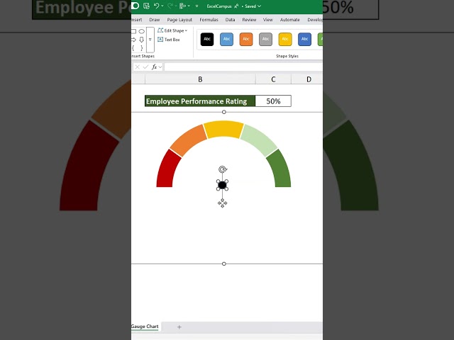
Have you ever wondered how to create a dynamic gauge in Excel? It's easier than you think! With just a few clicks, you can ...
42,172 views
1y ago
Create charts that wow your audience. Learn the secrets now—start today! https://link.xelplus.com/yt-g-dyn-range-charts-course ...
389,478 views
Pie charts are often used to visually express percentages. We'll show you how to make your own using a protractor. To learn more ...
247,851 views
Top 40 UK Songs Of The Week October 3rd 2026 Top 40 Songs Of The Week October 3rd, 2026, according to the Official UK ...
15,531 views
8d ago
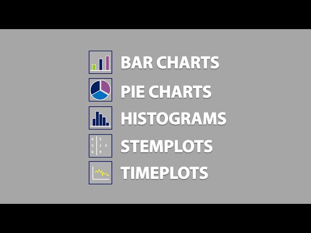
Quickly learn about bar charts, pie charts, histograms, stemplots, timeplots, and learn about which type of graphical tool is ...
753,666 views
10y ago
View full lesson: http://ed.ted.com/lessons/how-to-spot-a-misleading-graph-lea-gaslowitz When they're used well, graphs can help ...
3,802,890 views
9y ago
Top 40 UK Songs Of The Week September 26th 2026 Top 40 Songs Of The Week September 26th, 2026, according to the Official ...
21,798 views
2w ago
TRIAL Tier One Trading - Get coaching, accountability, structured education and a complete trading plan: ...
41,341 views
3w ago
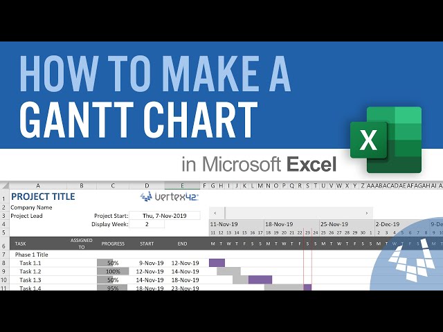
Learn how to Make a Gantt Chart in Excel, including features like a scrolling timeline and the ability to show the progress of each ...
4,272,999 views
6y ago
Show more