ViewTube

ViewTube
Sign inSign upSubscriptions
Filters

Upload date

Type

Duration

Sort by

Features

Reset

919 results

Data Is Beautiful
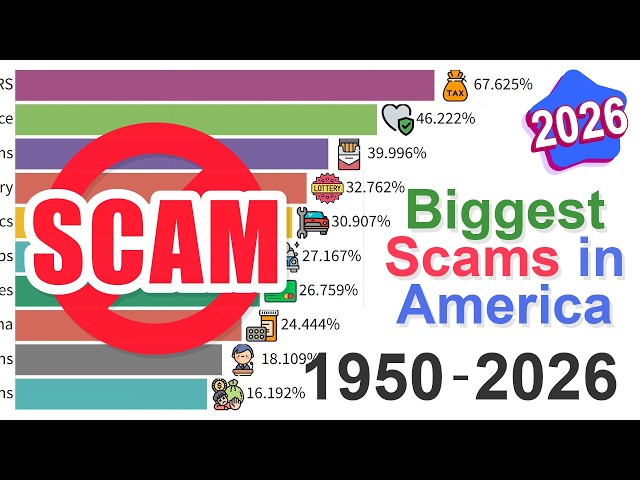
The Most Hated Scams: Data from 1950 to 2026

In this video I track how Americans' perception of the biggest scams in society has evolved from 1950 to 2026. The data ...

4:56
The Most Hated Scams: Data from 1950 to 2026

11,415 views

12h ago

bpwebs
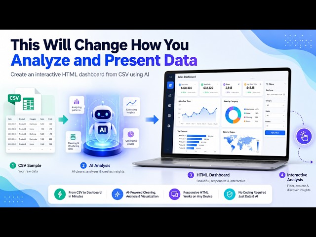
This Will Change How You Analyze and Present Data

What if you could give AI a CSV dataset and let it build an interactive data analysis dashboard for you? In this video, I show how to ...

13:31
This Will Change How You Analyze and Present Data

213 views

13h ago

Global Stats
Best-Selling Consoles: Who Ruled Gaming? (1972–2026)

Discover the best-selling video game consoles of all time in this animated sales ranking from 1972 to 2026. Watch worldwide ...

14:59
Best-Selling Consoles: Who Ruled Gaming? (1972–2026)

8,856 views

9h ago

Data Visualization
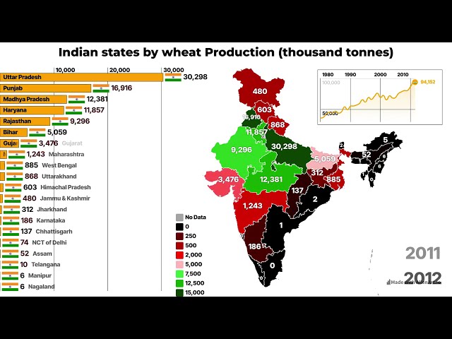
Indian states by wheat Production | Which Indian states produces most rice? #indianstate

Indian states by Wheat Production | Which Indian states produce the most wheat? | #india #indianstate #wheatproduction ...

2:30
Indian states by wheat Production | Which Indian states produces most rice? #indianstate

2,147 views

14h ago

The Celeritas AI
Introducing TCAI Datalake — Ingest, Store, Query & Analyze Data

Product: TCAI Datalake Built by: The Celeritas AI Focus: Data Lake | Data Engineering | SQL Analytics | Data Visualization ...

2:08
Introducing TCAI Datalake — Ingest, Store, Query & Analyze Data

7 views

18h ago

RESEACHER NICHOLUS
Professional Data Analytics for Businesses | Excel • SQL • Power BI

... Excel reporting • SQL data analysis • Power BI dashboards • KPI tracking • Sales and performance analysis • Data visualization ...

0:58
Professional Data Analytics for Businesses | Excel • SQL • Power BI

1 view

57 min ago

Aninkovsky
Europe Population 1850 - 2025 | 175 Years in One Bar Chart Race

Subscribe to Aninkovsky for more historical data visualizations, population races, economic history, geography, and long-term ...

4:15
Europe Population 1850 - 2025 | 175 Years in One Bar Chart Race

73 views

20h ago

Stats Atlas
The Oldest Hotel, Bank and School on Earth Are Still Open

#History #OldestInTheWorld #AncientEngineering #StillInUse #DataVisualization #AnimatedMap #WorldHistory #StatsAtlas.

13:08
The Oldest Hotel, Bank and School on Earth Are Still Open

5,308 views

17h ago

Daffa Faqih S
6 Power BI Dashboard Mistakes You're Probably Making

You can know every rule of good dashboard design and still ship one nobody uses. These are the six mistakes that quietly undo ...

3:36
6 Power BI Dashboard Mistakes You're Probably Making

33 views

15h ago

Shape: Reorganization Modelling
Sunburst in Shape: the whole organization on one screen (new layout)

An org chart shows a few levels at a time. The Sunburst shows the whole organization at once, sized by headcount, on one screen ...

2:23
Sunburst in Shape: the whole organization on one screen (new layout)

4 views

8h ago

DevTown
DAY - 5 | THE ART OF DATA EXPLORATION - TURN RAW DATA INTO MEANINGFUL INSIGHTS - 5 DAYS FREE LIVE

The Art of Data Exploration – Turn Raw Data into Meaningful Insights! ✨ Hey Future Data Analysts, Data Scientists, Business ...

Upcoming
DAY - 5 | THE ART OF DATA EXPLORATION - TURN RAW DATA INTO MEANINGFUL INSIGHTS - 5 DAYS FREE LIVE

0 views

ErykaDataPro
Is Your Construction Pipeline Costing More Than It Earns? | Real Estate CEO Dashboard | Power BI

This data visualization project explores how construction and real estate businesses track revenue, manage project pipelines, and ...

1:58
Is Your Construction Pipeline Costing More Than It Earns? | Real Estate CEO Dashboard | Power BI

0 views

7h ago

Data Penguin
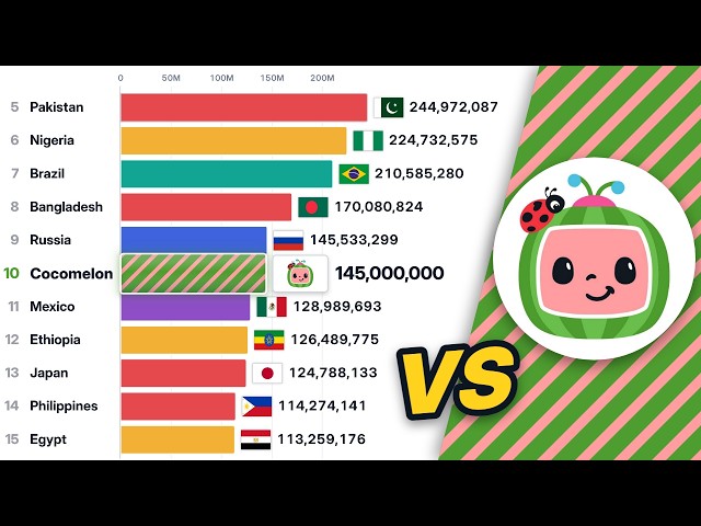
Cocomelon Subscribers vs Every Country's Population

... #UnitedStates #Indonesia #Pakistan #Nigeria #Brazil #Bangladesh #Russia #Japan #Population #DataVisualization.

8:01
Cocomelon Subscribers vs Every Country's Population

5,312 views

14h ago

Hen1Tech
Neural Networks Explained Visually: How AI Learns with Gradient Descent (4K)

How does a neural network recognize a handwritten digit, and how does it learn to get better? This animation walks through a ...

3:51
Neural Networks Explained Visually: How AI Learns with Gradient Descent (4K)

4 views

13h ago

CareerEX
Data Visualization with Excel - Week 4 Session 7

In today's class, we introduced data visualization, discussing what it is, its purpose, and its importance in data analysis.

1:37:27
Data Visualization with Excel - Week 4 Session 7

24 views

19h ago

ALL KIND STUFFS
EDA with R: Mean, Median, Histograms, Boxplots & Correlation Explained

... scatter plot in r, correlation in r, data visualization in r, r for data science, machine learning data exploration, data science tutorial ...

4:29
EDA with R: Mean, Median, Histograms, Boxplots & Correlation Explained

2 views

6h ago

BomsamdiDev
Swift Charts — SwiftUI View of the Week

A chart from an array of your own structs, and the one line that stops it from lying. Swift Charts takes your model as it is — no ...

7:52
Swift Charts — SwiftUI View of the Week

0 views

7h ago

Learn it Loud!
Eigenvectors & Eigenvalues Explained with Music | Same Line, New Length

What happens when a matrix transforms a space? Most arrows turn. An eigenvector stays on its line, while its eigenvalue tells you ...

3:36
Eigenvectors & Eigenvalues Explained with Music | Same Line, New Length

9 views

10h ago

Dani Insights
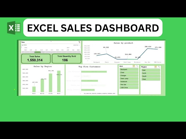
How to Create a Professional Sales Dashboard in Excel | Step-by-Step Tutorial 2026

... #DataVisualization #ExcelTraining #BusinessDashboard #Excel2026 #DataAnalytics #ExcelForBeginners #DashboardTutorial ...

9:54
How to Create a Professional Sales Dashboard in Excel | Step-by-Step Tutorial 2026

1 view

9h ago

DevTown
DAY - 4 | THE ART OF DATA EXPLORATION - TURN RAW DATA INTO MEANINGFUL INSIGHTS - 5 DAYS FREE LIVE

The Art of Data Exploration – Turn Raw Data into Meaningful Insights! ✨ Hey Future Data Analysts, Data Scientists, Business ...

Upcoming
DAY - 4 | THE ART OF DATA EXPLORATION - TURN RAW DATA INTO MEANINGFUL INSIGHTS - 5 DAYS FREE LIVE

0 views

Show more