Upload date
All time
Last hour
Today
This week
This month
This year
Type
All
Video
Channel
Playlist
Movie
Duration
Short (< 4 minutes)
Medium (4-20 minutes)
Long (> 20 minutes)
Sort by
Relevance
Rating
View count
Features
HD
Subtitles/CC
Creative Commons
3D
Live
4K
360°
VR180
HDR
1,222 results
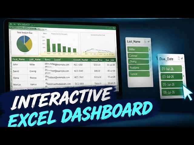
Welcome to Module 01 of our complete data visualization masterclass! In this foundational lesson, you will learn how to transform ...
65 views
3d ago
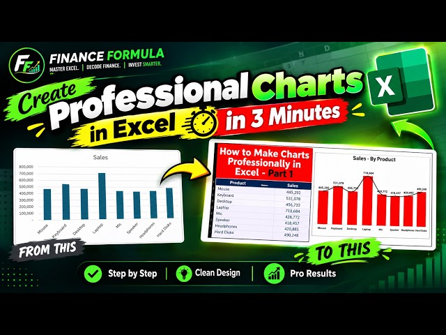
Topics covered: Excel Charts Column Chart in Excel Excel Chart Tutorial Professional Excel Charts Excel Data Visualization ...
17 views
1d ago
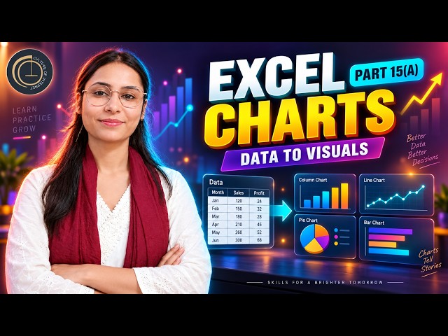
Learn how to create professional and easy-to-understand Charts in Microsoft Excel! Welcome to Part 15(A) of the Complete Excel ...
3 views
Perfect for beginners and professionals who want to visualize data quickly and effectively What you'll learn in this video: How to ...
54 views
6d ago
Pandas Data Visualization, EDA and AI-Powered Analytics | Python in Excel 365 Net Sales by Region Net Sales by Category Top ...
182 views
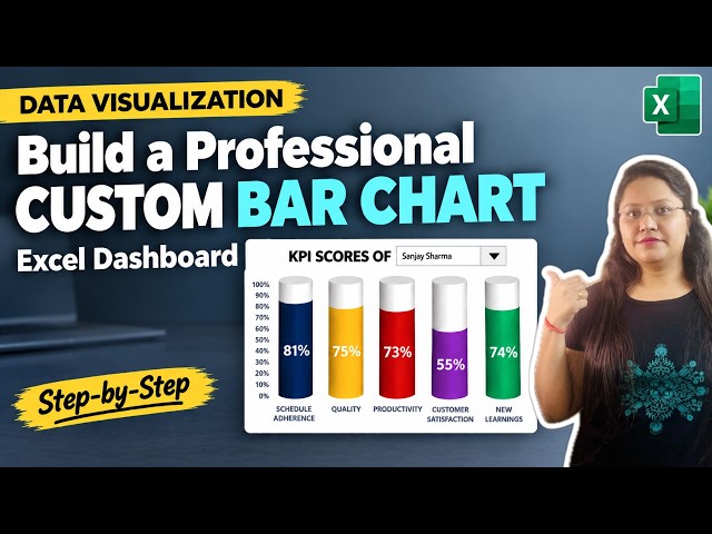
Learn how to visualize and track your key performance indicator ...
43 views
7d ago
A complete hands-on Excel training covering data cleaning, modern formulas, PivotTables, data visualization, and interactive ...
11 views
2d ago
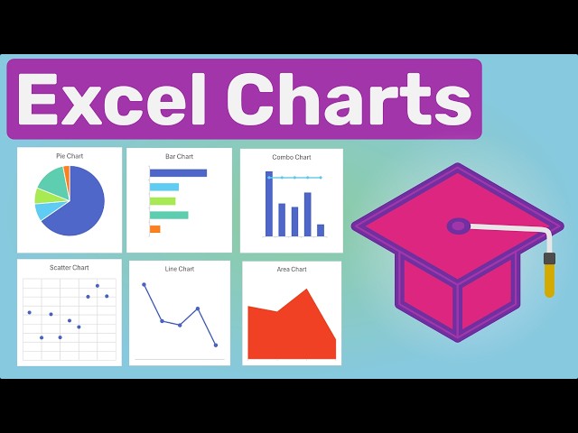
Learn how to create popular chart types in Microsoft Excel and choose the right chart for your data. In this tutorial, we cover Excel's ...
22 views
Learn how to create and use an interactive Excel Pivot Table to analyze purchase order data quickly and efficiently.
6 views
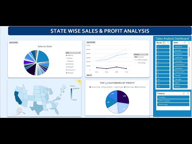
LIVE: USA Sales & Profit Dashboard in Excel | State-Wise Interactive Data Analysis Tutorial Description: Learn how to create an ...
162 views
Streamed 1d ago
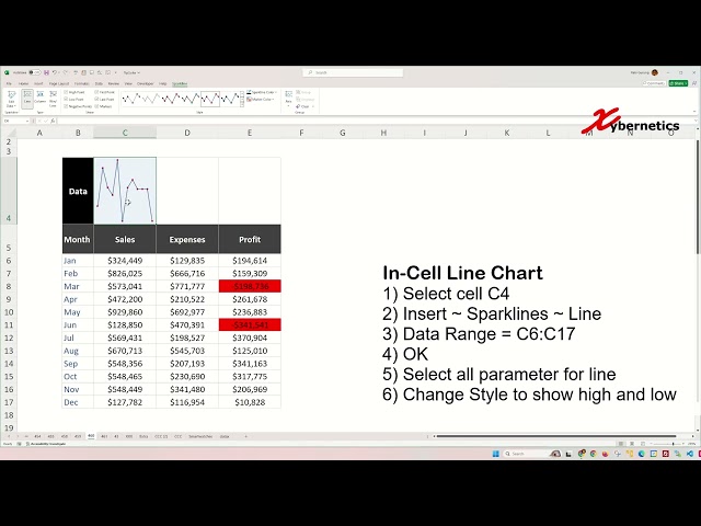
Learn how to create win loss line and column sparklines in Excel for data visualization. Win-loss sparkline charts, particularly ...
468 views
4d ago
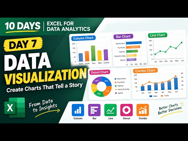
In Day 7 of my Excel for Data Analytics series, we're focusing on Data Visualization, turning raw data into clear and meaningful ...
1 view
4h ago
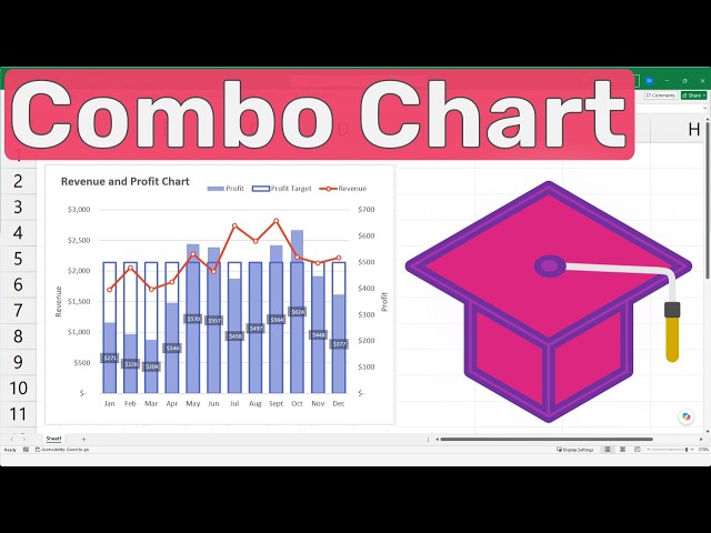
Learn how to create a Excel Combo Chart that combines a line chart and column charts to visualize revenue, profit, and profit ...
5 views
6h ago
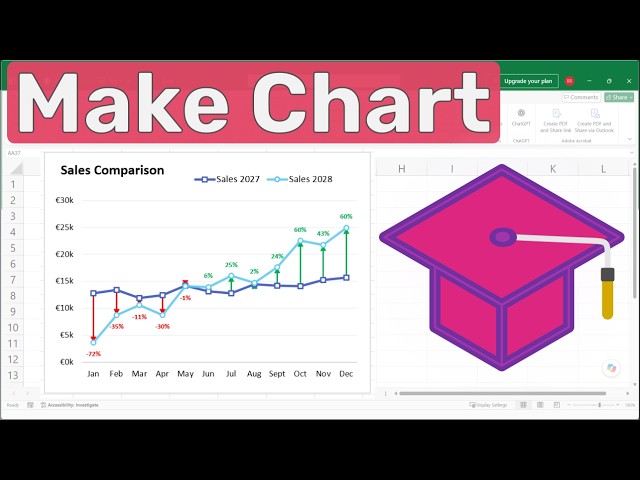
Learn how to create a Difference Chart in Excel to clearly visualize changes between two sets of data. In this step-by-step Excel ...
2 views
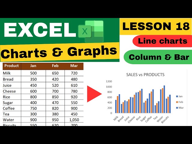
Excel Charts & Graphs for Beginners | Column, Bar & Line Charts Tutorial | Excel Lesson 18 Never miss anything! Subscribe ...
297 views
5d ago
Welcome to Module 03 of our complete data visualization masterclass! In this foundational lesson, you will learn how to transform ...
10h ago
... Excel line chart, Excel pie chart, Excel chart formatting, Excel chart design, customize Excel chart, Excel data visualization, ...
10 views
Welcome to Module 02 of our complete Data Visualization Masterclass! In this foundational lesson, you will learn how to transform ...
29 views
This method is perfect for anyone looking to improve their data visualization skills and create reports that respond instantly to user ...
4 views
Show more

![[MODULE01] - Foundation Data Visualization in Excel: Build Interactive Dashboards](/api/proxy/image?url=https%3A%2F%2Fi.ytimg.com%2Fvi%2FFiU2Jlwvzwc%2Fsddefault.jpg)




![[MODULE03] - Advanced Charting & Techniques](/api/proxy/image?url=https%3A%2F%2Fi.ytimg.com%2Fvi%2FDfBriylZn5k%2Fsddefault.jpg)
![How to Create Easy Charts in Excel [2026 Easy Guide]](/api/proxy/image?url=https%3A%2F%2Fi.ytimg.com%2Fvi%2FW_ADGM0URqc%2Fsddefault.jpg)
![[MODULE02] - Dashboard Concept And ToolS](/api/proxy/image?url=https%3A%2F%2Fi.ytimg.com%2Fvi%2Fh_jDZsgIlMg%2Fsddefault.jpg)