ViewTube

ViewTube
Sign inSign upSubscriptions
Filters

Upload date

Type

Duration

Sort by

Features

Reset

76 results

RESEACHER NICHOLUS
Professional Data Analytics for Businesses | Excel • SQL • Power BI

Turn your business data into clear reports, actionable insights, and interactive dashboards. Excel — $200 SQL — $300 Power BI ...

0:58
Professional Data Analytics for Businesses | Excel • SQL • Power BI

1 view

1h ago

CareerEX
Data Visualization with Excel - Week 4 Session 7

In today's class, we introduced data visualization, discussing what it is, its purpose, and its importance in data analysis.

1:37:27
Data Visualization with Excel - Week 4 Session 7

24 views

20h ago

Dani Insights
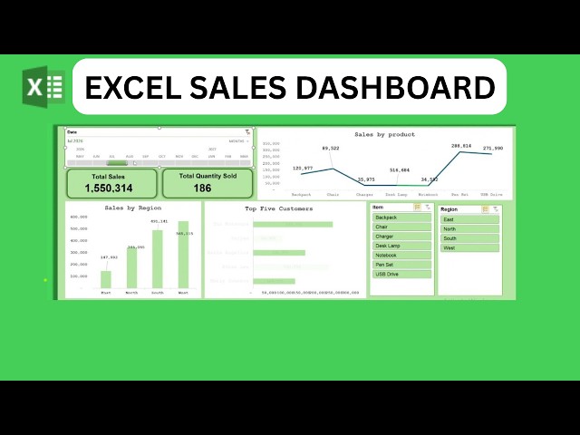
How to Create a Professional Sales Dashboard in Excel | Step-by-Step Tutorial 2026

How to Create a Professional Sales Dashboard in Excel | Step-by-Step Tutorial 2026 #Excel #ExcelDashboard #SalesDashboard ...

9:54
How to Create a Professional Sales Dashboard in Excel | Step-by-Step Tutorial 2026

1 view

10h ago

OneStudio247
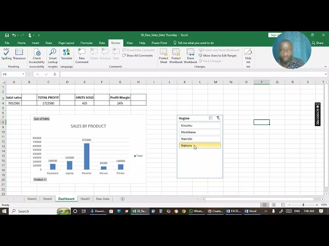
WEEK 4 DATA  CLASS PART 1

WEEK 4 DATA ANALYTICS CLASS RECORDING End of Module 1 | DATA VISUALIZATION Dear Equip50 Data Analytics ...

51:46
WEEK 4 DATA CLASS PART 1

0 views

6h ago

Tapas Digital
Basics of Charts & Graphs! Chart Elements, Colors, Themes, and Style! #excel #charts #graphs

Welcome to my YouTube channel, your ultimate destination for mastering Microsoft Excel! Whether you are a beginner taking your ...

21:42
Basics of Charts & Graphs! Chart Elements, Colors, Themes, and Style! #excel #charts #graphs

3 views

23h ago

Professor Nicholus
📊 NEED PROFESSIONAL BUSINESS DATA ANALYTICS?

Turn your business data into clear reports, powerful insights, and interactive dashboards using Excel, SQL, and Power BI. Excel ...

2:03
📊 NEED PROFESSIONAL BUSINESS DATA ANALYTICS?

0 views

1h ago

Vivek Kumar
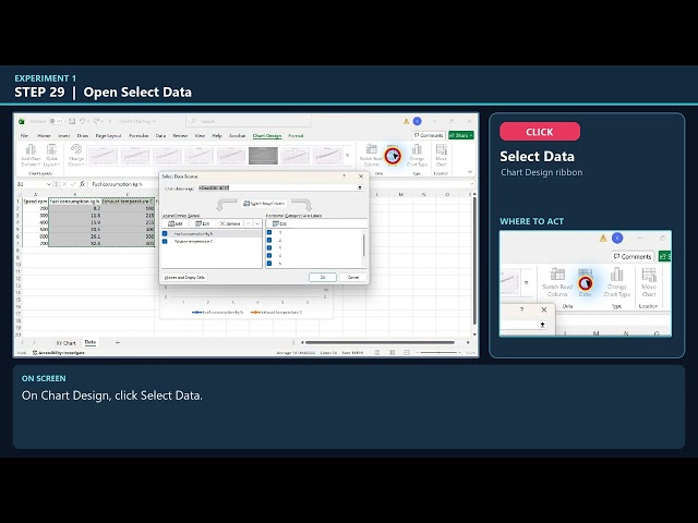
1: Excel Charts with Engine Data | Scatter, Dual Axis, Error Bars & Combo Chart (Experiment 1)

Build three Excel charts step by step using engine and maintenance data. The walkthrough shows each click, names the buttons ...

7:34
1: Excel Charts with Engine Data | Scatter, Dual Axis, Error Bars & Combo Chart (Experiment 1)

26 views

20h ago

Sunaina Lakshya Edu
Create a Professional Investment Dashboard in Excel Using ChatGPT | Interactive Dashboard📝

Want to turn a simple Investment Data Set into a Professional Interactive Dashboard?In this video, I have taken an Investment ...

7:22
Create a Professional Investment Dashboard in Excel Using ChatGPT | Interactive Dashboard📝

41 views

14h ago

DataCraft by El
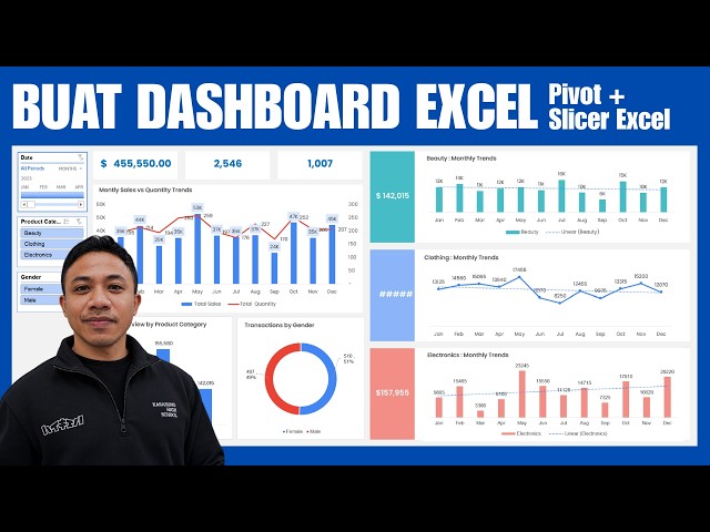
Tutorial Membuat Dashboard Excel Interaktif & Dinamis dari Nol (Pivot Table, Slicer & Connection)

Hai teman-teman semua, Bikin dashboard profesional dan interaktif di Microsoft Excel ternyata nggak serumit yang dibayangkan!

52:42
Tutorial Membuat Dashboard Excel Interaktif & Dinamis dari Nol (Pivot Table, Slicer & Connection)

26 views

12h ago

OneStudio247
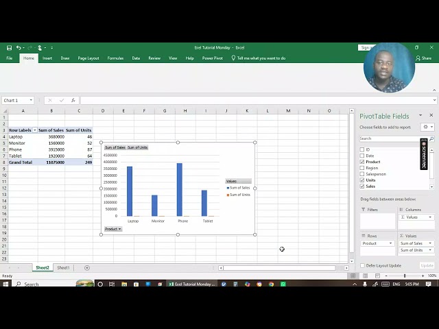
WEEK 4 DATA CLASS PART 2

WEEK 4 DATA ANALYTICS CLASS RECORDING End of Module 1 | PART 2 CONTINATION OF THE DATA VISUALIZATION ...

49:56
WEEK 4 DATA CLASS PART 2

1 view

6h ago

Tech Knowledge Hindi
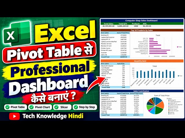
Excel Pivot Table से Professional Dashboard कैसे बनाएं | Interactive Excel Dashboard Step by Step

... Excel for Office Work, Excel Dashboard Kaise Banaye, Pivot Table Se Dashboard Kaise Banaye, Excel Data Visualization, ...

13:00
Excel Pivot Table से Professional Dashboard कैसे बनाएं | Interactive Excel Dashboard Step by Step

35 views

18h ago

Excel Learn and Apply
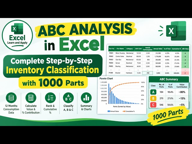
How to Perform ABC Analysis in Excel | Inventory Management Step by Step

Learn how to perform **ABC Analysis in Excel** using a practical inventory management example with **1000 part numbers and ...

6:03
How to Perform ABC Analysis in Excel | Inventory Management Step by Step

16 views

15h ago

Variablz Academy and Parthiban Kannan | AI & Analytics Expert
How to Create a Donut Chart in Python Matplotlib 🍩 | Data Visualization in Tamil

🍩 Learn how to create a Donut Chart using Python Matplotlib with a real-world sales dataset! In this Python Data ...

3:54
How to Create a Donut Chart in Python Matplotlib 🍩 | Data Visualization in Tamil

82 views

21h ago

Show more