Upload date
All time
Last hour
Today
This week
This month
This year
Type
All
Video
Channel
Playlist
Movie
Duration
Short (< 4 minutes)
Medium (4-20 minutes)
Long (> 20 minutes)
Sort by
Relevance
Rating
View count
Features
HD
Subtitles/CC
Creative Commons
3D
Live
4K
360°
VR180
HDR
83,734 results
In this video we compare Jotform AI Data Assistant, Julius AI, Bricks, Zebra AI, Gemini in Google Sheets, ChatGPT, and Claude ...
4,241 views
5d ago
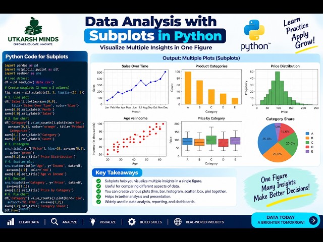
In this practical Python Data Analysis tutorial, we'll learn how to create Subplots to display multiple charts or visualizations in a ...
3 views
18h ago
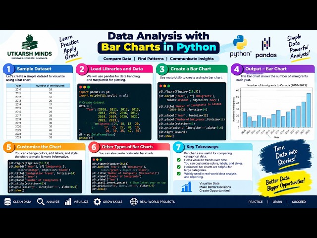
In this practical Python Data Analysis tutorial, we'll learn how to create and understand Bar Charts to compare different categories ...
0 views
19h ago
This video is part of both CIS 210 - Introduction to Machine Learning and CIS 230 - Programming for Data Science CIS 210 ...
10 views
2d ago
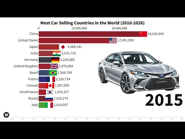
Which countries sell the most cars in the world? This animated bar chart race tracks the world's leading car-selling countries ...
401 views
4d ago
🤯 ChatGPT Can Create ANIMATED CHARTS?! Watch This! What if you could turn simple data into a beautiful animated visualization ...
9 views
15h ago
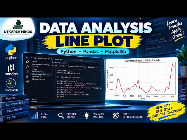
In this practical Python Data Analysis tutorial, we'll learn how to create and understand a Line Plot to visualize data and identify ...
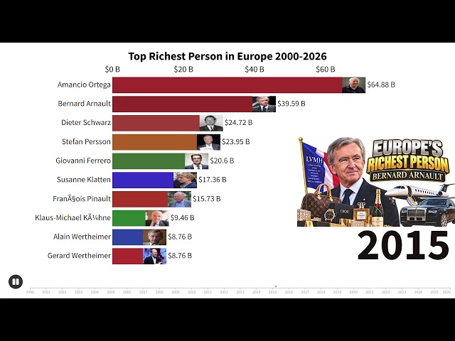
Who was the richest person in Europe from 2000 to 2026? Watch the fortunes of Europe's wealthiest individuals change over ...
29 views
6d ago
Seaborn | Seaborn Python | Seaborn Tutorial | Seaborn Course | Seaborn Lecture 05 | Bivariate Histogram | Bivariate Histogram ...
66 views
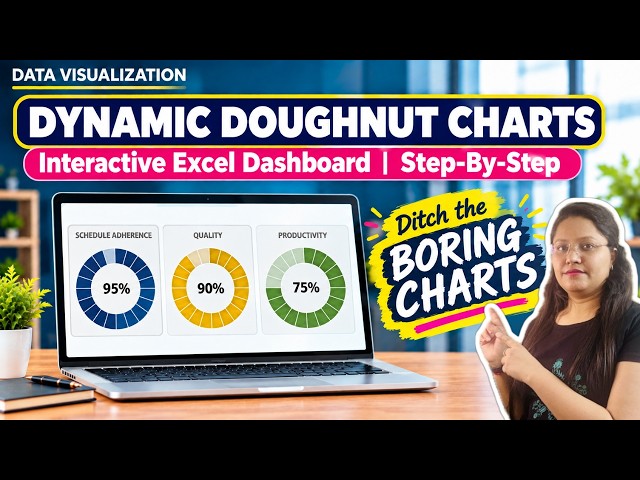
Learn how to visualize your KPI score using a clean, dynamic ...
14 views
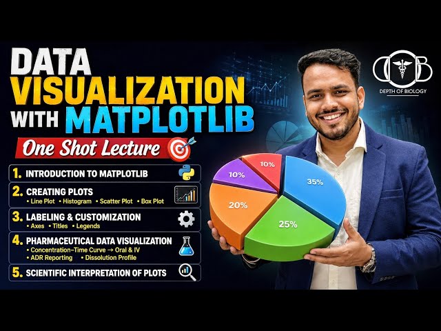
Data Visualization with Matplotlib | Creating line plot | Labeling axes,Legends & Interpretation In this One Shot Lecture, we cover ...
628 views
3d ago
Show more