Upload date
All time
Last hour
Today
This week
This month
This year
Type
All
Video
Channel
Playlist
Movie
Duration
Short (< 4 minutes)
Medium (4-20 minutes)
Long (> 20 minutes)
Sort by
Relevance
Rating
View count
Features
HD
Subtitles/CC
Creative Commons
3D
Live
4K
360°
VR180
HDR
118,100 results
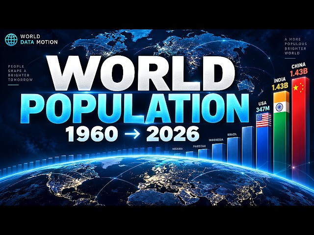
Watch how the world's population has changed by country from 1960 to 2026. This animated data visualization compares ...
240 views
13 days ago
In this video we compare Jotform AI Data Assistant, Julius AI, Bricks, Zebra AI, Gemini in Google Sheets, ChatGPT, and Claude ...
4,222 views
4 days ago
Data Visualization lets you graphically see the data in your design without changing the attributes of the underlying objects.
2,407 views
5 days ago
We generate enormous amounts of data every day—but raw data alone is often difficult to understand. Data visualization helps us ...
156 views
3 weeks ago
The Rise and Fall of Food Superpowers: World Wheat Production (1961–2024)** Who really feeds the world? In this data ...
8 views
11 days ago
What happens when you translate pure mathematics into audio frequencies? In this animation, we take three distinct ...
62,033 views
2 days ago
Dive into the future of data visualization with Claude and i40Pilot! Imagine creating an interactive 3D dashboard that not only ...
65 views
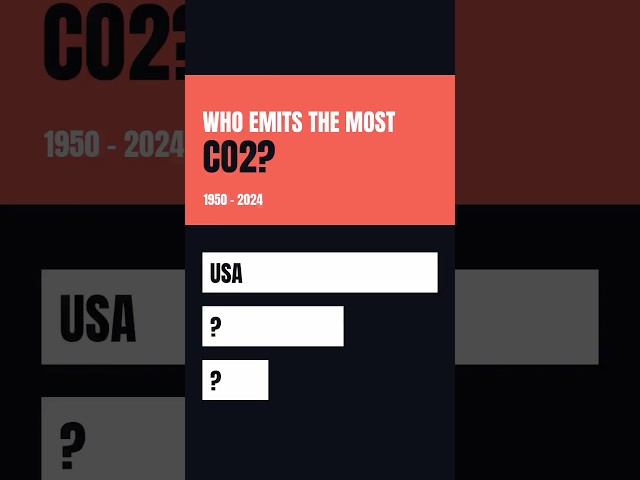
CO₂ emissions by country, 1950 → 2024. In 1950 America emitted more than the rest of the world combined. Then everything ...
868 views
2 hours ago
Welcome to Lecture 1 of the Data Visualization Complete Course by FreePlacementCourse, presented by Dr. Rupali Kulkarni.
281 views
4 weeks ago
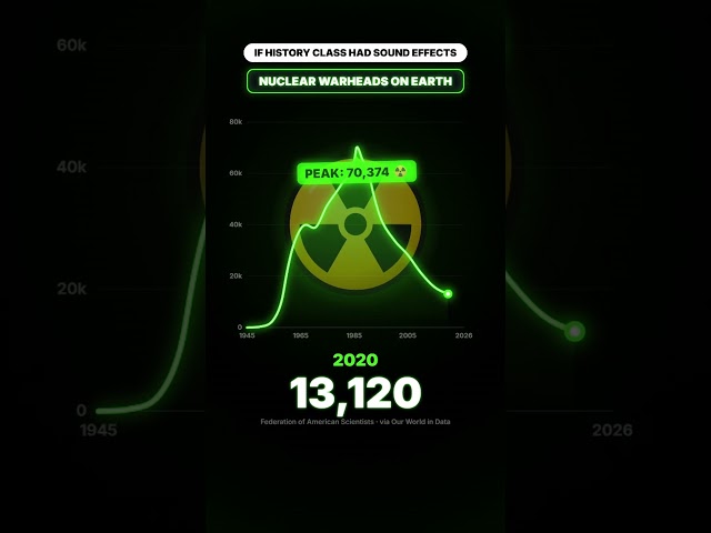
If data had sound 🔊 what would history sound like? Every graph in this Short makes its own sound, driven by real historical ...
33,248 views
6 days ago
Learn how to create a colorful bar chart in Python using Seaborn and Matplotlib — step by step. In this beginner-friendly Python ...
176 views
Ever wondered which foreign-born nationality earns the highest median income in each US state? According to U.S. ...
19,797 views
1 day ago
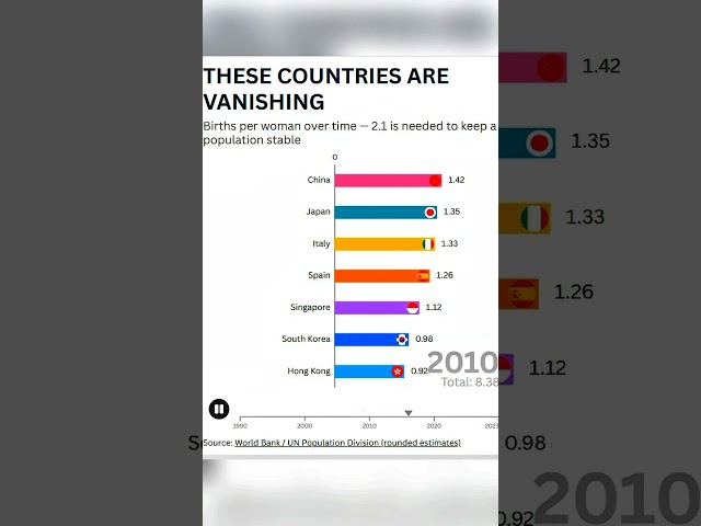
South Korea's birth rate has fallen to 0.72 — watch the countries whose populations are shrinking fastest. StatStack Source: ...
1,309 views
14 hours ago
This unit includes: -History and impact of data visualization. -Related professional areas. -Data formats to visualize. -Types of ...
38 views
We've reached the final video in my Simple Visualizations with Seaborn series! For this bonus episode, we're looking at the pie ...
10 views
Discover how to insert and edit Charts in Word to represent your data visually and make your documents stand out. Unlock the ...
13 views
2 weeks ago
datajournalism #datavisualization #data.
175 views
Es introduces a data visualization dashboard for public service facilities it provides a brand new perspective for the management ...
7 views
This video presents a walkthrough of the interactive dashboard developed as part of the Digital Media Capstone project.
Your business already has the data. The real question is: Can your team understand it fast enough to make the right decision?
0 views
Show more