Upload date
All time
Last hour
Today
This week
This month
This year
Type
All
Video
Channel
Playlist
Movie
Duration
Short (< 4 minutes)
Medium (4-20 minutes)
Long (> 20 minutes)
Sort by
Relevance
Rating
View count
Features
HD
Subtitles/CC
Creative Commons
3D
Live
4K
360°
VR180
HDR
32,813 results
Sharing the full step-by-step tutorial? Watch the complete breakdown video linked right here on my channel! Click the linked ...
163 views
1d ago
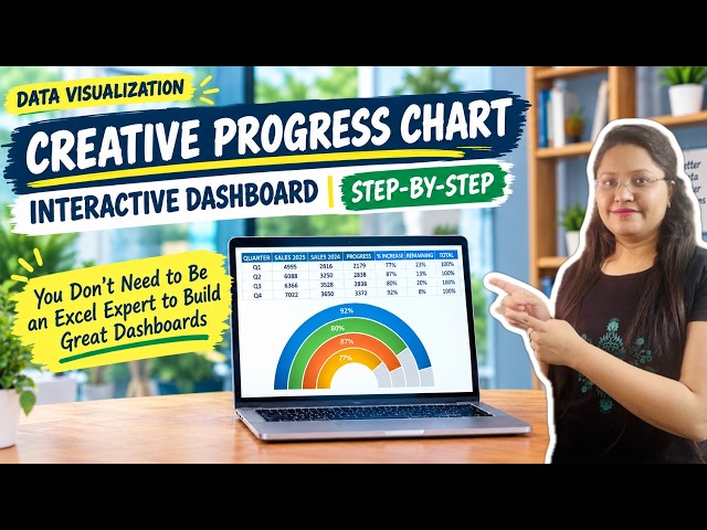
Learn how to build a modern, creative progress chart to instantly ...
3 views
18h ago
Pandas Data Visualization, EDA and AI-Powered Analytics | Python in Excel 365 Net Sales by Region Net Sales by Category Top ...
263 views
4d ago
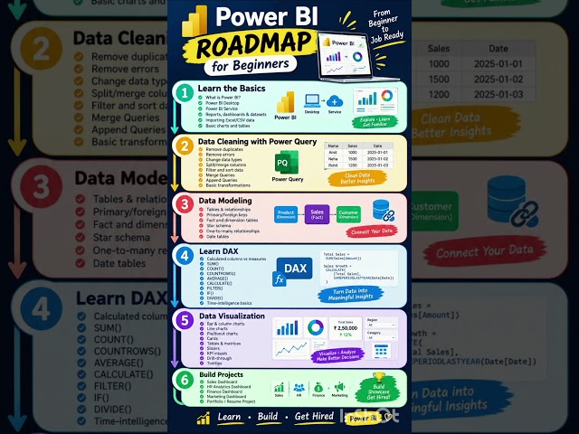
... Query ✓ Data Cleaning ✓ Data Modeling & Relationships ✓ DAX & Measures ✓ Data Visualization ✓ Interactive Dashboards ...
1,129 views
23h ago
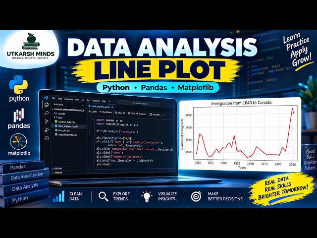
In this practical Python Data Analysis tutorial, we'll learn how to create and understand a Line Plot to visualize data and identify ...
5 views
These are tools and services I personally use or have tested, and I highly recommend them for learning, productivity, and ...
256 views
5d ago
Python for Data Science — Day 12** Data visualization is an essential part of Data Science. In this session, we learn how to ...
13 views
3d ago
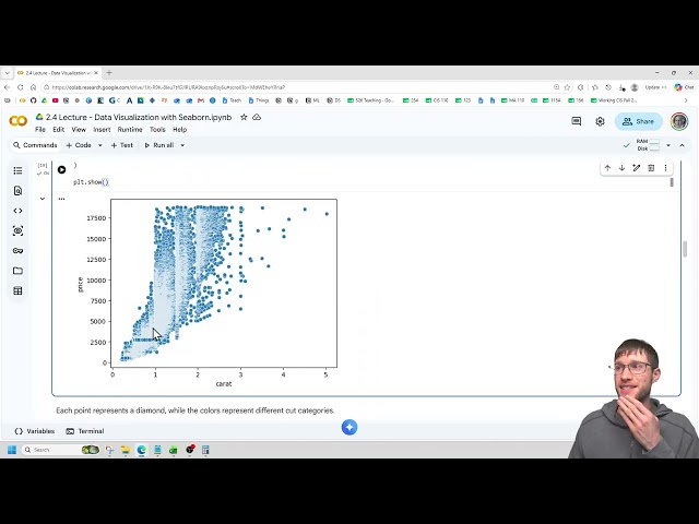
This video is part of both CIS 210 - Introduction to Machine Learning and CIS 230 - Programming for Data Science CIS 210 ...
10 views
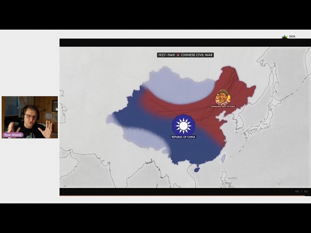
Why do some maps and graphs keep millions of people watching? And what can data visualization practitioners learn from ...
647 views
6d ago
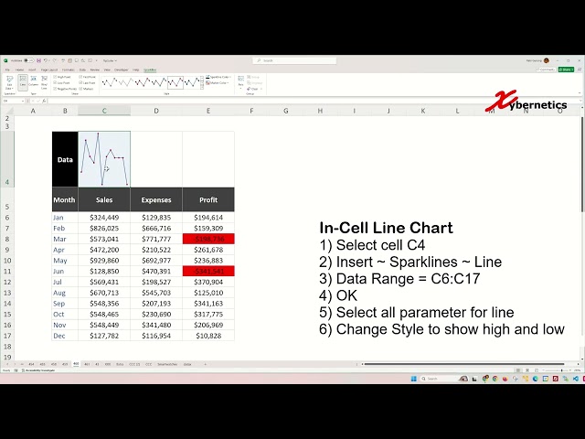
Learn how to create win loss line and column sparklines in Excel for data visualization. Win-loss sparkline charts, particularly ...
487 views
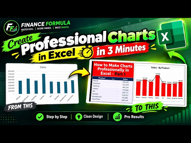
Learn how to create a professional chart in Microsoft Excel in just 3 minutes! 📊 In this quick Excel tutorial, I'll show you ...
35 views
In this practical Python Data Analysis tutorial, we'll learn how to create a WordCloud to visually represent the most frequently ...
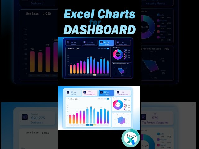
Excel Dashboard Tutorial 📊 | Create a Professional & Interactive Dashboard in Excel In this video, you'll learn how to create ...
5,452 views
2d ago
In this practical Python Data Analysis tutorial, we'll learn how to create and understand Bar Charts to compare different categories ...
1 view
5h ago
KPI Dashboard for Digital Marketing Data Visualization Template: ...
351 views
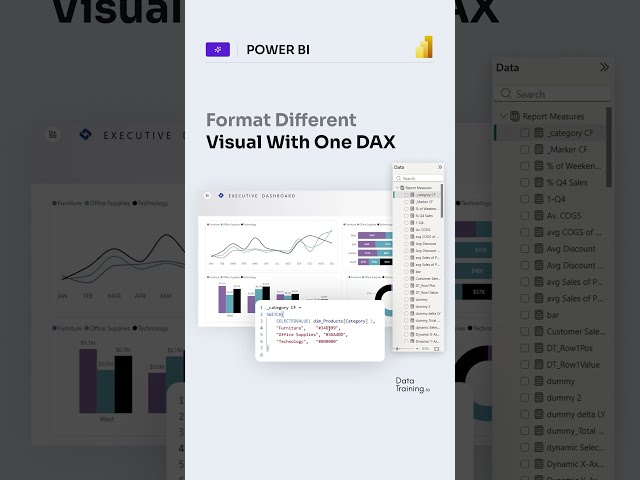
... #powerbitraining #powerbideveloper #DAX #fabric #fabricai #PowerBI #PowerBIAI #Copilot #DataVisualization #design ...
9,442 views
Maths #Mathematics #SoundDesign #Physics #OddlySatisfying #DataVisualization #Manim #ScienceFacts.
68,137 views
Data visualization is the process of representing data and information using visual elements such as charts, graphs, maps, and ...
489 views
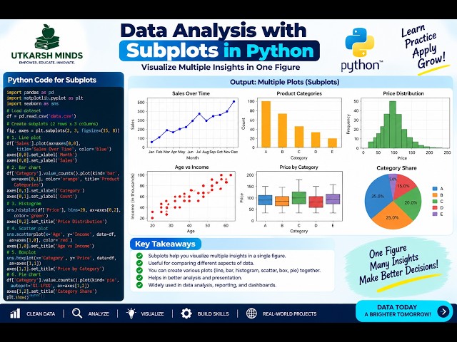
In this practical Python Data Analysis tutorial, we'll learn how to create Subplots to display multiple charts or visualizations in a ...
Show more



![How to Use Databricks: Free Edition UI Explained [2026] | Intro to Databricks](/api/proxy/image?url=https%3A%2F%2Fi.ytimg.com%2Fvi%2FFjaW981-jZc%2Fsddefault.jpg)