Upload date
All time
Last hour
Today
This week
This month
This year
Type
All
Video
Channel
Playlist
Movie
Duration
Short (< 4 minutes)
Medium (4-20 minutes)
Long (> 20 minutes)
Sort by
Relevance
Rating
View count
Features
HD
Subtitles/CC
Creative Commons
3D
Live
4K
360°
VR180
HDR
102,456 results
Data Visualization with Python (Part 1): Beginner to Pro Guide! Welcome to Part 1 of our Data Visualization with Python ...
212 views
3w ago
#Python #Matplotlib #DataVisualization #BarChart #DataScience #PythonTutorial #LearnPython #DataAnalysis.
39 views
2w ago
Learn how to create a colorful bar chart in Python using Seaborn and Matplotlib — step by step. In this beginner-friendly Python ...
188 views
4w ago
We've reached the final video in my Simple Visualizations with Seaborn series! For this bonus episode, we're looking at the pie ...
10 views
Even though the goal of data visualization is to communicate clearly, there are some common mistakes you might be making that ...
6,702 views
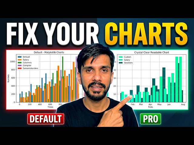
Are your Matplotlib charts hard to read? In this tutorial, learn how to take your Python graphs from cluttered to clean and ...
11 views
11d ago
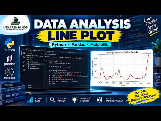
In this practical Python Data Analysis tutorial, we'll learn how to create and understand a Line Plot to visualize data and identify ...
4 views
2d ago
Turn raw data into clear visual insights with Python! In this hands-on tutorial, we complete five practical exercises using ...
225 views
Welcome to Part 2 of my Seaborn data visualization series. In the first video, we introduced Seaborn and created a simple bar plot.
61 views
matplotlib | matplotlib tutorial | matplotlib python | matplotlib practical working | matplotlib lecture 2 | matplotlib course | complete ...
109 views
Python for Data Science — Day 12** Data visualization is an essential part of Data Science. In this session, we learn how to ...
9 views
1d ago
In this video, I continue my Python Data Analytics journey by analyzing the dataset I cleaned in my previous video. I used Python ...
125 views
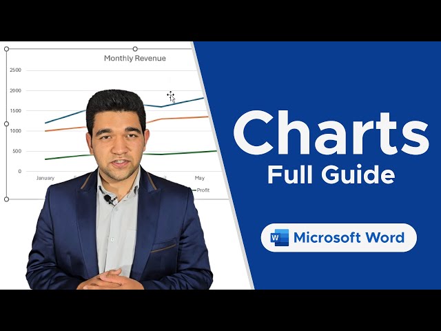
Discover how to insert and edit Charts in Word to represent your data visually and make your documents stand out. Unlock the ...
13 views
Hello guys in this video I show you how to use charts in monday.com. 🖼️ **monday.com: How to Use Charts — Here's How to ...
48 views
Welcome to Part 3 of my Seaborn data visualization series! In Part 1, we introduced Seaborn and created a simple bar plot.
81 views
Learn how to create a histogram in Google Sheets to visualize the distribution of your data. This quick, step-by-step tutorial shows ...
Choosing the right chart can make complex data easier to understand, while the wrong visualization can confuse the audience or ...
29 views
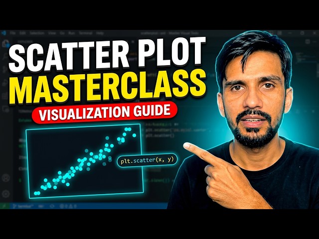
... tutorials! scatter plot in python matplotlib scatter plot plt scatter python python data visualization matplotlib tutorial for beginners ...
28 views
12d ago
Trying to be good in this video. This is my Fourth video of You Tube about Data Visualization. I'm not fluent in English so sorry for ...
7 views
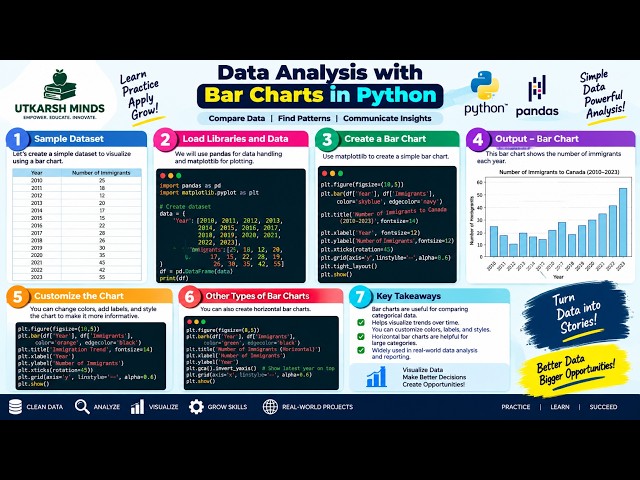
In this practical Python Data Analysis tutorial, we'll learn how to create and understand Bar Charts to compare different categories ...
1 view
Show more


![Learn Python Data Visualization with Matplotlib & Pandas on Colab [02/15]](/api/proxy/image?url=https%3A%2F%2Fi.ytimg.com%2Fvi%2FeAtkO-0Up_Q%2Fsddefault.jpg)