Upload date
All time
Last hour
Today
This week
This month
This year
Type
All
Video
Channel
Playlist
Movie
Duration
Short (< 4 minutes)
Medium (4-20 minutes)
Long (> 20 minutes)
Sort by
Relevance
Rating
View count
Features
HD
Subtitles/CC
Creative Commons
3D
Live
4K
360°
VR180
HDR
103,936 results
You hear the word 'dashboard' thrown around all the time, but what exactly is a dashboard, and why are they so important?
3,633 views
2d ago
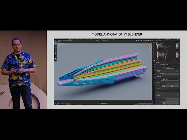
"Cella: 3D Data Visualization for Plant Single-Cell Transcriptomics" by Sampo Muranen at Blender Conference 2026 Recent ...
128 views
4h ago
Why do some maps and graphs keep millions of people watching? And what can data visualization practitioners learn from ...
631 views
5d ago
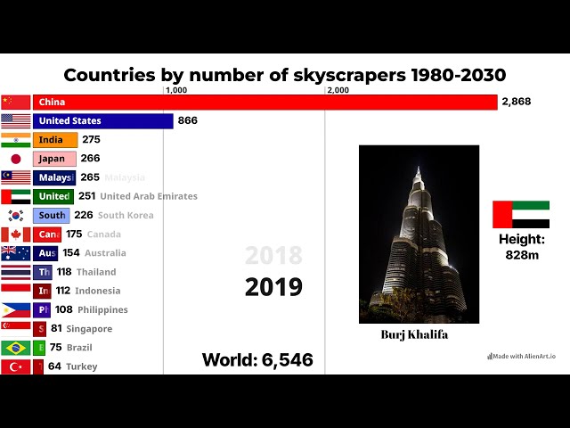
Countries with the Most Skyscrapers, 1980–2030 | Countries Ranked by Number of Skyscrapers @EshuGeo Thanks for Idea!
21,822 views
7d ago
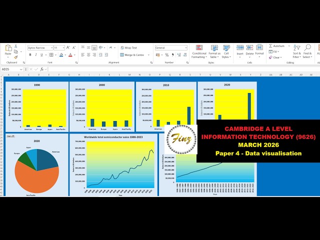
Pandas Data Visualization, EDA and AI-Powered Analytics | Python in Excel 365 Net Sales by Region Net Sales by Category Top ...
212 views
4d ago
Desig Opportunities - Lab 1.
11 views
Join me as I learn data skills, both technical and soft... completely in public. I'll make mistakes, work through them in real time, and ...
1 view
Streamed 1d ago
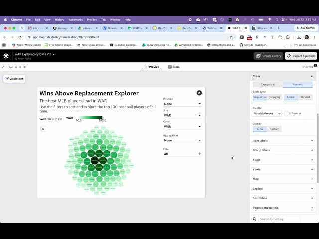
0:00 Intro 1:24 Select a Template 4:05 Adding Data 5:18 Defining Data Types 6:23 Headline/Frame 8:44 Sizing by Data 9:58 ...
3 views
2h ago
Python for Data Science — Day 12** Data visualization is an essential part of Data Science. In this session, we learn how to ...
Animation https://youtu.be/dccE1_OTyX4.
398 views
6d ago
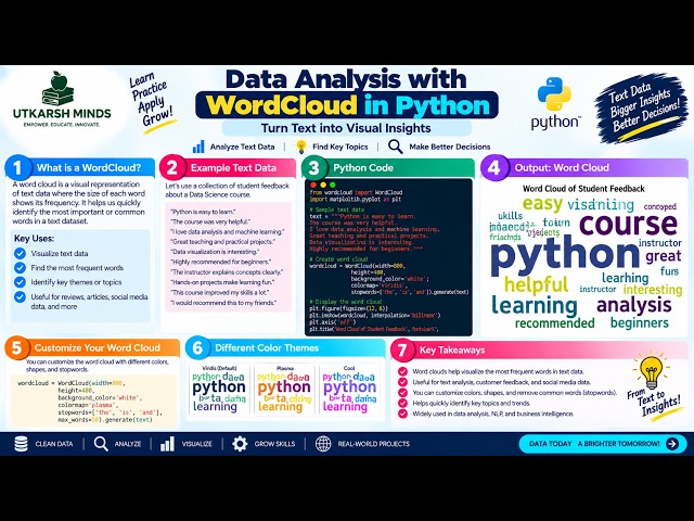
In this practical Python Data Analysis tutorial, we'll learn how to create a WordCloud to visually represent the most frequently ...
13 views
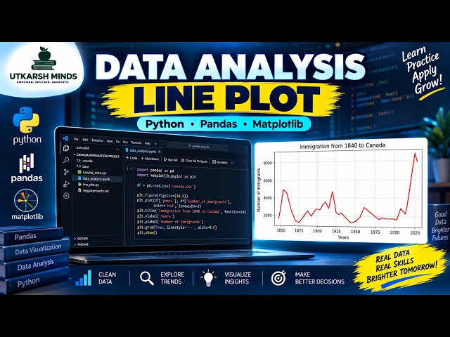
In this practical Python Data Analysis tutorial, we'll learn how to create and understand a Line Plot to visualize data and identify ...
4 views
3d ago
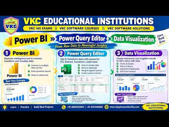
Data Analytics with AI - Power BI -- Power Query Editor -- Data Visualization.
32 views
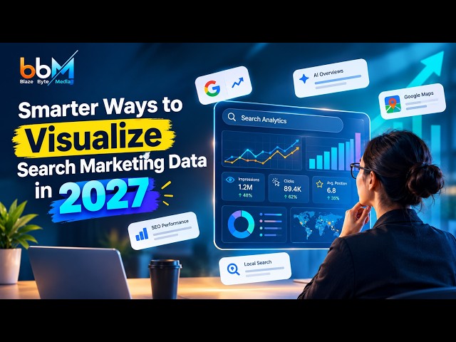
SEO and PPC reports are full of numbers—but numbers alone don't tell a story. In 2027, search marketers need to move beyond ...
2 views
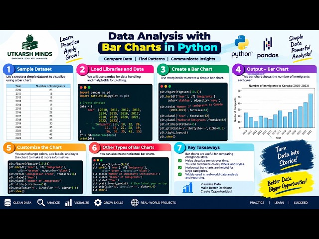
In this practical Python Data Analysis tutorial, we'll learn how to create and understand Bar Charts to compare different categories ...
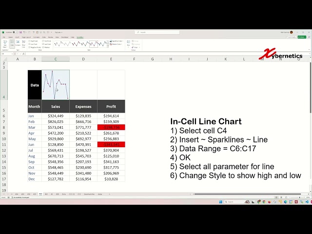
Learn how to create win loss line and column sparklines in Excel for data visualization. Win-loss sparkline charts, particularly ...
479 views
Show more