Upload date
All time
Last hour
Today
This week
This month
This year
Type
All
Video
Channel
Playlist
Movie
Duration
Short (< 4 minutes)
Medium (4-20 minutes)
Long (> 20 minutes)
Sort by
Relevance
Rating
View count
Features
HD
Subtitles/CC
Creative Commons
3D
Live
4K
360°
VR180
HDR
307,637 results
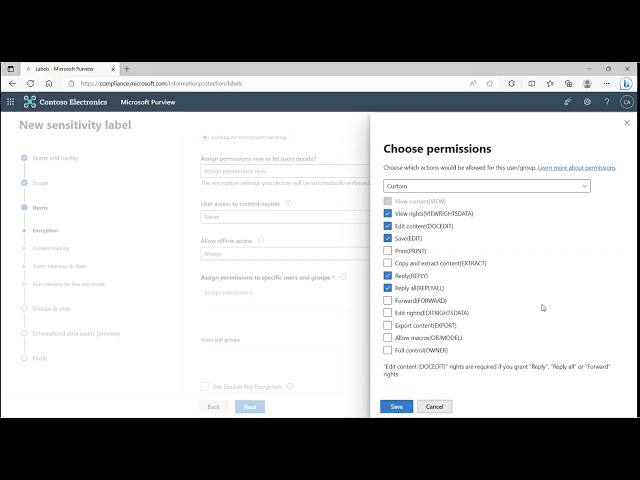
In this video you will learn how to create sensitivity labels and label policies using Microsoft Purview Information Protection.
360 views
4mo ago
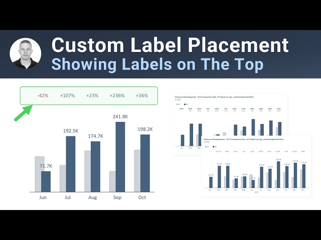
Step by step video on how to adjust label placement in Power BI. It addresses very specific use-case: 1) only column chart can be ...
2,877 views
9mo ago
SC-401: Easy Guide to Microsoft 365 Data Retention Tricks! Welcome to Part 16 of the SC-401 Exam Prep Series! In this video ...
1,274 views
10mo ago
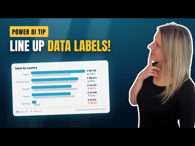
Ever tried to line up your data labels and detail labels in a Power BI bar chart, only to watch them scatter everywhere? In this video ...
1,859 views
1mo ago
Join Patrick LeBlanc and guest expert Wolfgang Strasser as they dive deep into why data governance should be a foundational ...
3,113 views
7mo ago
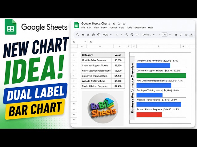
Google Sheets Bar Chart with Dual Data Labels showing both Value and Percentage. Next video for you ...
204 views
2mo ago
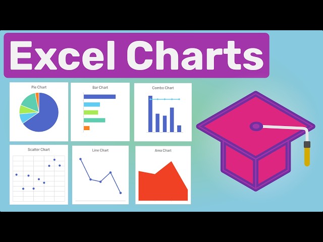
You'll also learn how to format your charts, add data labels and trendlines, work with multiple data series, and make your charts ...
72 views
2d ago
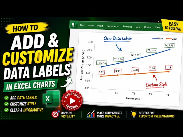
Want to make your Excel charts look more professional and easier to understand? In this step-by-step tutorial, you'll learn how to ...
55 views
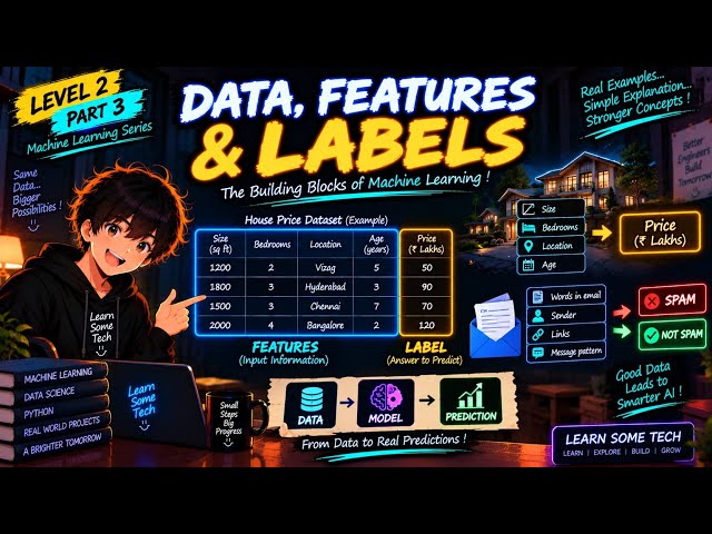
Welcome back to Learn Some Tech! In Part 2, we learned about the three main types of Machine Learning... Now, it's time to ...
9 views
2w ago
How to Add Dynamic Data Labels in Excel Charts (Quick Guide) In Today's Video We Cover: how to change color of data labels in ...
61 views
How To Add Data Labels To Your Excel Chart In Excel [2026 Guide] In today's video we cover: how to add data labels to your ...
16 views
Want to know how to add data labels to visuals in Power BI so your charts communicate clearly without making viewers guess ...
60 views
In this video, we discuss how to change the font color of axis labels in an Excel chart, providing an easy guide for Excel chart ...
76 views
Hands‑on walkthrough of Microsoft Purview's sensitivity labeling capabilities. In this session, you'll learn how to enable label ...
128 views
6mo ago
How To Add Text Label To Bar Column Or Line Chart In Google Sheets (Tutorial 2026) I cover everything from website builders ...
Building an ISO 27001-Ready Information Security Management System (ISMS) Episode 10: Data Labeling and Classification In ...
917 views
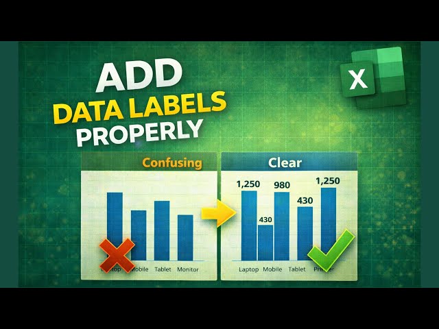
Struggling to read values in your Excel charts? In this tutorial, you'll learn how to add data labels properly in Excel so your charts ...
542 views
8mo ago
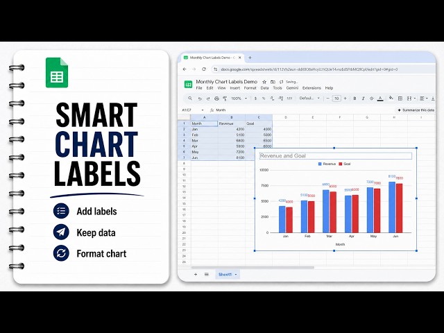
Learn how to add data labels in Google Sheets without breaking your source data. This tutorial walks you through inserting a ...
3mo ago
How to Add Data Labels to a Chart in Microsoft Excel [2026 Easy Guide] Business & collaborations: ...
21 views
How to Make Cell Bar Charts with Data Labels in Excel [2026 Easy Guide] Business & collaborations: ...
11 views
Show more



![How To Add Data Labels To Your Excel Chart In Excel [2026 Guide]](/api/proxy/image?url=https%3A%2F%2Fi.ytimg.com%2Fvi%2FBRg1F8z9pjg%2Fsddefault.jpg)

![How to Add Data Labels to a Chart in Microsoft Excel [2026 Easy Guide]](/api/proxy/image?url=https%3A%2F%2Fi.ytimg.com%2Fvi%2FidB_CuGIiME%2Fsddefault.jpg)
![How to Make Cell Bar Charts with Data Labels in Excel [2026 Easy Guide]](/api/proxy/image?url=https%3A%2F%2Fi.ytimg.com%2Fvi%2FddVLB_fu8jg%2Fsddefault.jpg)