Upload date
All time
Last hour
Today
This week
This month
This year
Type
All
Video
Channel
Playlist
Movie
Duration
Short (< 4 minutes)
Medium (4-20 minutes)
Long (> 20 minutes)
Sort by
Relevance
Rating
View count
Features
HD
Subtitles/CC
Creative Commons
3D
Live
4K
360°
VR180
HDR
107,022 results
Heat maps. Bar charts. Line graphs. Balls! There's a lot of ways to visualize the performance data from your servers, databases, ...
16,437 views
Streamed 4w ago
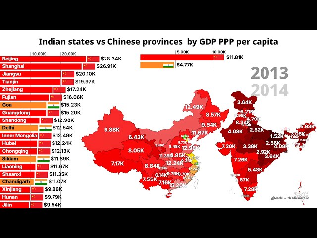
In this video, we explore a comparative data visualization of Chinese provinces and Indian states, tracking their GDP per capita ...
7,391 views
2w ago
Link to my full 2026 Data Analyst Roadmap here: ...
2,654 views
3w ago
Alan Wilson—Every Single Thing Mapping 365 Days with over 180000 Data Points (Outlier 2026) Inspired by the meticulous ...
165 views
4w ago
Amanda Shendruk is an award-winning visual journalist who's spent 15 years making charts for the Washington Post, Quartz and ...
1,181 views
Watch how the world's population has changed by country from 1960 to 2026. This animated data visualization compares ...
256 views
Stay Connected: Subscribe Now & Start Your Web Development Journey Today!
3,176 views
https://media.ccc.de/v/emf2026-241-1-data-visualisation-the-good-the-bad-the-ugly (Alt title - Look at this Graph: How to make ...
379 views
In this video, I will show you the new Cloud Computer feature in Gemini Notebook, the app that used to be called NotebookLM, ...
2,533 views
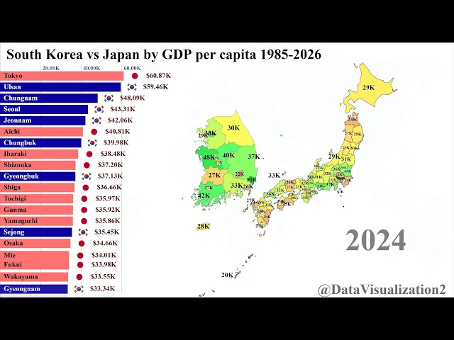
Dive into the economic transformation of East Asia as we compare the GDP growth of Japanese prefectures against South Korean ...
8,547 views
Show more