Upload date
All time
Last hour
Today
This week
This month
This year
Type
All
Video
Channel
Playlist
Movie
Duration
Short (< 4 minutes)
Medium (4-20 minutes)
Long (> 20 minutes)
Sort by
Relevance
Rating
View count
Features
HD
Subtitles/CC
Creative Commons
3D
Live
4K
360°
VR180
HDR
42,672 results
Excel is one of the most used skills in the data world. In this series we will be walking through all of the most important topics that ...
255,180 views
4y ago
In this Microsoft Excel tutorial you will learn how to add a data series to your chart in Microsoft Excel. About The Trainer: This ...
160,217 views
6y ago
Take my Full Excel Course Here: https://www.analystbuilder.com/courses/excel-for-data-analytics Download Datasets: ...
292,903 views
1y ago
Take my Full Excel for Data Analytics Course! https://www.analystbuilder.com/courses/excel-for-data-analytics In this video we ...
1,347,776 views
Do you like our content? Buy us a cup of coffee! https://ko-fi.com/burntolearn The next time you want to represent the content of a ...
289 views
3y ago
In this Microsoft PowerPoint tutorial you will learn how to copy and use data from Excel to create a chart using Microsoft ...
637 views
In this tutorial you can learn How To Draw A Graph In Excel. Please subscribe my channel and keep in touch... Thanks.
2,230 views
8y ago
This video will teach you how to use CHART in Microsoft Office EXCEL in an easy way. If you have any suggested topics that you ...
1,498 views
How to Format the chart x-axis and y-axis in an Excel Chart.
13,640 views
7y ago
Diagrams present numbers in a quick easily understandable format. There are three chart types: - Column: Suited to compare ...
22,469 views
10y ago
This video offers practical tips for using AI. The videos in this playlist were created for the SALTO Digital Resource Centre. SALTO ...
22 views
2w ago
Excel Waterfall Chart: Beginner's Guide Learn how to create a waterfall chart in Excel with this beginner's guide! Waterfall charts ...
78,979 views
2y ago
This video was produced as part of the seminar "Applied Linguistics/Corpus Linguistics" at the University of Hildesheim, Germany.
123 views
Is video mein hum seekhenge ki Microsoft Excel mein professional aur attractive charts kaise banaye jate hain. Agar aap student ...
34 views
3mo ago
Join members: https://www.youtube.com/channel/UCeX5SphLC0ky7rpbsffFwqg/join If you're tired of scrolling through rows and ...
291,140 views
Support Me & More: linktr.ee/benthompsonuk In this tutorial I demonstrate how you can create a dynamic yet easy to implement ...
13,473 views
In this video I demonstrate how to create a boxplot using Microsoft Excel 365.
79,878 views
Take my Full Excel for Data Analytics Course! https://www.analystbuilder.com/courses/excel-for-data-analytics Excel is one of the ...
1,544,076 views
Download my FREE guide "1:1 Mastery for Employees," here: https://www.risracademy.com/1-1-mastery-for-employees Complete ...
198,785 views
5y ago
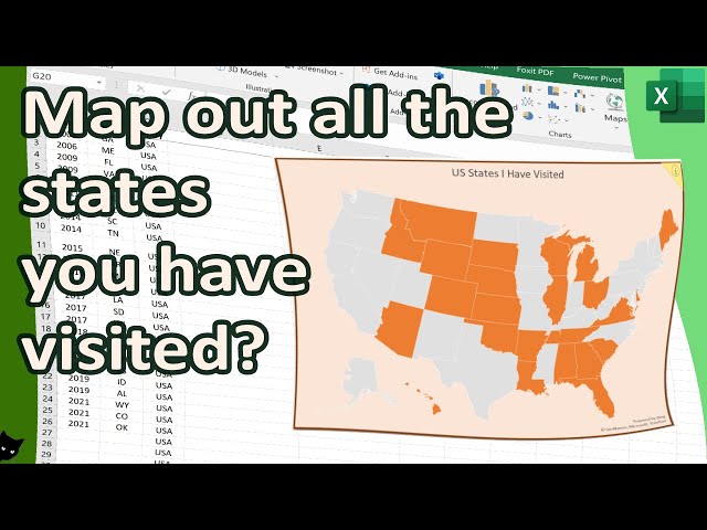
Do you have a list of all the states you have been to (or want to be)? If so, this map chart is for you! In this map chart, you can map ...
4,485 views
Show more




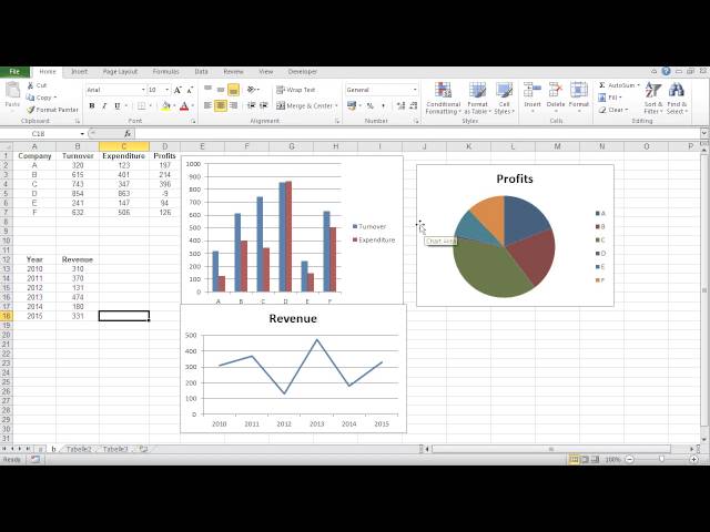
![How to create a simple chart on Excel [Quick Tutorial]](/api/proxy/image?url=https%3A%2F%2Fi.ytimg.com%2Fvi%2FMFqQQB2Xkp8%2Fsddefault.jpg)