Upload date
All time
Last hour
Today
This week
This month
This year
Type
All
Video
Channel
Playlist
Movie
Duration
Short (< 4 minutes)
Medium (4-20 minutes)
Long (> 20 minutes)
Sort by
Relevance
Rating
View count
Features
HD
Subtitles/CC
Creative Commons
3D
Live
4K
360°
VR180
HDR
9,671 results
How to Create a Waterfall Chart in Excel (in Excel 2016 or newer) | How to Learn Excel In this video, we'll walk through creating a ...
1,841 views
2y ago
Excel Charts 101: Best Practices for Clean and Effective Charts In this tutorial, you will learn: How to properly organize your data ...
326 views
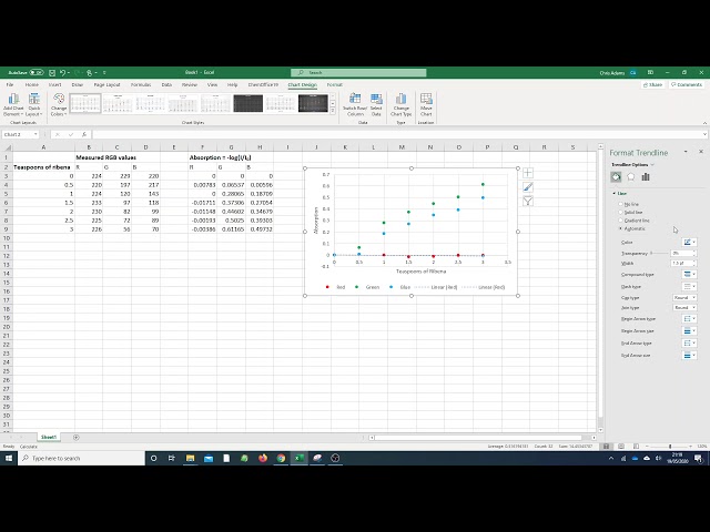
So that's our basic chart - so let's work on prettifying it a bit. The first thing I want to do I'll put some titles on the axes. If I click on this ...
692 views
5y ago
Master Excel in just 12 minutes! Whether you're new to spreadsheets or need a refresher, this step-by-step tutorial will teach you ...
241 views
1y ago
In this video of #engineeringmanagementacademy #pivottable is tutored in an #ExcelProject by #DrMehrdadArashpour ❎ Excel ...
463 views
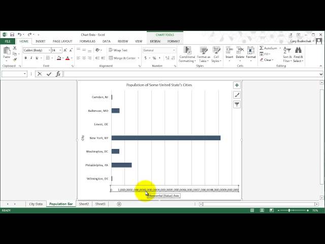
This video covers how to create column, bar, and pie charts and how to label axis and put a title on the chart. This video is part of ...
5,917 views
12y ago
In this video of #engineeringmanagementacademy #sparklines are tutored for #communication_management by ...
220 views
Learn more about Inserting Charts in Microsoft Excel | insert chart in excel | Create Chart in Excel | 2D - 3D Chart its easy process ...
22 views
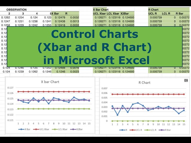
In this video I walk you through all the steps necessary to construct Control Charts (Xbar and R) in Microsoft Excel. Control charts ...
48,327 views
7y ago
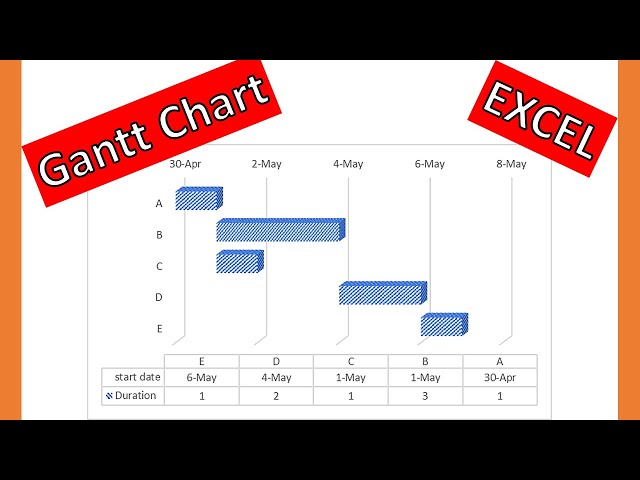
In this video drawing 3D #ganttchart in #excel is explained by #drmehrdadarashpour → #ganttdiagram #ganttchartexcel ❎ Excel ...
2,474 views
Basics of graphing in Microsoft Excel. This video is licensed under CC-BY-SA.
303 views
6y ago
Do you want to know how to make a graph with Microsoft Access? First, create a query with the data for the chart. Then make a ...
126,381 views
In this video I show you how to create a pivot chart and a Pareto chart using Excel.
1,113 views
This video covers basics of working with big data in excel including: Split Panes, GoTo, shift vs. control for selecting cells, and ...
3,143 views
In this video of Drawing #CriticalPathMethod in #excel is explained by #drmehrdadarashpour → #cpm ❎ Excel workbook to ...
26,589 views
Welcome to the my Channel : newtech4niit kumar My Previour Class Links Frist Excel Class Link: https://youtu.be/8Sqb2n7e3VQ ...
21 views
In this video, we will look at three different types of graphs in Excel - bar, line and scatter graphs. We will look at calculating the ...
101 views
In this lesson, I will be teaching you how to calculate student grades using Microsoft Excel. #Excel #Microsoft #AdjoTech ...
248,118 views
This video covers stacked and 100% stacked area charts. This video is part of an excel class in the Energy Management and ...
2,137 views
Two ways to customize your x-axis labels in an Excel Chart.
69,435 views
4y ago
Show more