Upload date
All time
Last hour
Today
This week
This month
This year
Type
All
Video
Channel
Playlist
Movie
Duration
Short (< 4 minutes)
Medium (4-20 minutes)
Long (> 20 minutes)
Sort by
Relevance
Rating
View count
Features
HD
Subtitles/CC
Creative Commons
3D
Live
4K
360°
VR180
HDR
155,377 results
5️⃣Excel Tips to Create Eye-Catching Data Visualizations! But want to REALLY create stunning visualizations in Excel and ...
493 views
11mo ago
Welcome to this Tableau Tutorial for Beginners! In this video, you'll learn how to install Tableau Desktop, connect an Excel dataset ...
28 views
2mo ago
... technical results to a non-technical audience you'll achieve this by following data visualization best practices use dashboards or ...
1,409 views
Turn raw data into stunning visual stories with our new IDE course, Data Visualization in Python! If you've ever stared at a ...
25,092 views
What makes one data visualization more effective than another? Professor Eric Bogert from Northeastern's D'Amore-McKim ...
40 views
5mo ago
Welcome to TrendIgnite — your go-to channel for learning Data Analytics, Power BI, and real career skills step-by-step.
18 views
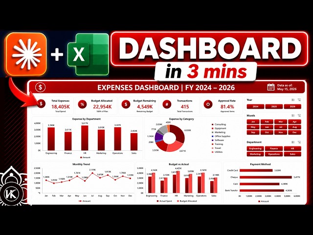
... #aitools2026 #aitools2026 #nocodingjobs #datavisualization #claudeaitutorial #1 #claudecowork #claude #claudecode ...
467,370 views
4mo ago
Sharing the full step-by-step tutorial? Watch the complete breakdown video linked right here on my channel! Click the linked ...
15 views
2h ago
In this video I will show how to create a pie chart in Figma, Figma pie chart tutorial, design data visualization graphics in Figma ...
0 views
3h ago
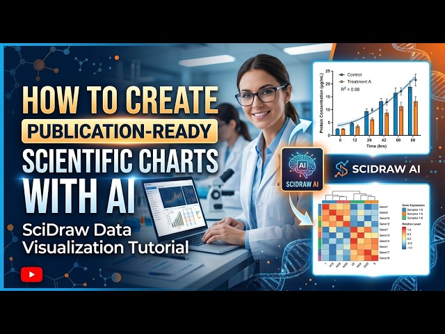
Upload CSV data and let AI generate publication-quality scientific charts following Nature, Science, and Cell journal standards.
146 views
Data Analyst vs. Data Scientist Skills, Salary, and Degree -- Data Analytics Roadmap, Data Science Roadmap, Data Analytics ...
650,189 views
How to Make a Chart in LibreOffice Calc In this video, we show you exactly how to make a chart in LibreOffice Calc to transform ...
1,054 views
8mo ago
Learn how to turn raw data into beautiful visual insights using Python's most powerful libraries: Matplotlib and Seaborn! In this ...
114 views
exceltips for making #excel look less like… Excel #spreadsheet #dashboards #datavisualization #exceltipsandtricks.
2,781 views
10mo ago
How To Create A Custom Dashboard In Airtable Live Tutorial (2026 Guide) airtable custom dashboard, airtable dashboard tutorial ...
270 views
7mo ago
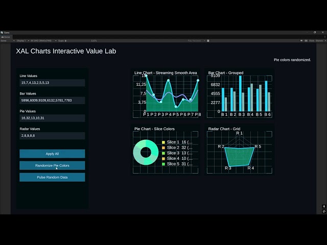
Tired of heavy sprites and blurry UI charts in your Unity projects? Meet XAL Charts: A 100% procedural, high-performance data ...
49 views
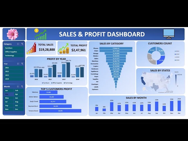
Doston, is video mein maine ek complete Sales & Profit Dashboard share kiya hai jo aapke business data ko track karne aur ...
80 views
Learn how Python, NumPy, Pandas, data visualization, and machine learning concepts come together to analyze data, uncover ...
70 views
31 min ago
How to Create Charts in Microsoft SharePoint Lists [2026 Guide] In today's video we cover: Microsoft SharePoint, SharePoint ...
429 views
3mo ago
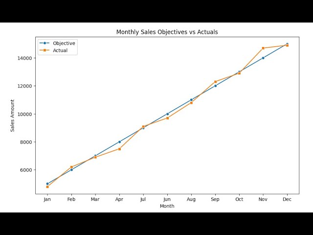
In this short demo, I showcase two internship application tasks for Apexcify Technologies: 1️⃣ Monthly Sales Visualization ...
26 views
9mo ago
Show more






![How to Make a Chart in LibreOffice Calc [2026 Full Guide]](/api/proxy/image?url=https%3A%2F%2Fi.ytimg.com%2Fvi%2FwJDuLI7a4Hg%2Fsddefault.jpg)




![How to Create Charts in Microsoft SharePoint Lists [2026 Guide]](/api/proxy/image?url=https%3A%2F%2Fi.ytimg.com%2Fvi%2FTM66sN4BK3A%2Fsddefault.jpg)