ViewTube

ViewTube
Sign inSign upSubscriptions
Filters

Upload date

Type

Duration

Sort by

Features

Reset

959 results

iCT SHARE
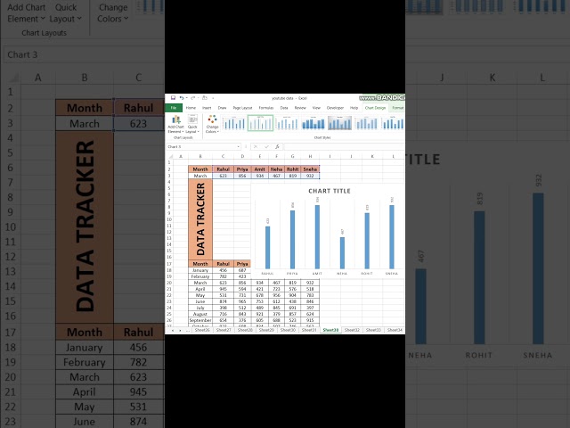
Data Visualization (Full Course)

Sharing the full step-by-step tutorial? Watch the complete breakdown video linked right here on my channel! Click the linked ...

0:22
Data Visualization (Full Course)

158 views

1d ago

Computer Hub
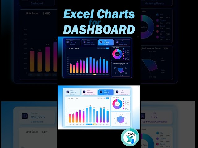
Create a Professional Dashboard in Excel | Excel Data Visualization #shorts #excel #viral #trending

Excel Dashboard Tutorial 📊 | Create a Professional & Interactive Dashboard in Excel In this video, you'll learn how to create ...

2:24
Create a Professional Dashboard in Excel | Excel Data Visualization #shorts #excel #viral #trending

5,312 views

2d ago

Just Ask Leo
How to Create and Share Custom Charts in Jira With Dashboard Hub Pro (2026 Guide)

Creating a custom chart in Jira can be confusing when you need to configure it, share it, and keep it useful on a dashboard.

3:29
How to Create and Share Custom Charts in Jira With Dashboard Hub Pro (2026 Guide)

1 view

2d ago

Coding Inspiration
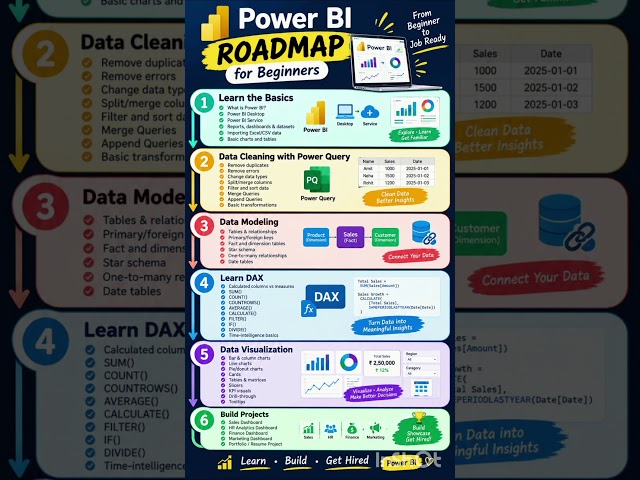
Power BI Roadmap 2026 📊 | Beginner to Job Ready #shorts

... Query ✓ Data Cleaning ✓ Data Modeling & Relationships ✓ DAX & Measures ✓ Data Visualization ✓ Interactive Dashboards ...

0:06
Power BI Roadmap 2026 📊 | Beginner to Job Ready #shorts

995 views

19h ago

Jasmine Jones
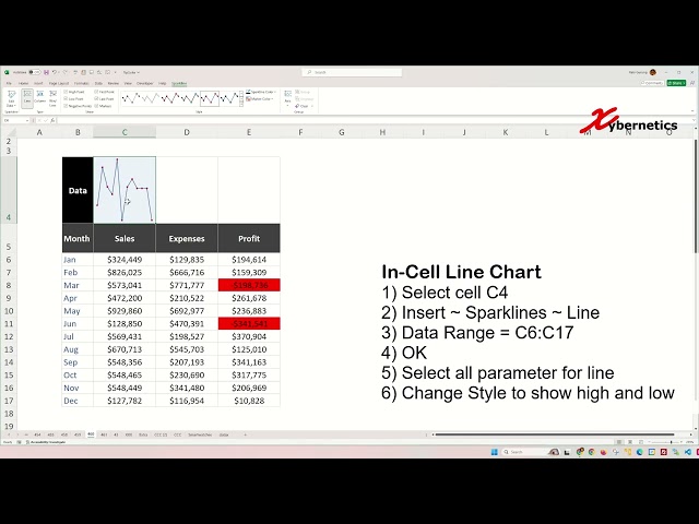
Data Visualization: Win Loss, line and column Sparkline Charts In Excel - #excel #tips and #tricks

Learn how to create win loss line and column sparklines in Excel for data visualization. Win-loss sparkline charts, particularly ...

1:48
Data Visualization: Win Loss, line and column Sparkline Charts In Excel - #excel #tips and #tricks

486 views

5d ago

Guide Hub (2026 WORKING GUIDES)
How To Filter Year in Power BI (𝟮𝟬𝟮𝟲) | 100% WORKS | NO Yapping, To The Point! | FAST & EASY

(2026) Learn How To Filter Year in Power BI in this video (NO YAPPING + 100% WORKS!) | EASY FULL GUIDE, Everything ...

2:03
How To Filter Year in Power BI (𝟮𝟬𝟮𝟲) | 100% WORKS | NO Yapping, To The Point! | FAST & EASY

0 views

4d ago

Utkarsh Minds-Data Science, analytics, AI
Data Analysis Using WordCloud | Python Data Visualization

In this practical Python Data Analysis tutorial, we'll learn how to create a WordCloud to visually represent the most frequently ...

3:43
Data Analysis Using WordCloud | Python Data Visualization

13 views

3d ago

iCT SHARE
Data Visualization #fullcourse

Sharing the full step-by-step tutorial? Watch the complete breakdown video linked right here on my channel! Click the linked ...

0:23
Data Visualization #fullcourse

1 view

1h ago

Cloud2BR
What Is Data Visualization?

Data visualization is the process of representing data and information using visual elements such as charts, graphs, maps, and ...

0:11
What Is Data Visualization?

480 views

5d ago

QED Rendered
If Math Functions Had a Sound 📈🔊

Maths #Mathematics #SoundDesign #Physics #OddlySatisfying #DataVisualization #Manim #ScienceFacts.

0:22
If Math Functions Had a Sound 📈🔊

67,926 views

5d ago

Kamli
Tableau for Beginners Ep #4 | Create Your First Visualization | Tableau Tutorial

Tableau for Beginners Ep #4 | Create Your First Visualization | Tableau Tutorial** Welcome to **XL-IN-IT**! In this episode of our ...

2:05
Tableau for Beginners Ep #4 | Create Your First Visualization | Tableau Tutorial

2 views

4d ago

Global Data 365
From Business Central to Power BI dashboard design level up! 🚀#powerbi #dataviz

... business central data. https://globaldata365.com/power-bi-training/ #powerbi #businesscentral #datavisualization #dashboard ...

0:10
From Business Central to Power BI dashboard design level up! 🚀#powerbi #dataviz

988 views

2d ago

Excel Visual
Digital Marketing Data Visualization in Excel for a KPI Tracking Dashboard

KPI Dashboard for Digital Marketing Data Visualization Template: ...

0:36
Digital Marketing Data Visualization in Excel for a KPI Tracking Dashboard

344 views

1d ago

How to Power BI
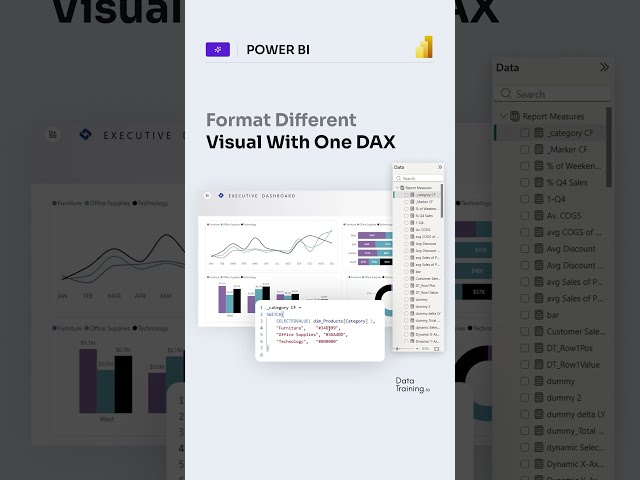
Control colors in all visuals at once! Only one DAX Measure Possible Since July 2026

... #powerbitraining​ #powerbideveloper​ #DAX #fabric #fabricai #PowerBI #PowerBIAI #Copilot #DataVisualization #design ...

0:12
Control colors in all visuals at once! Only one DAX Measure Possible Since July 2026

9,392 views

4d ago

Finance With VKey
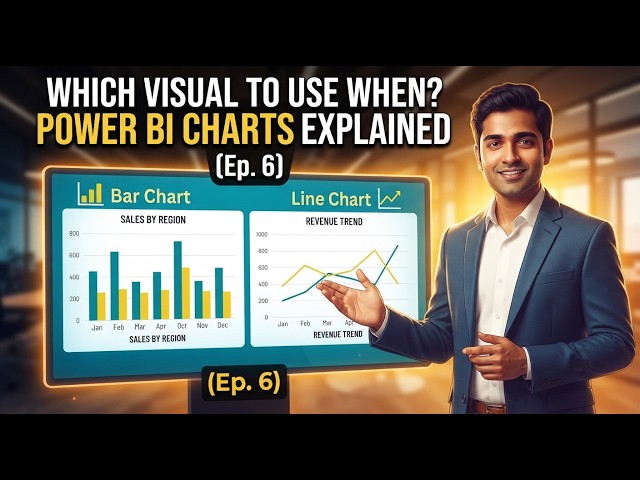
Power BI Charts Explained — Which Visual to Use When (Ep. 6)

Power BI Course — Episode 6: Visualizations — Charts aur Best Practices Is episode mein hum seekhenge kaunsa chart type ...

2:57
Power BI Charts Explained — Which Visual to Use When (Ep. 6)

6 views

7d ago

RR Consultancy Assignment Guidance
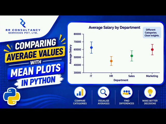
Comparing Average Values Across Categories with Mean Plots in Python

Don't forget to like, share, and subscribe for more programming and data visualization tutorials!Suggested Keywords / TagsMean ...

1:39
Comparing Average Values Across Categories with Mean Plots in Python

6 views

5d ago

The Power BI with Sudhir
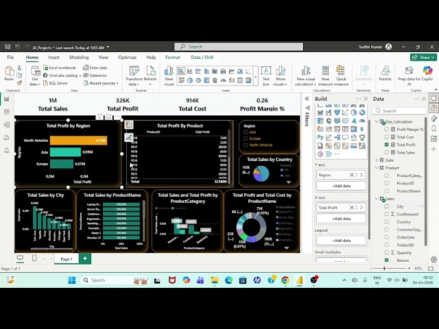
Why More Data Does NOT Mean Better Decisions | Power BI Dashboard | Power BI projects

powerbitutorialforbeginners #powerbitutorial ...

2:57
Why More Data Does NOT Mean Better Decisions | Power BI Dashboard | Power BI projects

21 views

17h ago

LetsLearn
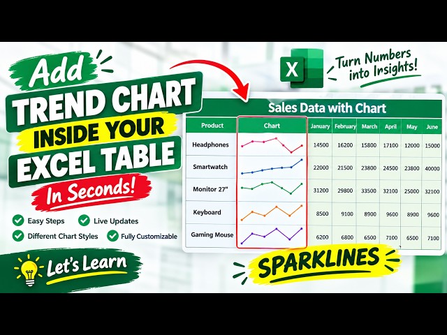
How to Create a Sales Trend Chart in Excel Using Sparklines

Learn how to add Excel Sparklines directly into your data tables to visualize trends instantly. This tutorial shows you how to select ...

3:05
How to Create a Sales Trend Chart in Excel Using Sparklines

8 views

4h ago

How to Power BI
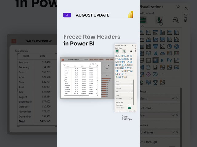
Freeze / Unfreeze Row Headers in Power BI Matrix. Full flexibility! (see description)

... #powerbitraining​ #powerbideveloper​ #DAX #fabric #fabricai #PowerBI #PowerBIAI #Copilot #DataVisualization #design ...

0:15
Freeze / Unfreeze Row Headers in Power BI Matrix. Full flexibility! (see description)

9,548 views

3d ago

QuickFix Tech
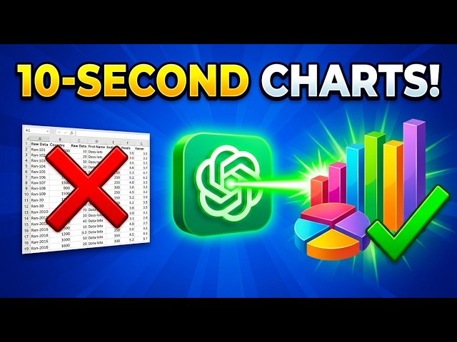
The AI Secret to Perfect Excel Charts & Dashboards 📊

What you'll learn: - How to prompt ChatGPT for data visualization - Quick chart creation in Excel & Google Sheets - Instant ...

1:03
The AI Secret to Perfect Excel Charts & Dashboards 📊

2 views

19h ago

Show more