Upload date
All time
Last hour
Today
This week
This month
This year
Type
All
Video
Channel
Playlist
Movie
Duration
Short (< 4 minutes)
Medium (4-20 minutes)
Long (> 20 minutes)
Sort by
Relevance
Rating
View count
Features
HD
Subtitles/CC
Creative Commons
3D
Live
4K
360°
VR180
HDR
81,242 results
Sharing the full step-by-step tutorial? Watch the complete breakdown video linked right here on my channel! Click the linked ...
15 views
1h ago
Hello guys in this video I show you how to use charts in monday.com. 🖼️ **monday.com: How to Use Charts — Here's How to ...
48 views
4w ago
How to Create a Diagram From an Excel Spreadsheet [2026 Quick Guide] Learn how to create a diagram from an excel ...
26 views
3w ago
How to Create a Professional Data Dashboard with Google Gemini (Step by Step) dashboard with google gemini, gemini canvas ...
39 views
2w ago
What You'll Learn Here: * Step-by-step Data Analytics & Data Visualization tutorials * Dashboard creation using Power BI * Career ...
658 views
Data visualization is the process of representing data and information using visual elements such as charts, graphs, maps, and ...
468 views
4d ago
Learn how to create a histogram in Google Sheets to visualize the distribution of your data. This quick, step-by-step tutorial shows ...
13 views
11d ago
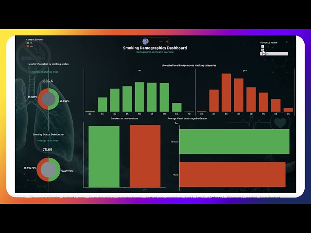
Python for Preprocessing, EDA and Tableau for Data Visualization.
17 views
In this video I'll walk you through exactly how to visualize data in Airtable — step by step, start to finish. What you'll learn: How to ...
4 views
Random Data Visualization Class | Learning Data Visualization from Scratch In this spontaneous class, we dive into the ...
60 views
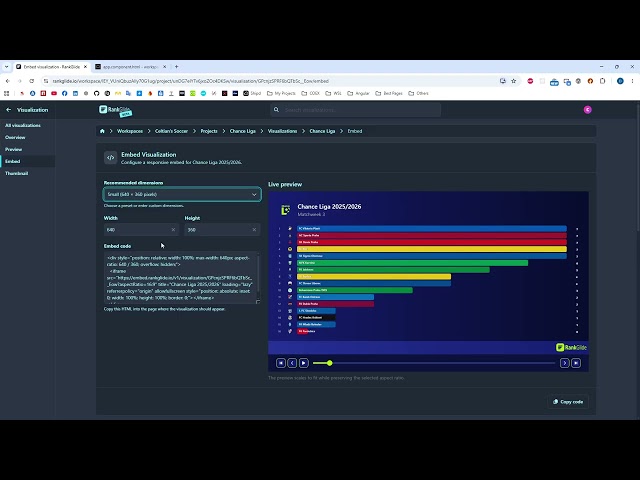
Learn how to embed a published RankGlide visualization on any website. In this tutorial, you'll learn how to: • open the embed ...
7 views
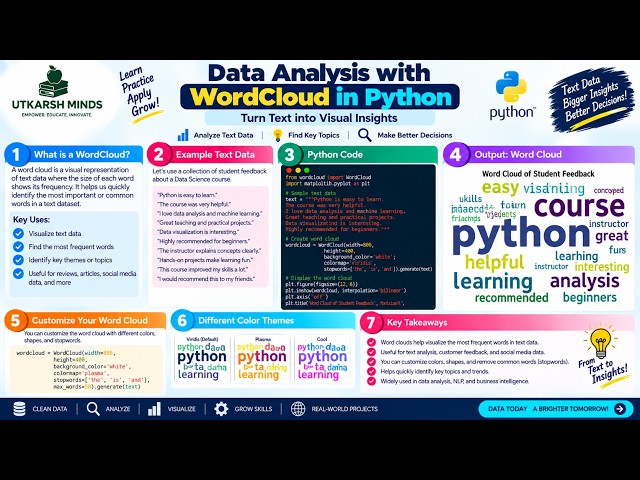
In this practical Python Data Analysis tutorial, we'll learn how to create a WordCloud to visually represent the most frequently ...
12 views
2d ago
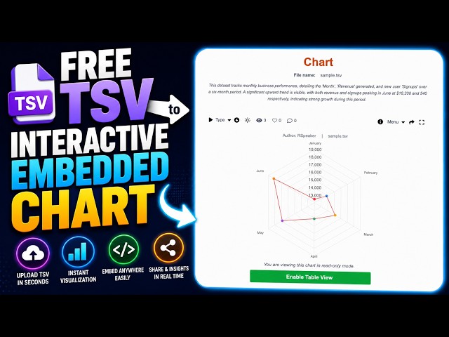
Turn a TSV (Tab-Separated Values) file into an interactive chart in just a few seconds with MonChart — no premium plan required.
20 views
How to Create a Gauge Chart Using a Pie Chart [2026 Tutorial] Learn how to create a gauge chart using a pie chart in seconds ...
KPI Dashboard for Digital Marketing Data Visualization Template: ...
231 views
18h ago
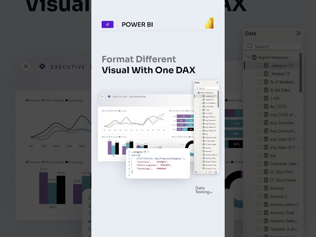
... #powerbitraining #powerbideveloper #DAX #fabric #fabricai #PowerBI #PowerBIAI #Copilot #DataVisualization #design ...
8,675 views
3d ago
... gemini kpi dashboard, ai sales report google, interactive dashboard gemini, gemini data visualization, sales data dashboard ai, ...
34 views
Learn how to convert log arguments into live variables in Traxcope and visualize them in real time on an STM32 embedded ...
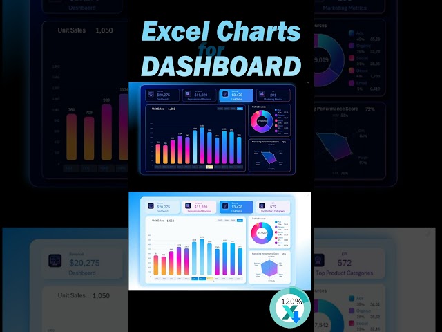
Excel Dashboard Tutorial 📊 | Create a Professional & Interactive Dashboard in Excel In this video, you'll learn how to create ...
4,346 views
1d ago
This video walks you through the process of inserting Charts in Word and editing their layout for impactful data presentation.
Show more



![How to Create a Diagram From an Excel Spreadsheet [2026 Quick Guide]](/api/proxy/image?url=https%3A%2F%2Fi.ytimg.com%2Fvi%2FfmJoEzQ2Itk%2Fsddefault.jpg)




![How To Visualize Data In Airtable [Quick Guide]](/api/proxy/image?url=https%3A%2F%2Fi.ytimg.com%2Fvi%2F_I2aMLdQAcE%2Fsddefault.jpg)
![How to Create a Gauge Chart Using a Pie Chart [2026 Tutorial]](/api/proxy/image?url=https%3A%2F%2Fi.ytimg.com%2Fvi%2FfnSnobM33Zk%2Fsddefault.jpg)