ViewTube

ViewTube
Sign inSign upSubscriptions
Filters

Upload date

Type

Duration

Sort by

Features

Reset

29,432 results

Data Is Beautiful
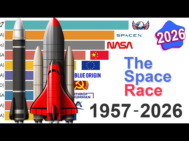
The Space Race - Most Payload Launched: Data from 1957 to 2026

I'm visualizing 70 years of The Space Race and the evolution of global launch capability from 1957 to 2026. The data presented in ...

4:30
The Space Race - Most Payload Launched: Data from 1957 to 2026

5,628 views

5 hours ago

Jotform
Best AI Data Visualization Tools in 2026

In this video we compare Jotform AI Data Assistant, Julius AI, Bricks, Zebra AI, Gemini in Google Sheets, ChatGPT, and Claude ...

13:19
Best AI Data Visualization Tools in 2026

4,284 views

6 days ago

Learning Globe
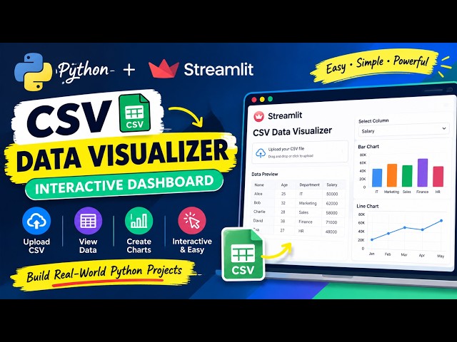
CSV Data Visualizer Using Python & Streamlit | Build an Interactive Data Analysis Dashboard

#Python #Streamlit #DataScience #Pandas #DataVisualization #PythonProjects #CSV #DataAnalysis #Dashboard ...

6:52
CSV Data Visualizer Using Python & Streamlit | Build an Interactive Data Analysis Dashboard

0 views

7 hours ago

DataBlitz
How Long Will You LIVE Based On Your Country? (2026 World Map)

In this interactive data visualization, we travel across all continents to map life expectancy at birth, highlighting global longevity ...

10:04
How Long Will You LIVE Based On Your Country? (2026 World Map)

2 views

4 hours ago

InfoZoom
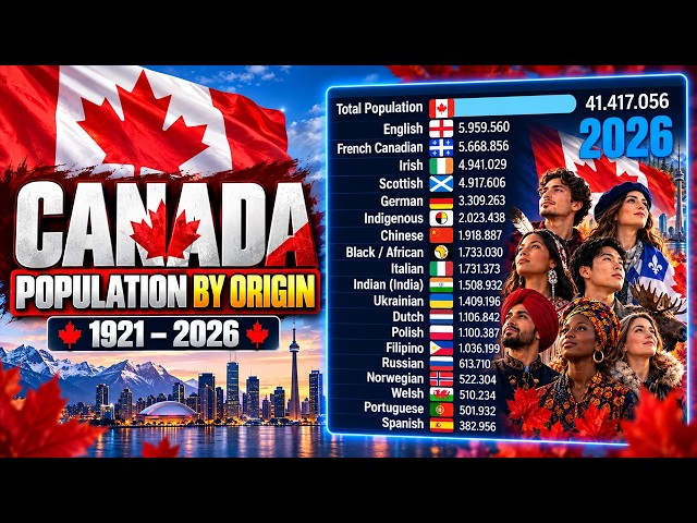
Canada Ethnic Groups by Population 1921–2026

... #DataVisualization #BarChartRace #Statistics #History #Census #StatisticsCanada #CanadaHistory #PopulationByOrigin ...

8:02
Canada Ethnic Groups by Population 1921–2026

46,264 views

2 days ago

Data Analyst
World's Largest Wool Exporters

This data visualization video shows [World's Largest Wool Exporters]. For new videos, subscribe and stay updated! Stay ...

8:15
World's Largest Wool Exporters

403 views

4 days ago

Rahim Zulfiqar Ali
Pandas Data Visualization, EDA and AI-Powered Analytics Python | Excel AI Mastery 2026-2027

Pandas Data Visualization, EDA and AI-Powered Analytics | Python in Excel 365 Net Sales by Region Net Sales by Category Top ...

10:25
Pandas Data Visualization, EDA and AI-Powered Analytics Python | Excel AI Mastery 2026-2027

195 views

3 days ago

AI_Ryan Ahmed
28   Using Claude Chat to Perform Research and Data Visualization
8:16
28 Using Claude Chat to Perform Research and Data Visualization

1 view

7 days ago

UrTechBlueprint
Data Visualization - 1 | Why Data Visualization is required?? #datavisualization #analytics
4:00
Data Visualization - 1 | Why Data Visualization is required?? #datavisualization #analytics

21 views

7 days ago

TES Data
The Rise and Fall of the Most Used Artificial Intelligences | 2022-2026

... artificial intelligences in the world from 2022 to 2026, tracking the explosive AI revolution through a dynamic data visualization.

9:53
The Rise and Fall of the Most Used Artificial Intelligences | 2022-2026

180,583 views

6 days ago

InfoZoom
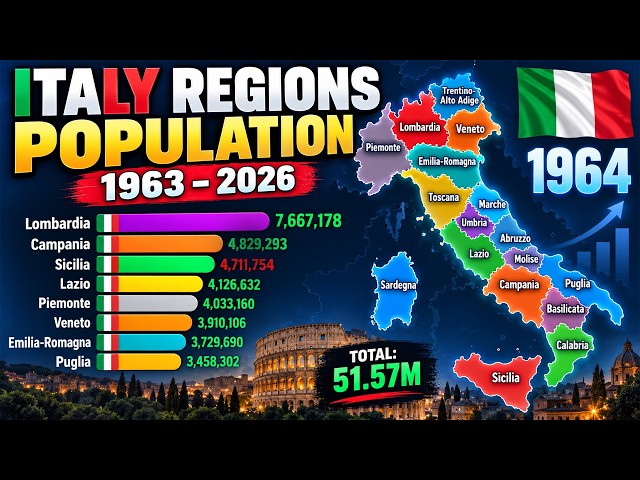
How Italy’s Regions Changed by Population | 1963–2026

... #DataVisualization #Statistics #PopulationHistory #Demography #Europe #EuropeanPopulation #AnimatedChart #DataViz.

8:01
How Italy’s Regions Changed by Population | 1963–2026

33,914 views

4 days ago

Analytics in 10 Minutes
How to Calculate Rolling Average in Power BI Using Variables in DAX

Whether you're a Power BI user working with DAX, or a Python user who prefers matplotlib for data visualization, this video shows ...

9:08
How to Calculate Rolling Average in Power BI Using Variables in DAX

1,098 views

6 days ago

World Data Race
10,000 Years of Population Change in 10 Minutes

This 10-minute data visualization uses historical population estimates from Our World in Data, HYDE, Gapminder and United ...

10:00
10,000 Years of Population Change in 10 Minutes

12 views

5 days ago

StatisticsMart
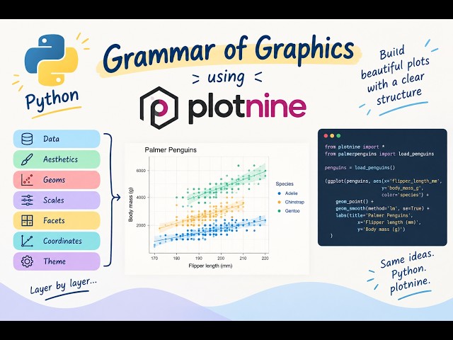
Data Visualisation in Python: The Grammar of Graphics Grammar of Graphics with Python & Plotnine

Learn how to create data visualisations in Python using plotnine and the Grammar of Graphics approach. Plotnine follows a ...

19:18
Data Visualisation in Python: The Grammar of Graphics Grammar of Graphics with Python & Plotnine

38 views

16 hours ago

Utkarsh Minds-Data Science, analytics, AI
Data Analysis Using Line Plot | Python & Pandas Data Visualization

In this practical Python Data Analysis tutorial, we'll learn how to create and understand a Line Plot to visualize data and identify ...

10:47
Data Analysis Using Line Plot | Python & Pandas Data Visualization

2 views

2 days ago

AI Motion Lab Hindi
I Created an ANIMATED CHART Using ChatGPT! | AI Data Visualization

🤯 ChatGPT Can Create ANIMATED CHARTS?! Watch This! What if you could turn simple data into a beautiful animated visualization ...

5:06
I Created an ANIMATED CHART Using ChatGPT! | AI Data Visualization

40 views

2 days ago

Utkarsh Minds-Data Science, analytics, AI
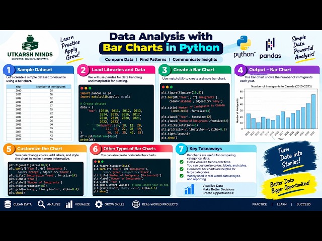
Data Analysis Using Bar Charts | Python Data Visualization

In this practical Python Data Analysis tutorial, we'll learn how to create and understand Bar Charts to compare different categories ...

7:57
Data Analysis Using Bar Charts | Python Data Visualization

0 views

2 days ago

Rise & Reflect
Create an interactive dashboard in just 10 minutes using Excel

Perfect for beginners and professionals who want to visualize data quickly and effectively What you'll learn in this video: How to ...

11:09
Create an interactive dashboard in just 10 minutes using Excel

56 views

6 days ago

Data Penguin
Countries Resized by Population in South America (10,000 BC – 2100)

This video redraws the map of South America so that every country and territory is the size of its population, from 10000 BC to ...

15:33
Countries Resized by Population in South America (10,000 BC – 2100)

5,997 views

8 hours ago

Blaze Byte Media
Stop Reporting SEO Data Like This: Smarter Data Visualization for 2027

SEO and PPC reports are full of numbers—but numbers alone don't tell a story. In 2027, search marketers need to move beyond ...

8:39
Stop Reporting SEO Data Like This: Smarter Data Visualization for 2027

2 views

1 day ago

Show more