ViewTube

ViewTube
Sign inSign upSubscriptions
Filters

Upload date

Type

Duration

Sort by

Features

Reset

109,079 results

🎯Project Management Office for Planners–Gowsith
3D Cylindrical Chart in Excel | Impress with Modern Data Visualization

3D Cylindrical Chart in Excel | Impress with Modern Data Visualization.

11:09
3D Cylindrical Chart in Excel | Impress with Modern Data Visualization

14 views

11 months ago

Easy Click Learning
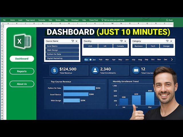
Professional Excel Dashboard Just in 10 Minutes (No VBA) #excel #dashboard

... ✓Excel Dashboard Tutorial ✓Excel Pivot Tables ✓Excel Slicers & Timelines ✓Excel KPI Cards ✓Excel Data Visualization ...

12:41
Professional Excel Dashboard Just in 10 Minutes (No VBA) #excel #dashboard

299,581 views

7 months ago

Excel For Freelancers
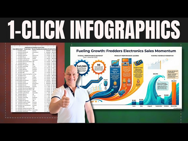
Turn  Excel Data Into Amazing Infographics In 1 CLICK

1 click infographics in Excel — this one-click trick turns raw data into a finished infographic instantly. Designing an infographic by ...

14:04
Turn Excel Data Into Amazing Infographics In 1 CLICK

39,156 views

9 months ago

Excel Campus - Jon
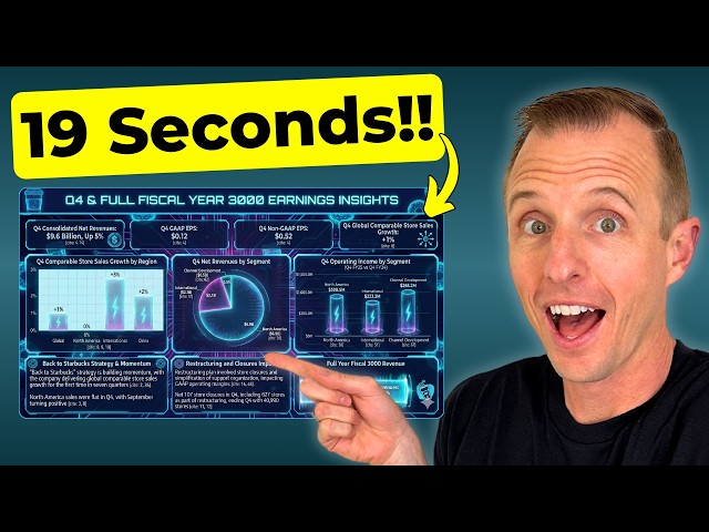
Google's New AI Creates Dashboards at INSANE Speeds

Save 75% on our AI Literacy for Excel Course during Black Friday/Cyber Monday ...

9:22
Google's New AI Creates Dashboards at INSANE Speeds

112,084 views

9 months ago

Short and Clear Excel
Create Advanced Charts in Excel Step by Step

Welcome everyone to another practical Microsoft Excel tutorial! In this video, I'll show you how to create 5 Advanced Charts and ...

17:43
Create Advanced Charts in Excel Step by Step

2,291 views

3 weeks ago

Ashok Subedi
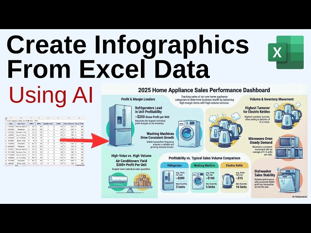
Create Infographics form Excel Data | Data Visualization and Analysis Made Easy!!

Learn how to create infographics form Excel data. This amazing AI tool turns your data into powerful and insightful infographic ...

4:42
Create Infographics form Excel Data | Data Visualization and Analysis Made Easy!!

275 views

5 months ago

Karina Adcock
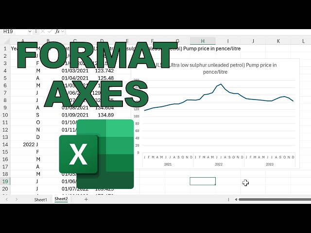
Data visualization in excel: better looking axis

Make axes text horizontal Change interval between numbers Turn 5000000 into 5 million Multilevel axis Format dates Change ...

5:18
Data visualization in excel: better looking axis

201 views

4 months ago

Vedakarna
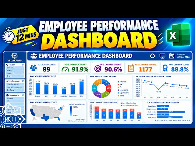
How to Create Employee Performance Dashboard in Excel | 12 Mins Tutorial | Beginner to Pro

WhatsApp: https://whatsapp.com/channel/0029VbCIu9XHVvTSpnBDWr0e Telegram: https://t.me/+aBQXL9Kwg_FhM2Jl ...

12:26
How to Create Employee Performance Dashboard in Excel | 12 Mins Tutorial | Beginner to Pro

23,052 views

12 days ago

Karina Adcock
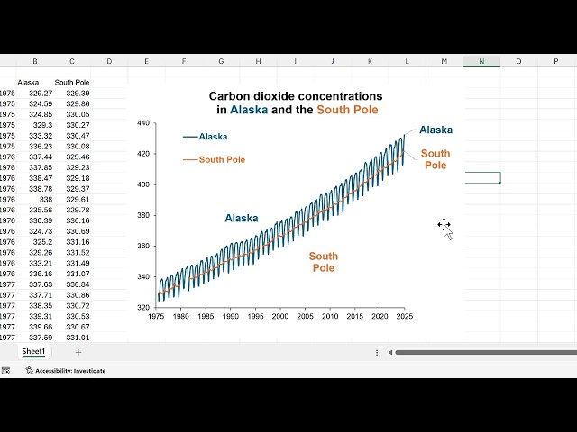
Data visualization in excel charts: alternatives to legends

Direct labels, color-coded titles: Overlap the legend and the chart Move the legend to the top Change the color of the text in the ...

5:11
Data visualization in excel charts: alternatives to legends

228 views

4 months ago

Excel Lab PK
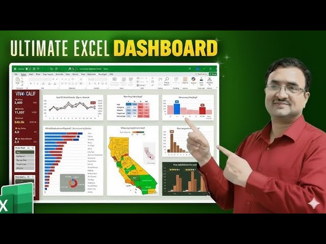
đź’Ą The Ultimate Excel Dashboard 2026: 2 Data Science Hacks to Visualize Data Like a Pro!

The Ultimate Excel Dashboard 2026: 2 Data Science Hacks to Visualize Data Like a Pro! Do you want to build a professional, ...

8:48
đź’Ą The Ultimate Excel Dashboard 2026: 2 Data Science Hacks to Visualize Data Like a Pro!

1,514 views

9 months ago

First Keyframe
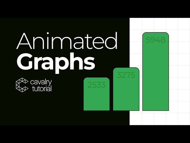
How to turn Spreadsheets into Animated Graphs using Cavalry

... into animated graphs using Cavalry App. Even though you might not traditionally use a motion software for data visualization, ...

12:37
How to turn Spreadsheets into Animated Graphs using Cavalry

2,542 views

10 months ago

Analytic Edge
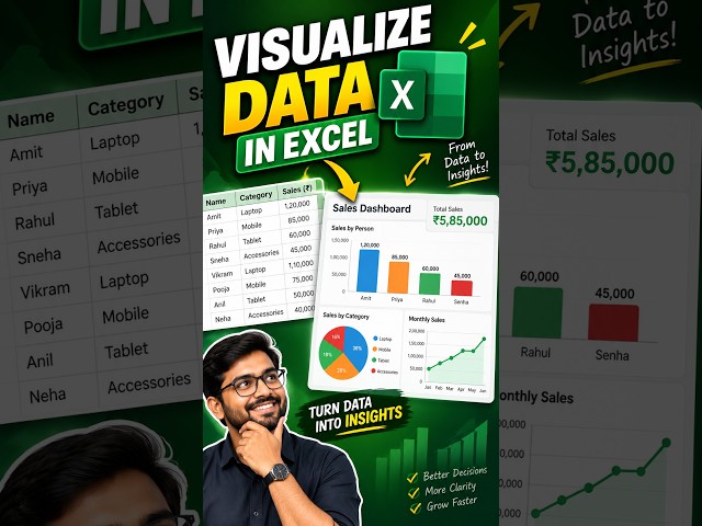
Excel Data Visualization in 5 Minutes!

In this tutorial, I'll show you step-by-step how to turn boring data into stunning, easy-to-read dashboards. ⏱️ Timestamps: 0:00 ...

5:17
Excel Data Visualization in 5 Minutes!

1 view

13 days ago

Gurru Tech Solutions
Nano Banana + Gemini 3: AI Data Visualization That Actually Works

Nano Banana + Gemini 3: The Data Visualization Workflow You Need | Stop Making Boring Charts – Use This Nano Banana + ...

10:14
Nano Banana + Gemini 3: AI Data Visualization That Actually Works

27,731 views

9 months ago

Excel University
Build an Excel Dashboard in Minutes with AI (Claude Add-in Tutorial)

File Download: https://www.excel-university.com/yt_x1m2m7ct0ao/ Get confident in Excel fast with our full online course, try it ...

8:18
Build an Excel Dashboard in Minutes with AI (Claude Add-in Tutorial)

12,787 views

5 months ago

The Missing Link
Mastering Data Analysis & Visualization in Excel | From Basics to Advanced Statistics

Video Description: Welcome to the ultimate guide on Data Analysis and Visualization in Microsoft Excel! Whether you are using ...

4:08
Mastering Data Analysis & Visualization in Excel | From Basics to Advanced Statistics

6 views

5 months ago

Corporate Finance Institute
What's New at CFI | Excel Data Visualization & Dashboards

Excel Data Visualization & Dashboards: Turn Raw Data into Executive-Ready Stories Excel is the foundational tool for analysis, ...

19:14
What's New at CFI | Excel Data Visualization & Dashboards

568 views

9 months ago

Vedakarna
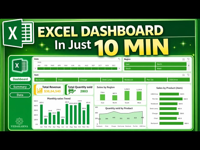
Create Professional Excel Dashboard in Just 10 Minutes | Dynamic & Interactive | No Coding!

... #DashboardDesign #ExcelForBeginners #DataVisualization #ExcelTricks #BusinessAnalytics #LearnExcel #Dashboard #KPI ...

12:32
Create Professional Excel Dashboard in Just 10 Minutes | Dynamic & Interactive | No Coding!

113,476 views

3 months ago

DR EXCEL
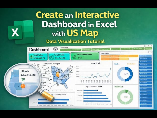
Create an Interactive Dashboard in Excel with US Map | Data Visualization Tutorial

ExcelDashboard #DataVisualization #ExcelTutorialLearn how to create a professional interactive Excel dashboard featuring a ...

14:14
Create an Interactive Dashboard in Excel with US Map | Data Visualization Tutorial

216 views

10 months ago

Centre of Best Learnings (CBL)
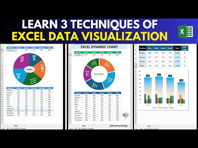
Learn Excel Data Visualization using 3 techniques | Step-by-Step

In this video learn Learn Excel Data Visualization using 3 techniques | Step-by-Step. #excel #exceltutorial #exceltips ...

5:45
Learn Excel Data Visualization using 3 techniques | Step-by-Step

343 views

10 months ago

HR Analytics & Rewards Lab
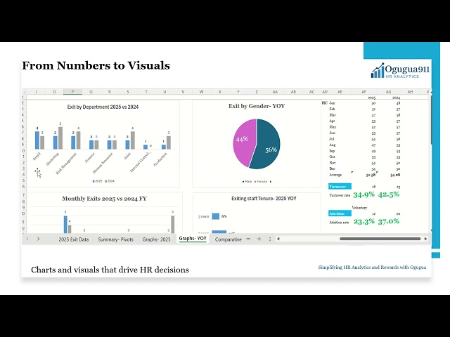
HR Exit Data Visualization in Excel | Charts & Trends Made Simple - Ogugua911

Turning HR exit data into visuals is the key to unlocking insights. In this video, @ogugua911 demonstrates how to present data ...

10:39
HR Exit Data Visualization in Excel | Charts & Trends Made Simple - Ogugua911

178 views

11 months ago

Show more