Upload date
All time
Last hour
Today
This week
This month
This year
Type
All
Video
Channel
Playlist
Movie
Duration
Short (< 4 minutes)
Medium (4-20 minutes)
Long (> 20 minutes)
Sort by
Relevance
Rating
View count
Features
HD
Subtitles/CC
Creative Commons
3D
Live
4K
360°
VR180
HDR
140,549 results
Making Sense of Complexity: How Data Visualization Drives Smarter Decisions From climate adaptation to public health, from ...
13,675 views
1y ago
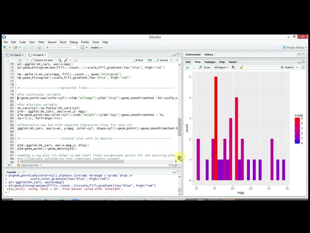
Well-documented data visualization using ggplot2, geom_density2d, stat_density_2d, geom_smooth, stat_ellipse, scatterplot and ...
5 views
4y ago
Facilitators: Dan Hennessy & Jeanette Perthel Session Date: March 31, 2023 Description: In this mini session, our recent OPI Data ...
67 views
3y ago
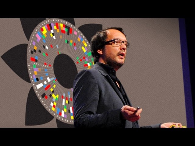
View full lesson: http://ed.ted.com/lessons/david-mccandless-the-beauty-of-data-visualization David McCandless turns complex ...
1,604,322 views
13y ago
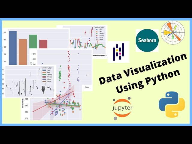
In this video, I will show you how you can represent the data in different visual contexts, patterns, etc on Jupyter Notebook using ...
149,687 views
6y ago
Career Center Skills Labs are designed to give you a sneak peek into an in-demand skill that might make the difference between ...
59 views
powerbi Dashboard in a Day 2023. Power BI. Lab three. Data Visualization. We create a Guage and column and line chart.
855 views
Viewers like you help make PBS (Thank you ) . Support your local PBS Member Station here: http://to.pbs.org/Donateoffbook ...
521,644 views
Lab 3 of DIAD (Dashboard in a Day). This presentation was hosted on Microsoft Teams on 1/10/2021 by Cameron Holl, a Senior ...
390 views
5y ago
In this video, we cover Experiment-1 of Data Visualization Laboratory (BAI504): Getting Started with Tableau – Workspace, ...
1,137 views
8mo ago
In this video, we will demonstrate the difference between data visualization charts including: - Bar Chart - Line Chart - Bubble ...
201,964 views
This is a brief video summary of the research work that has been done in the iDVX Lab at Tongji University, in Shanghai, China.
43 views
8y ago
In its annual summer hackathon, my lab (the Social Computation Representations And Prediction Laboratory, or SCRAP Lab ...
189 views
25 views
9mo ago
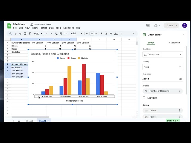
A brief tutorial for using google sheets to make graphs for chemistry.
48 views
18 views
powerbi Dashboard in a Day 2023. Lab 3. Part Two - Data Visualization. Adding Bookmarks. A Play Axis. AI Smart Narrative Card ...
575 views
College : Aryabhatta College of Management, Ajmer University : Bikaner Technical University, Bikaner Course : Management of ...
BAIL504 #Tableue #Download #DataVisualization #vtu #engineering #computerScienceprogram #information Science ...
96 views
Upload Your Data.
51 views
11y ago
Show more