Upload date
All time
Last hour
Today
This week
This month
This year
Type
All
Video
Channel
Playlist
Movie
Duration
Short (< 4 minutes)
Medium (4-20 minutes)
Long (> 20 minutes)
Sort by
Relevance
Rating
View count
Features
HD
Subtitles/CC
Creative Commons
3D
Live
4K
360°
VR180
HDR
1,848 results
In this video we compare Jotform AI Data Assistant, Julius AI, Bricks, Zebra AI, Gemini in Google Sheets, ChatGPT, and Claude ...
4,233 views
4 days ago
21 views
5 days ago
Perfect for beginners and professionals who want to visualize data quickly and effectively What you'll learn in this video: How to ...
36 views
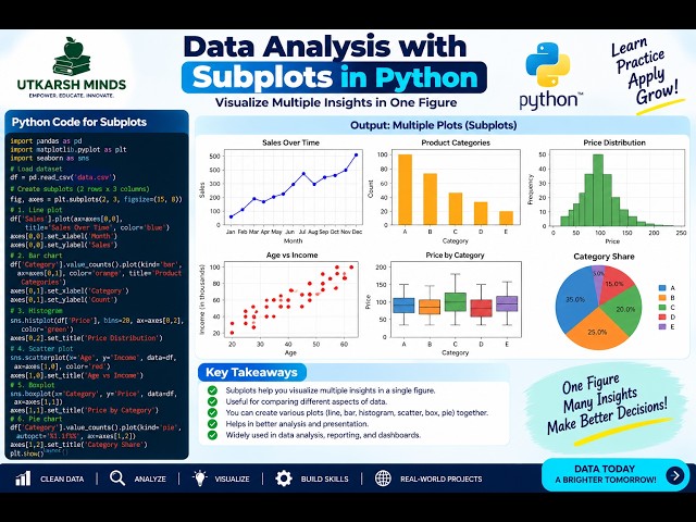
In this practical Python Data Analysis tutorial, we'll learn how to create Subplots to display multiple charts or visualizations in a ...
3 views
10 hours ago
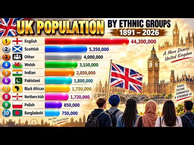
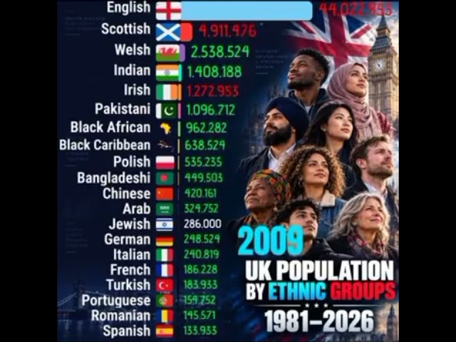
UK Population by Ethnic Groups | 1891–2026 How has the population of major ethnic and national communities in the UK ...
173 views
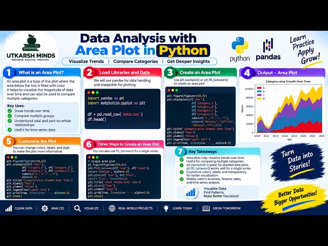
In this practical Python Data Analysis tutorial, we'll learn how to create and understand an Area Plot to visualize data, compare ...
1 view
11 hours ago
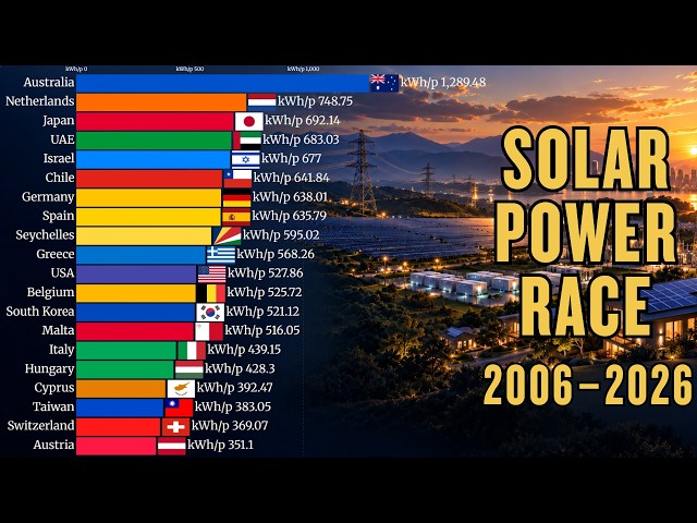
Top Countries by Solar Electricity Generation per Capita | 2006–2026 Watch how solar electricity generation per person changed ...
5,111 views
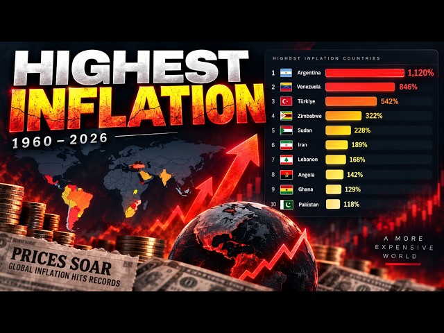
How have inflation rates changed around the world since 1960? This animated bar chart race shows annual consumer price ...
268 views
6 days ago
UK Population Transformation by Ethnic Groups (1981–2026) #UKDemographics #UKPopulation #UKHistory ...
7 views
Which countries produce the most vehicles in the world? This animated bar chart race shows annual motor vehicle production by ...
237 views
3 days ago
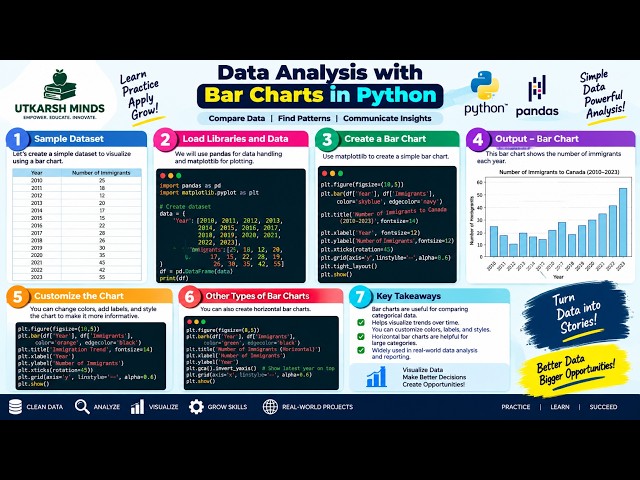
In this practical Python Data Analysis tutorial, we'll learn how to create and understand Bar Charts to compare different categories ...
0 views
Data Visualization lets you graphically see the data in your design without changing the attributes of the underlying objects.
2,454 views
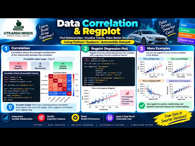
How do two variables relate to each other? In this tutorial, we explore Correlation and Regplot using Python to understand ...
12 hours ago
Stop looking at ugly spreadsheets and start building beautiful, visual stories with Python. Welcome back to ABAYSA with AI, your ...
195 views
7 days ago
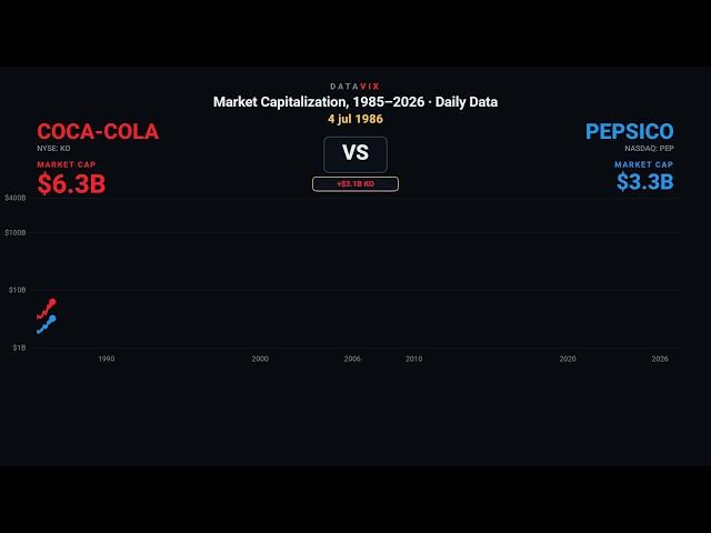
Coca-Cola and Pepsi, tracked day by day, every trading day since 1985. For 41 years Coca-Cola has been worth more than Pepsi ...
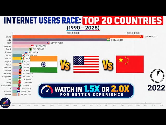
How did the world go online? This video shows the Internet Users Race: Top 20 Countries from 1990 to 2026, visualizing how ...
25,601 views
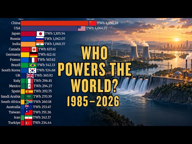
Watch how the world's largest electricity-producing countries changed from 1985 to 2026. This animated bar chart race ranks ...
7,565 views
This data visualization video shows [World's Largest Wool Exporters]. For new videos, subscribe and stay updated! Stay ...
345 views
2 days ago
🤯 ChatGPT Can Create ANIMATED CHARTS?! Watch This! What if you could turn simple data into a beautiful animated visualization ...
9 views
7 hours ago
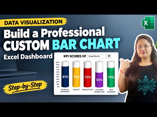
Learn how to visualize and track your key performance indicator ...
43 views
Show more