Upload date
All time
Last hour
Today
This week
This month
This year
Type
All
Video
Channel
Playlist
Movie
Duration
Short (< 4 minutes)
Medium (4-20 minutes)
Long (> 20 minutes)
Sort by
Relevance
Rating
View count
Features
HD
Subtitles/CC
Creative Commons
3D
Live
4K
360°
VR180
HDR
142 results
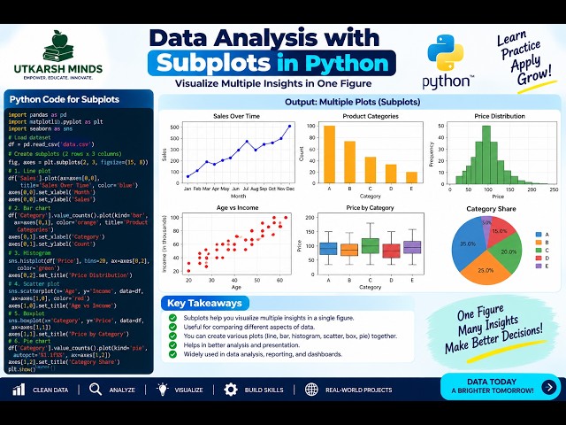
In this practical Python Data Analysis tutorial, we'll learn how to create Subplots to display multiple charts or visualizations in a ...
3 views
20 hours ago
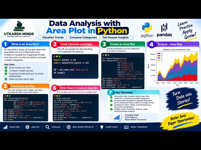
In this practical Python Data Analysis tutorial, we'll learn how to create and understand an Area Plot to visualize data, compare ...
1 view
21 hours ago
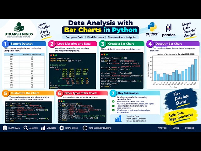
In this practical Python Data Analysis tutorial, we'll learn how to create and understand Bar Charts to compare different categories ...
0 views
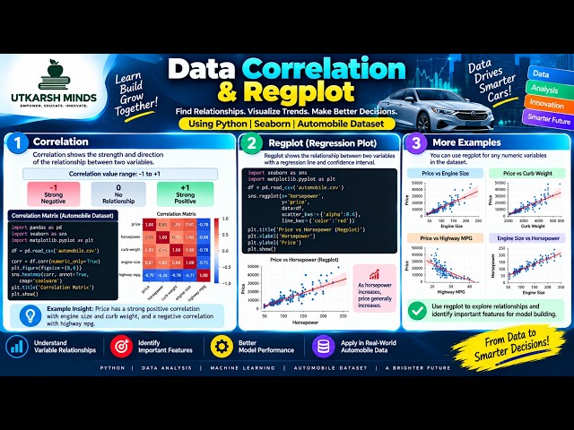
How do two variables relate to each other? In this tutorial, we explore Correlation and Regplot using Python to understand ...
23 hours ago
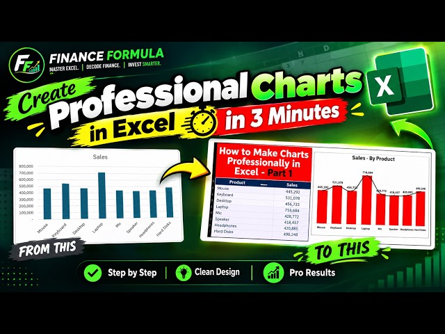
Learn how to create a professional chart in Microsoft Excel in just 3 minutes! In this quick Excel tutorial, I'll show you how to turn ...
7 views
13 hours ago
🤯 ChatGPT Can Create ANIMATED CHARTS?! Watch This! What if you could turn simple data into a beautiful animated visualization ...
9 views
17 hours ago
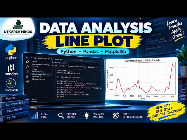
In this practical Python Data Analysis tutorial, we'll learn how to create and understand a Line Plot to visualize data and identify ...
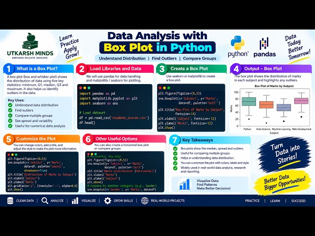
In this practical Python Data Analysis tutorial, we'll learn how to create and understand a Boxplot to analyze the distribution, ...
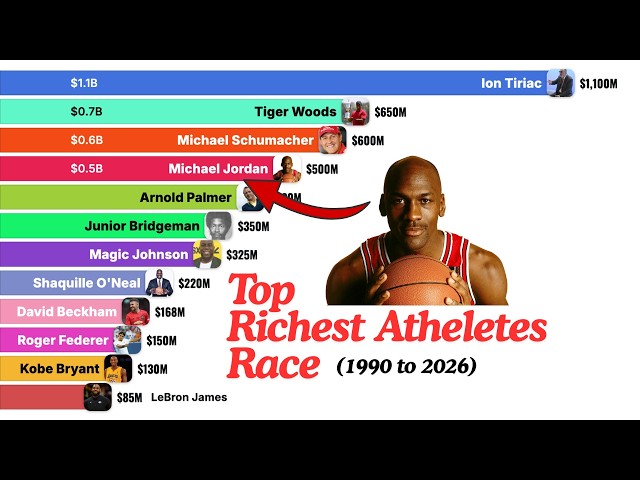
The richest athlete in the world made most of his money after he stopped playing — and it isn't close. This bar chart race ranks the ...
6 views
10 hours ago
Master Data Visualization using Matplotlib & Pyplot for CBSE Class 12 Informatics Practices (IP)! In this video, we cover the ...
22 hours ago
China vs Japan Economic Comparison from 1960 to 2026. This video compares the economic development of China and Japan ...
11 views
12 hours ago
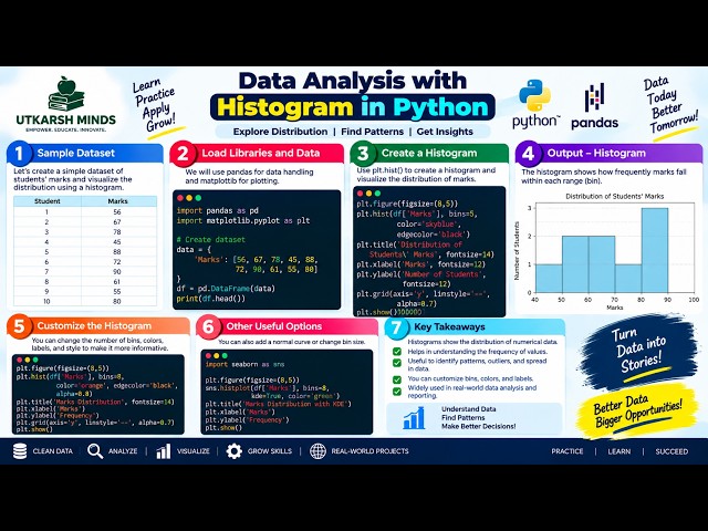
In this practical Python Data Analysis tutorial, we'll learn how to create and understand a Histogram to visualize the distribution of ...
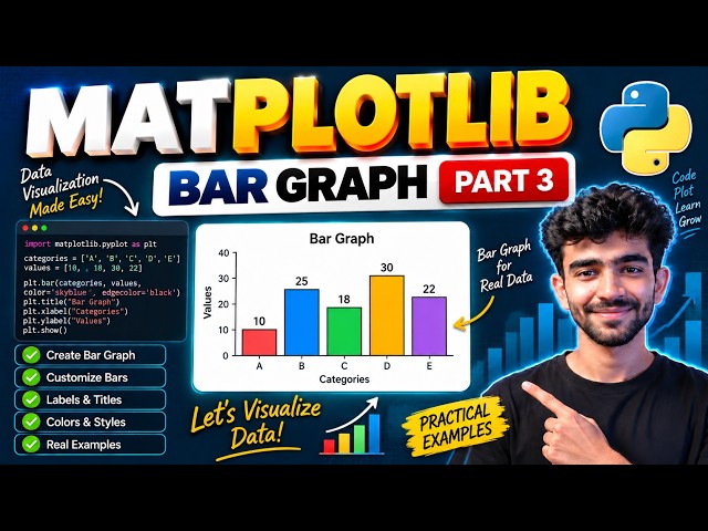
In this video, we will learn how to create Bar Graphs using Matplotlib in Python This is Part 3 of our Matplotlib series where ...
Learn how to design pie charts in Figma using both manual arc controls and a fast plugin method. This tutorial covers circles, ...
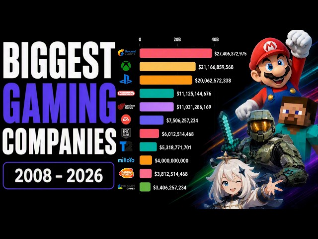
Explore the evolution of the biggest gaming companies from 2008 to 2026. This animated data visualization compares the largest ...
9 hours ago
Plenty of Power BI issues that look like DAX issues start one layer down, in the model. The formula is correct, the relationship ...
316 views
Welcome to Day 12 of our 30 Days Data Analytics Training Series! In this series, you will learn Data Analytics from beginner to ...
19 hours ago
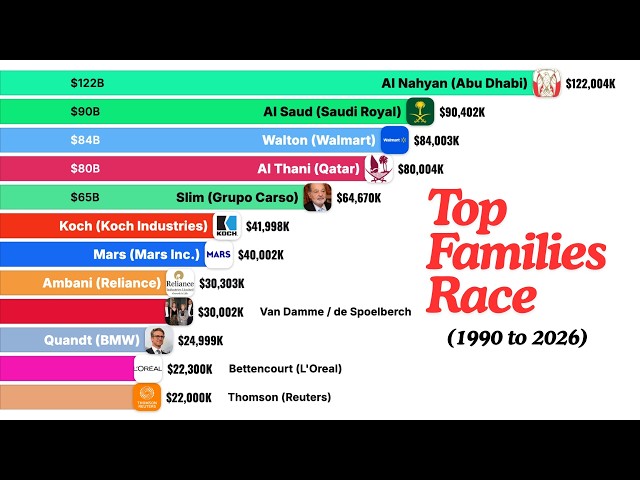
The richest family in the world owns a supermarket chain — and out-earns entire royal dynasties sitting on oil. This bar chart race ...
16 views
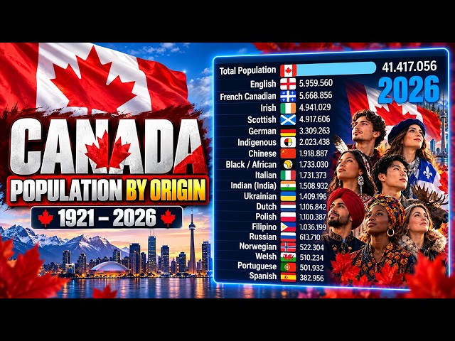
How Canada's Population Changed by Origin | 1921–2026 Explore more than a century of change in Canada's population by ...
22,282 views
16 hours ago
In this video, I show you how to make a simple line graph using Matplotlib. We go line-by-line to understand what is going on at ...
Show more