Upload date
All time
Last hour
Today
This week
This month
This year
Type
All
Video
Channel
Playlist
Movie
Duration
Short (< 4 minutes)
Medium (4-20 minutes)
Long (> 20 minutes)
Sort by
Relevance
Rating
View count
Features
HD
Subtitles/CC
Creative Commons
3D
Live
4K
360°
VR180
HDR
94,504 results
Watch how the world's population has changed by country from 1960 to 2026. This animated data visualization compares ...
241 views
13 days ago
In this video we compare Jotform AI Data Assistant, Julius AI, Bricks, Zebra AI, Gemini in Google Sheets, ChatGPT, and Claude ...
4,230 views
4 days ago
Hello everyone, welcome to my channel! This Video presents the concept of Data Visualization.
18 views
1 month ago
Data Visualization lets you graphically see the data in your design without changing the attributes of the underlying objects.
2,424 views
6 days ago
16 views
21 views
5 days ago
Course Files & Resources All the files, notebooks, PDFs, and other resources used in this **Python with DSA** course are ...
0 views
4 weeks ago
In this tutorial, I'll show you step-by-step how to turn boring data into stunning, easy-to-read dashboards. ⏱️ Timestamps: 0:00 ...
1 view
12 days ago
Data Visualization with Python (Part 1): Beginner to Pro Guide! Welcome to Part 1 of our Data Visualization with Python ...
212 views
3 weeks ago
CATCH US LIVE TODAY 5PM.
29 views
Streamed 11 days ago
In this video, I continue my Python Data Analytics journey by analyzing the dataset I cleaned in my previous video. I used Python ...
125 views
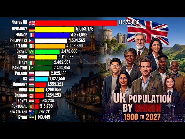
UK #immigrants #UK_BORN #UK_DATA Watch how the United Kingdom's foreign-born population shifted by country of origin ...
2,987 views
10 hours ago
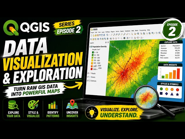
In this episode, we're diving into Data Visualization and Exploration in QGIS. GIS isn't just about putting data on a map. The real ...
141 views
Discover how to insert and edit Charts in Word to represent your data visually and make your documents stand out. Unlock the ...
13 views
2 weeks ago
See how Codex connects to RankGlide through MCP to build and publish a production-ready football visualization from a single ...
22 views
Data is valuable, but its value depends on our ability to understand it and communicate what it is telling us. That's where Data ...
33 views
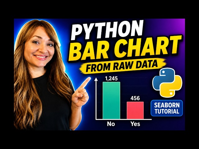
Learn how to create a colorful bar chart in Python using Seaborn and Matplotlib — step by step. In this beginner-friendly Python ...
176 views
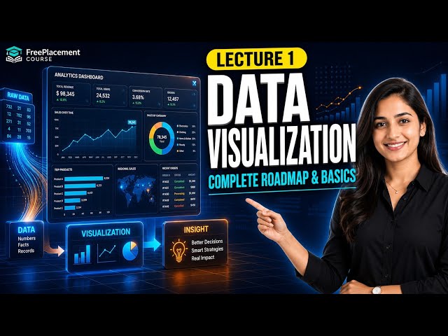
Welcome to Lecture 1 of the Data Visualization Complete Course by FreePlacementCourse, presented by Dr. Rupali Kulkarni.
281 views
5 views
1 day ago
We've reached the final video in my Simple Visualizations with Seaborn series! For this bonus episode, we're looking at the pie ...
10 views
Show more