Upload date
All time
Last hour
Today
This week
This month
This year
Type
All
Video
Channel
Playlist
Movie
Duration
Short (< 4 minutes)
Medium (4-20 minutes)
Long (> 20 minutes)
Sort by
Relevance
Rating
View count
Features
HD
Subtitles/CC
Creative Commons
3D
Live
4K
360°
VR180
HDR
721 results
Pandas Data Visualization, EDA and AI-Powered Analytics | Python in Excel 365 Net Sales by Region Net Sales by Category Top ...
289 views
5d ago
Build Dashboard in minutes with Claude Code inside Vscode in any tools like Power BI, Excel or Python. Chat me up if want me to ...
781 views
3d ago
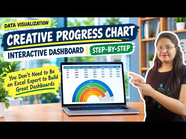
Learn how to build a modern, creative progress chart to instantly ...
8 views
1d ago
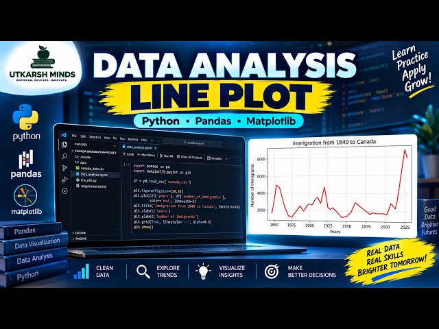
In this practical Python Data Analysis tutorial, we'll learn how to create and understand a Line Plot to visualize data and identify ...
5 views
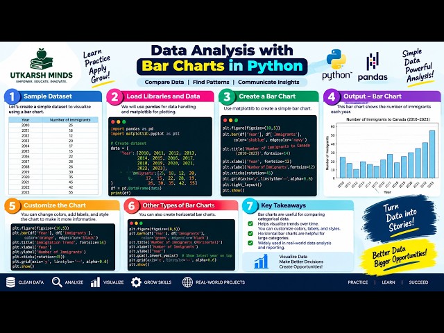
In this practical Python Data Analysis tutorial, we'll learn how to create and understand Bar Charts to compare different categories ...
3 views
Forecasting in Tableau takes one click. Making it trustworthy takes ten minutes — and that's what this tutorial is about. We build a ...
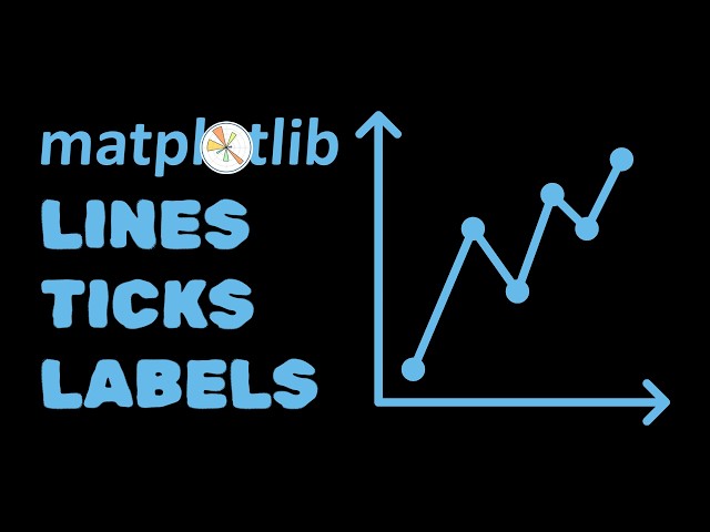
In this video, I show you how to make a better line graph using Matplotlib. We go line-by-line to understand what is going on at ...
2d ago
In this lesson, we'll walk through how Dashboards work in Salesforce and how they can be used to turn report data into clear, ...
4 views
𝖫𝖾𝖺𝗋𝗇 how to create a stylish, modern doughnut chart in Microsoft ...
2 views
17h ago
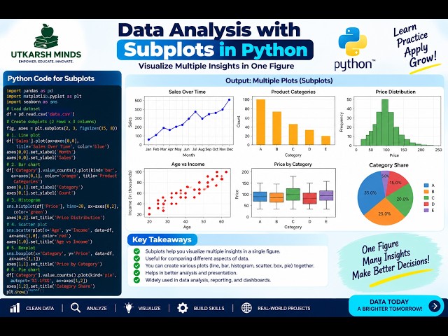
In this practical Python Data Analysis tutorial, we'll learn how to create Subplots to display multiple charts or visualizations in a ...
4d ago
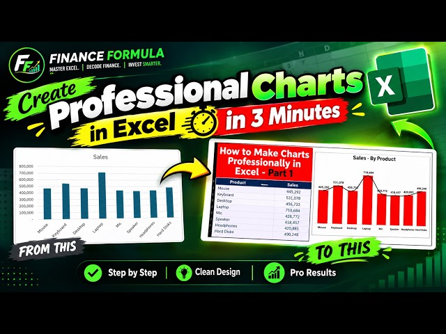
Learn how to create a professional chart in Microsoft Excel in just 3 minutes! 📊 In this quick Excel tutorial, I'll show you ...
37 views
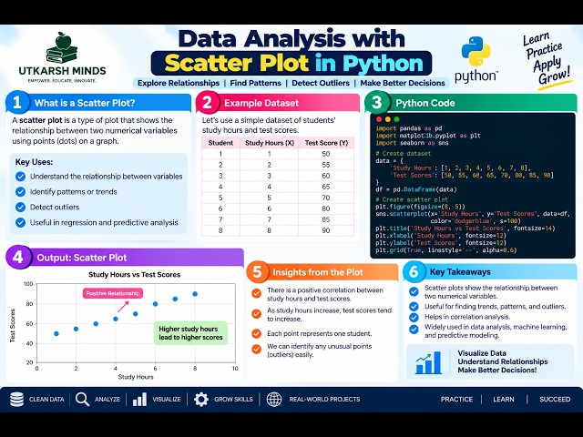
In this practical Python Data Analysis tutorial, we'll learn how to create and understand a Scatter Plot to visualize the relationship ...
6 views
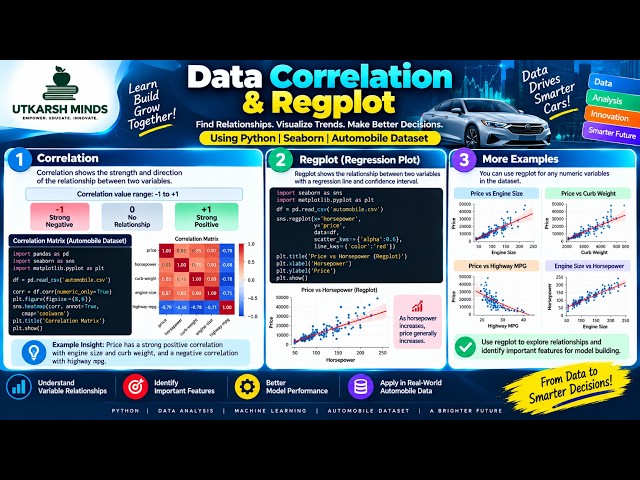
How do two variables relate to each other? In this tutorial, we explore Correlation and Regplot using Python to understand ...
1 view
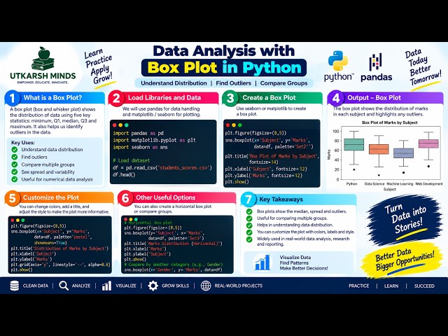
In this practical Python Data Analysis tutorial, we'll learn how to create and understand a Boxplot to analyze the distribution, ...
0 views
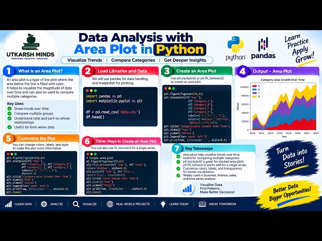
In this practical Python Data Analysis tutorial, we'll learn how to create and understand an Area Plot to visualize data, compare ...
Learn how to design pie charts in Figma using both manual arc controls and a fast plugin method. This tutorial covers circles, ...
10 views
Welcome to **Topic 069** of the **Data Analytics and Business Intelligence** course. In this lesson, we will demonstrate a ...
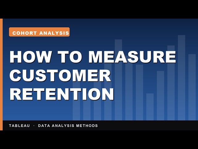
A monthly sales chart can never tell you whether the customers you won in January are still here in June. A cohort grid can.
7 views
9 views
6d ago
... and Subscribe to Hustle & Giggles for more Tableau, Data Analytics, Business Intelligence, and Data Visualization tutorials.
11 views
Show more