ViewTube

ViewTube
Sign inSign upSubscriptions
Filters

Upload date

Type

Duration

Sort by

Features

Reset

36 results

Data Cruise
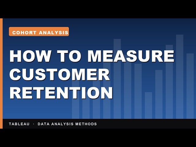
How to Perform Cohort Analysis in Tableau | Data Analysis Methods in Tableau

A monthly sales chart can never tell you whether the customers you won in January are still here in June. A cohort grid can.

10:37
How to Perform Cohort Analysis in Tableau | Data Analysis Methods in Tableau

5 views

10h ago

Productivity Shots
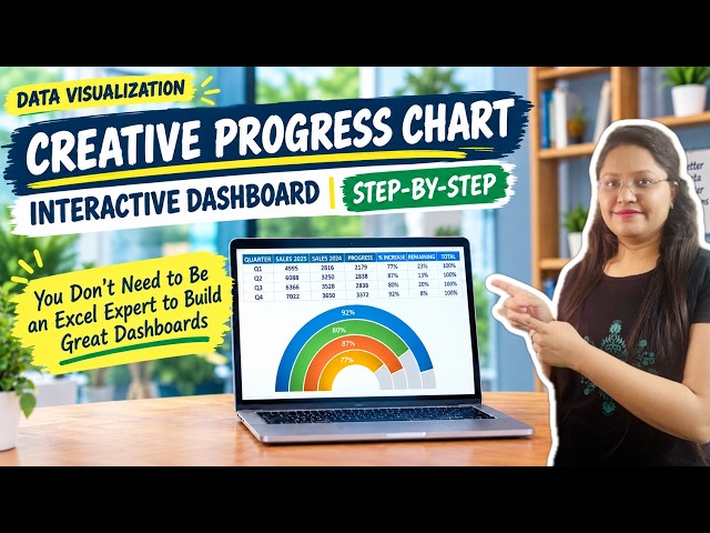
Design a Modern & Unique PROGRESS CHART in Excel Dashboards | Data Visualization | Step-by-Step

Learn how to build a modern, creative progress chart to instantly ...

10:27
Design a Modern & Unique PROGRESS CHART in Excel Dashboards | Data Visualization | Step-by-Step

2 views

7h ago

Illustrae
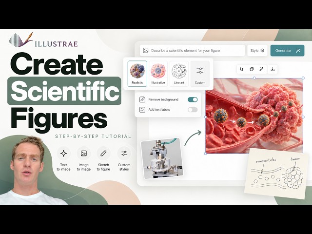
How To Create Scientific Figures In 2026: Illustrae Tutorial

... #ResearchFigures #GraphicalAbstract #ScienceCommunication #AcademicResearch #ResearchTools #DataVisualization ...

5:41
How To Create Scientific Figures In 2026: Illustrae Tutorial

20 views

21h ago

TechEdge Wave
I Tested JoggAI So You Don't Have To

Whether you are looking to refresh old reports or create new presentations, mastering data visualization within an AI-driven ...

6:08
I Tested JoggAI So You Don't Have To

12 views

9h ago

yitayew solomon
80. Data Analytics with Python Project | Complete End-to-End Data Analytics| Capstone Project Part 9

Welcome to the final project of our Data Analytics with Python playlist! This capstone project is designed to demonstrate how the ...

16:49
80. Data Analytics with Python Project | Complete End-to-End Data Analytics| Capstone Project Part 9

21 views

18h ago

PM Expert
R Programming for Beginners | Learn R Basics with Student Marks Project | Data Science

Learn R Programming from scratch with this beginner-friendly R Programming tutorial! In this video, we learn the fundamentals ...

5:45
R Programming for Beginners | Learn R Basics with Student Marks Project | Data Science

25 views

22h ago

Illustrae
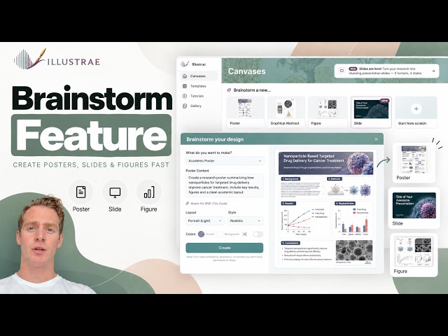
How To Create Academic Posters, Graphical Abstracts & Slides In Minutes: Brainstorm Feature Tutorial

... #ResearchPoster #GraphicalAbstract #ScientificIllustration #ResearchTools #DataVisualization #PresentationDesign ...

8:35
How To Create Academic Posters, Graphical Abstracts & Slides In Minutes: Brainstorm Feature Tutorial

44 views

21h ago

Analytics in 10 Minutes
Power BI RANKX Explained: Rank Top 5 and Bottom 5 Cities by Sales Using DAX Measures and Variables

... where I build a complete sales analytics dashboard from scratch, covering DAX, and data visualization. ⏱️ Timestamps 00:00 ...

9:50
Power BI RANKX Explained: Rank Top 5 and Bottom 5 Cities by Sales Using DAX Measures and Variables

25 views

16h ago

amir HONARMAND
Tableau Prep Tutorial | How to Pivot Rows to Columns & Columns to Rows (Episode 15)

Struggling with a messy, wide dataset where years or months are stuck in separate columns? 🤯 Don't panic! It's time to master ...

7:01
Tableau Prep Tutorial | How to Pivot Rows to Columns & Columns to Rows (Episode 15)

17 views

11h ago

StatSphere with Dr. Sajjad
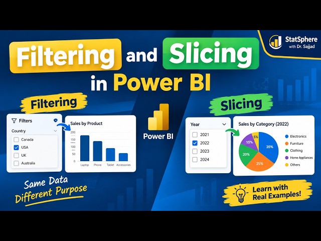
Filtering vs Slicing in Power BI | Difference Explained with Examples

In this Power BI tutorial, we learn the difference between **Filtering and Slicing in Power BI** with simple, practical examples.

16:41
Filtering vs Slicing in Power BI | Difference Explained with Examples

1 view

6h ago

James Clare
Pydantic Tutorial EP11 - Nested Models & Complex JSON

In Episode 11 we'll explore how to represent complex JSON with a nested Model. My site: https://python-with-james.com ...

11:35
Pydantic Tutorial EP11 - Nested Models & Complex JSON

56 views

17h ago

The Orange WorkFlow
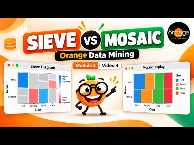
Sieve Diagram & Mosaic Display in Orange Data Mining | CBSE AI | Module 2

Learn Sieve Diagram and Mosaic Display in Orange Data Mining with a simple, step-by-step example! In this Module 2 – Data ...

8:41
Sieve Diagram & Mosaic Display in Orange Data Mining | CBSE AI | Module 2

7 views

13h ago

The Geoscientist
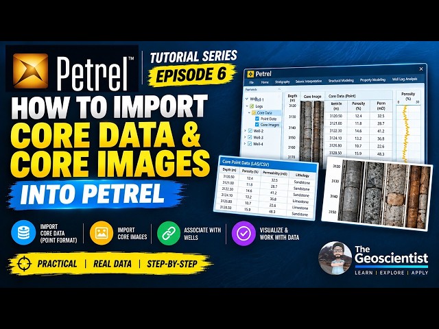
How to Import Core Data & Core Images in Petrel | Point Data & Core Images | Episode 6

Petrel Tutorial Series – Episode 6 In this tutorial, I demonstrate how to import core data in Point format and core images into Petrel ...

15:49
How to Import Core Data & Core Images in Petrel | Point Data & Core Images | Episode 6

22 views

12h ago

Geojay GIS Solution
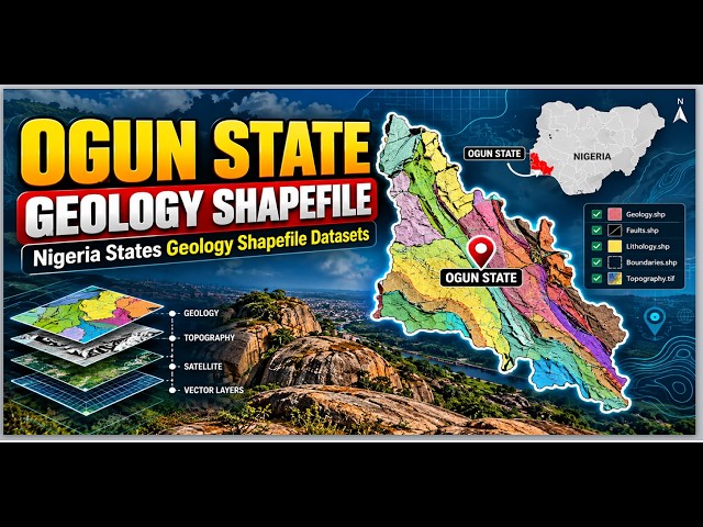
Geology Shapefile of Ogun State: Nigeria States Geology Shapefile Datasets

OgunState #GeologyShapefile #GIS #GeospatialData #NigeriaGeology #ShapefileDataset #QGIS Need a ready-to-use ...

4:38
Geology Shapefile of Ogun State: Nigeria States Geology Shapefile Datasets

47 views

17h ago

AITECHONE
How to Add Closed Status in Salesforce Case | Support Process Explained

... Lightning Web Components (LWC), AgentForce, Omnistudio, Machine Learning, Python, Data Visualization, and much more!

5:17
How to Add Closed Status in Salesforce Case | Support Process Explained

28 views

18h ago

Shivam Sinha
Module 1: Introduction to Business intelligence and Power BI | What is Power BI?

Welcome to this channel, In this video, we begin Module 1: Introduction to Business Intelligence and Power BI. You'll learn what ...

5:15
Module 1: Introduction to Business intelligence and Power BI | What is Power BI?

6 views

8h ago

Infomity
Understanding U Sigma and V in SVD Explained Visually

Are you struggling with the linear algebra behind Singular Value Decomposition? This video provides a clear, animated guide to ...

5:22
Understanding U Sigma and V in SVD Explained Visually

71 views

12h ago

DataCraft by El
Cara Menggunakan Field Parameter di Power BI - Daily, Monthly, Quarter & Year

Hai semua! Di video kali ini kita akan belajar cara menggunakan Field Parameter di Power BI untuk membuat dashboard yang ...

12:25
Cara Menggunakan Field Parameter di Power BI - Daily, Monthly, Quarter & Year

27 views

14h ago

Isaac Emmanuel
How I Got 6 Data Analytics Gigs in 1 Month
14:26
How I Got 6 Data Analytics Gigs in 1 Month

0 views

BAGG-AI
SuperQDA ile Nitel Veri Analizi Dersleri 8: Görselleştirme Stüdyosu ve Grafik Araçları

SuperQDA ile Nitel Veri Analizi serimizin bu kapsamlı dersinde, metin yoğun nitel araştırma bulgularını infografik düzeyinde ...

9:56
SuperQDA ile Nitel Veri Analizi Dersleri 8: Görselleştirme Stüdyosu ve Grafik Araçları

0 views

1h ago

Show more