Upload date
All time
Last hour
Today
This week
This month
This year
Type
All
Video
Channel
Playlist
Movie
Duration
Short (< 4 minutes)
Medium (4-20 minutes)
Long (> 20 minutes)
Sort by
Relevance
Rating
View count
Features
HD
Subtitles/CC
Creative Commons
3D
Live
4K
360°
VR180
HDR
87,336 results
Even though the goal of data visualization is to communicate clearly, there are some common mistakes you might be making that ...
6,703 views
4w ago
Data Visualization with Python (Part 1): Beginner to Pro Guide! Welcome to Part 1 of our Data Visualization with Python ...
212 views
3w ago
... Real dataset example 07:30 - Recap Subscribe and hit the bell icon for more practical Python and data visualization tutorials.
29 views
2w ago
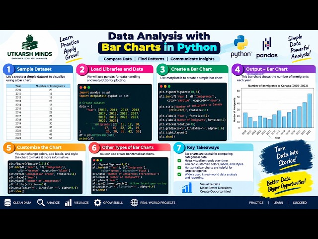
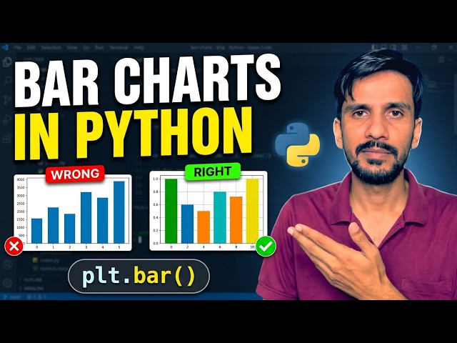
#Python #Matplotlib #DataVisualization #BarChart #DataScience #PythonTutorial #LearnPython #DataAnalysis.
39 views
We've reached the final video in my Simple Visualizations with Seaborn series! For this bonus episode, we're looking at the pie ...
10 views
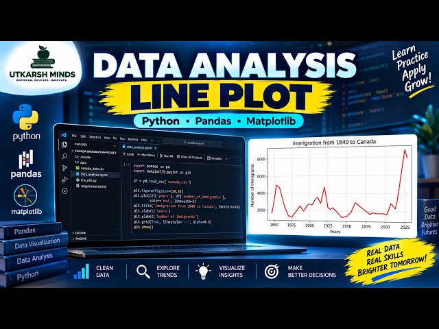
In this practical Python Data Analysis tutorial, we'll learn how to create and understand a Line Plot to visualize data and identify ...
4 views
2d ago
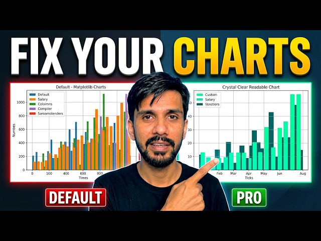
Are your Matplotlib charts hard to read? In this tutorial, learn how to take your Python graphs from cluttered to clean and ...
11 views
11d ago
Welcome to Part 2 of my Seaborn data visualization series. In the first video, we introduced Seaborn and created a simple bar plot.
61 views
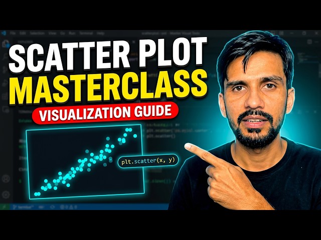
... tutorials! scatter plot in python matplotlib scatter plot plt scatter python python data visualization matplotlib tutorial for beginners ...
28 views
12d ago
In this video, I continue my Python Data Analytics journey by analyzing the dataset I cleaned in my previous video. I used Python ...
125 views
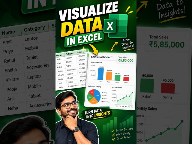
In this tutorial, I'll show you step-by-step how to turn boring data into stunning, easy-to-read dashboards. ⏱️ Timestamps: 0:00 ...
1 view
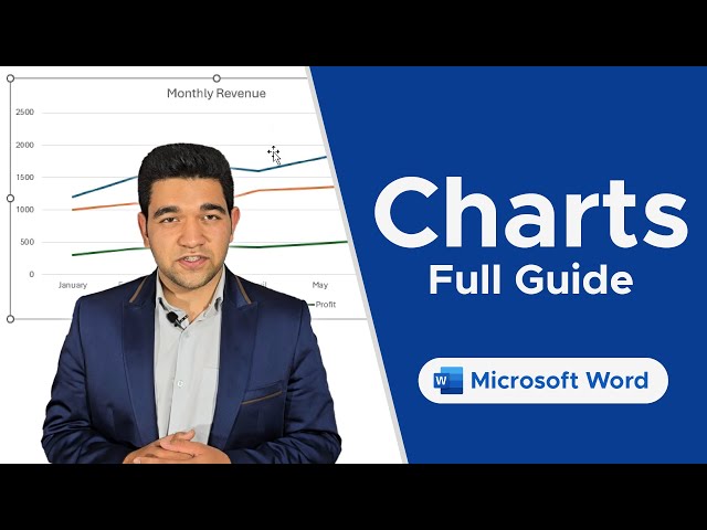
Discover how to insert and edit Charts in Word to represent your data visually and make your documents stand out. Unlock the ...
13 views
Turn raw data into clear visual insights with Python! In this hands-on tutorial, we complete five practical exercises using ...
226 views
Welcome to Part 3 of my Seaborn data visualization series! In Part 1, we introduced Seaborn and created a simple bar plot.
81 views
In this practical Python Data Analysis tutorial, we'll learn how to create and understand Bar Charts to compare different categories ...
YouTube Description Welcome to Part 4 of my Seaborn data visualization series! So far in this series, we've explored: Part 1: ...
24 views
Choosing the right chart can make complex data easier to understand, while the wrong visualization can confuse the audience or ...
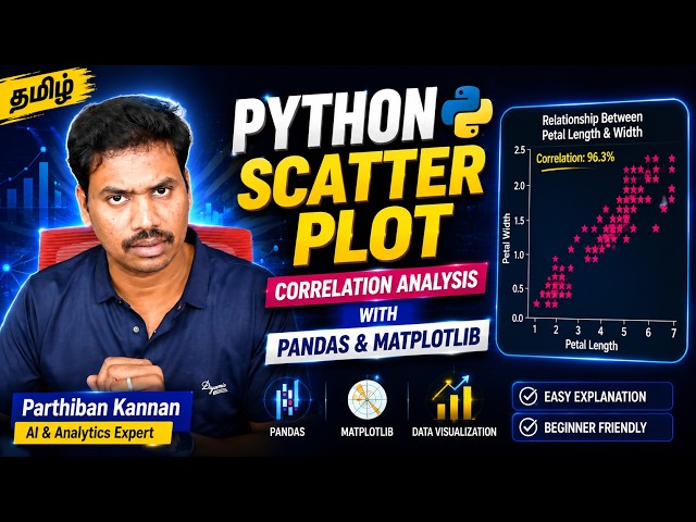
Learn how to find and visualize correlation in Python using Pandas and Matplotlib with the famous Iris dataset. 📊🐍 In this ...
295 views
Ask questions and get answers in seconds in the form of meaningful data visualizations. https://veezoo.com Founded in 2016, ...
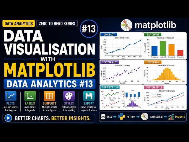
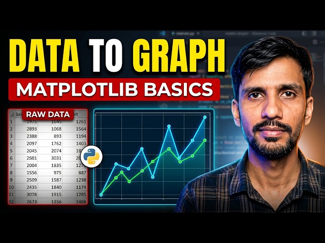
A number in a table convinces almost nobody. A good chart convinces everyone. Let's learn Matplotlib. What you'll learn: - The ...
56 views
Show more





![Learn Python Data Visualization with Matplotlib & Pandas on Colab [02/15]](/api/proxy/image?url=https%3A%2F%2Fi.ytimg.com%2Fvi%2FeAtkO-0Up_Q%2Fsddefault.jpg)