Upload date
All time
Last hour
Today
This week
This month
This year
Type
All
Video
Channel
Playlist
Movie
Duration
Short (< 4 minutes)
Medium (4-20 minutes)
Long (> 20 minutes)
Sort by
Relevance
Rating
View count
Features
HD
Subtitles/CC
Creative Commons
3D
Live
4K
360°
VR180
HDR
26,602 results
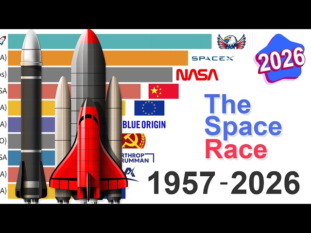
I'm visualizing 70 years of The Space Race and the evolution of global launch capability from 1957 to 2026. The data presented in ...
1,987 views
3 hours ago
In this video we compare Jotform AI Data Assistant, Julius AI, Bricks, Zebra AI, Gemini in Google Sheets, ChatGPT, and Claude ...
4,284 views
6 days ago
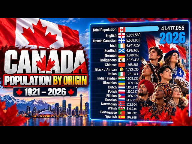
... #DataVisualization #BarChartRace #Statistics #History #Census #StatisticsCanada #CanadaHistory #PopulationByOrigin ...
44,255 views
2 days ago
... artificial intelligences in the world from 2022 to 2026, tracking the explosive AI revolution through a dynamic data visualization.
178,213 views
#Python #Streamlit #DataScience #Pandas #DataVisualization #PythonProjects #CSV #DataAnalysis #Dashboard ...
0 views
5 hours ago
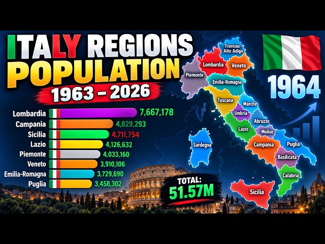
... #DataVisualization #Statistics #PopulationHistory #Demography #Europe #EuropeanPopulation #AnimatedChart #DataViz.
33,805 views
4 days ago
This data visualization video shows [World's Largest Wool Exporters]. For new videos, subscribe and stay updated! Stay ...
401 views
This video redraws the map of South America so that every country and territory is the size of its population, from 10000 BC to ...
3,322 views
6 hours ago
Pandas Data Visualization, EDA and AI-Powered Analytics | Python in Excel 365 Net Sales by Region Net Sales by Category Top ...
182 views
3 days ago
21 views
7 days ago
1 view
🤯 ChatGPT Can Create ANIMATED CHARTS?! Watch This! What if you could turn simple data into a beautiful animated visualization ...
38 views
Whether you're a Power BI user working with DAX, or a Python user who prefers matplotlib for data visualization, this video shows ...
1,095 views
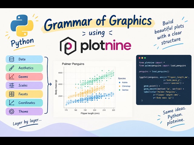
Learn how to create data visualisations in Python using plotnine and the Grammar of Graphics approach. Plotnine follows a ...
33 views
14 hours ago
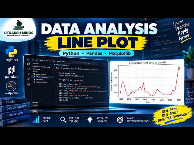
In this practical Python Data Analysis tutorial, we'll learn how to create and understand a Line Plot to visualize data and identify ...
2 views
In this video, I show you how to make a better line graph using Matplotlib. We go line-by-line to understand what is going on at ...
43 minutes ago
Get the skill that teaches your agent to do this here - https://datawithmicah.gumroad.com/l/Graphcam SciGraphs, the free Blender ...
1,842 views
5 days ago
Perfect for beginners and professionals who want to visualize data quickly and effectively What you'll learn in this video: How to ...
54 views
www.sportsvisio.ai/coachmode?utm_source=cyh&utm_medium=partner&utm_campaign=codemodesummer ...
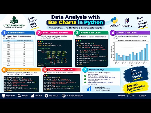
In this practical Python Data Analysis tutorial, we'll learn how to create and understand Bar Charts to compare different categories ...
Show more