Upload date
All time
Last hour
Today
This week
This month
This year
Type
All
Video
Channel
Playlist
Movie
Duration
Short (< 4 minutes)
Medium (4-20 minutes)
Long (> 20 minutes)
Sort by
Relevance
Rating
View count
Features
HD
Subtitles/CC
Creative Commons
3D
Live
4K
360°
VR180
HDR
80,467 results
16 views
2w ago
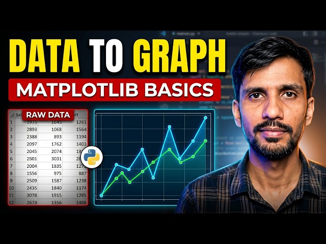
In this video, I'll introduce you to Matplotlib, Python's most popular data visualization library, and show you how to create your first ...
32 views
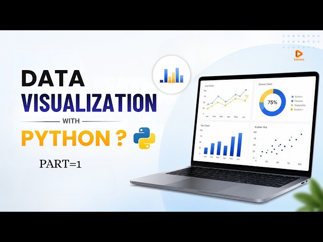
Data Visualization with Python (Part 1): Beginner to Pro Guide! Welcome to Part 1 of our Data Visualization with Python ...
214 views
3w ago
... by country, world ranking, global statistics, demographic data, country comparison, mens health statistics, data visualization.
47 views
Subscribe to **DataIsWonderful** for more data visualizations, country rankings, historical statistics, population races and ...
1,002 views
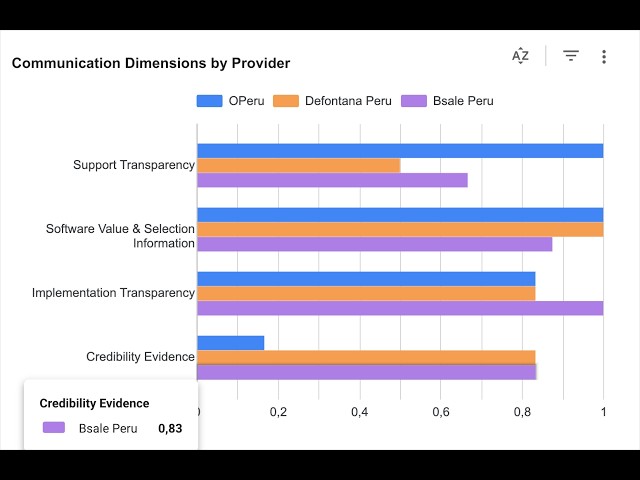
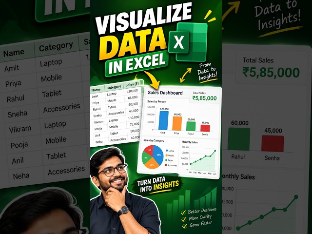
In this tutorial, I'll show you step-by-step how to turn boring data into stunning, easy-to-read dashboards. ⏱️ Timestamps: 0:00 ...
1 view
In this video, I will show you the new Cloud Computer feature in Gemini Notebook, the app that used to be called NotebookLM, ...
2,533 views
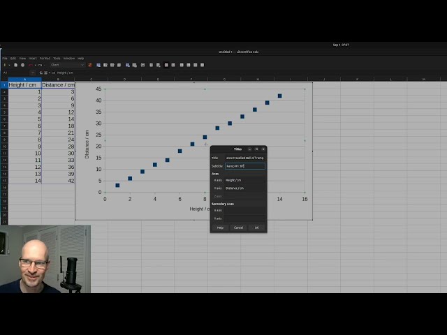
Data Visualisation in Libreoffice calc.
4 views
The Rise and Fall of Food Superpowers: World Wheat Production (1961–2024)** Who really feeds the world? In this data ...
14 views
This animated data visualization tracks economic shifts by comparing what 1000 dollars could buy in terms of Big Macs or liters of ...
80 views
Data is valuable, but its value depends on our ability to understand it and communicate what it is telling us. That's where Data ...
34 views
Turn raw data into clear visual insights with Python! In this hands-on tutorial, we complete five practical exercises using ...
226 views
This video presents a walkthrough of the interactive dashboard developed as part of the Digital Media Capstone project.
8 views
4w ago
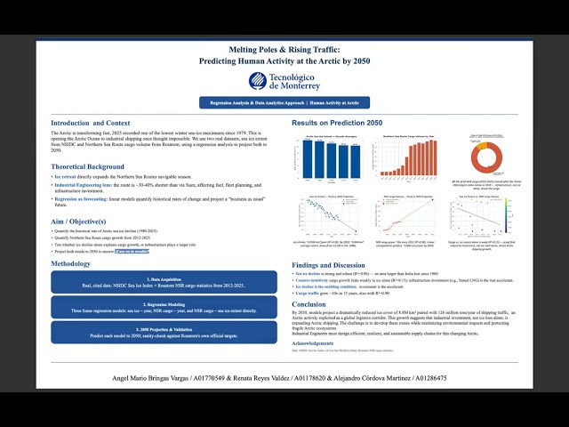
Proposed ways to lower down crime rates in Los Angeles City using 2020 to 2024 LAPD reported crimes data analysis.
27 views
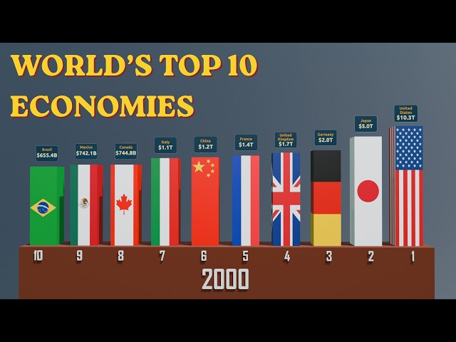
How has the global economic balance changed since 1960? In this visualization, we compare the **world's top 10 economies** ...
72 views
Prepare to have your perception of the world map completely reshaped! In this definitive 2025 ranking, we visualize the largest ...
Top AI Data Visualization Tools For Stunning Visuals | Software Testing Help Are you still wasting hours creating reports, ...
130 views
Choosing the right chart can make complex data easier to understand, while the wrong visualization can confuse the audience or ...
31 views
Welcome to Learn with Mitra ! Our mission is to make learning simple, interesting, and result-oriented for every student in Nepal.
81 views
Learn Data Visualization in Python using Matplotlib and Seaborn and understand how to turn raw data into clear, meaningful ...
35 views
Show more





![Learn Python Data Visualization with Matplotlib & Pandas on Colab [02/15]](/api/proxy/image?url=https%3A%2F%2Fi.ytimg.com%2Fvi%2FeAtkO-0Up_Q%2Fsddefault.jpg)