Upload date
All time
Last hour
Today
This week
This month
This year
Type
All
Video
Channel
Playlist
Movie
Duration
Short (< 4 minutes)
Medium (4-20 minutes)
Long (> 20 minutes)
Sort by
Relevance
Rating
View count
Features
HD
Subtitles/CC
Creative Commons
3D
Live
4K
360°
VR180
HDR
2,100,146 results
View full lesson: http://ed.ted.com/lessons/david-mccandless-the-beauty-of-data-visualization David McCandless turns complex ...
1,602,167 views
13y ago
You've probably heard the term data visualization thrown around a lot. It's why you're here, isn't it? So let's make it clear — data ...
198,113 views
4y ago
Subscribe and to the BBC https://bit.ly/BBCYouTubeSub Watch the BBC first on iPlayer https://bbc.in/iPlayer-Home More ...
11,456,419 views
15y ago
Viewers like you help make PBS (Thank you ) . Support your local PBS Member Station here: http://to.pbs.org/Donateoffbook ...
520,940 views
Data visualization is present in every aspect of our lives - but is it really as unbiased as it's said to be? In this SciToons video, learn ...
150,495 views
7y ago
Setup, conflict, resolution. You know right away when you see an effective chart or graphic. It hits you with an immediate sense of ...
688,122 views
6y ago
In the second episode of ReForm, we look at how big data and art have converged into a new visual culture. Six major data artists ...
76,949 views
11y ago
Today we're going to start our two-part unit on data visualization. Up to this point we've discussed raw data - which are just ...
511,715 views
8y ago
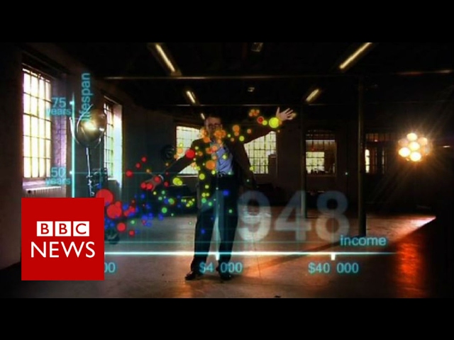
Swedish stats guru and public educator Hans Rosling has died aged 68. In this spectacular section of The Joy Of Stats, broadcast ...
340,757 views
9y ago
Dustin hopes that the audience learns how anyone can use data visualization to improve their work, understand their world, and ...
76,302 views
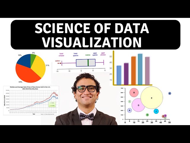
In this video, we will demonstrate the difference between data visualization charts including: - Bar Chart - Line Chart - Bubble ...
200,782 views
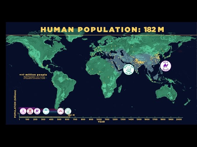
An updated version of this video can be found here: https://youtu.be/vJ5p3pZlBi4 It took 200000 years for our human population to ...
19,228,879 views
This primary math lesson video is about data and practices data collection, data organization, data visualization and data ...
4,867,526 views
5y ago
Today we're going to finish up our unit on data visualization by taking a closer look at how dot plots, box plots, and stem and leaf ...
348,044 views
This video is part of a series of videos that consider data analysis using R programming. It is primarily for beginners. In this video I ...
168,727 views
Descriptive statistics is all about describing you data. To do this we firstly describe the spread of the data using the range and ...
130,243 views
In our society's constant hunger for shocking and sensational news, we tend to overlook the importance of what is happening ...
127,476 views
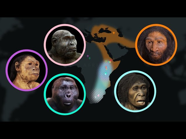
Scientists use fossils to reconstruct the evolutionary history of hominins—the group that includes modern humans, our immediate ...
3,608,669 views
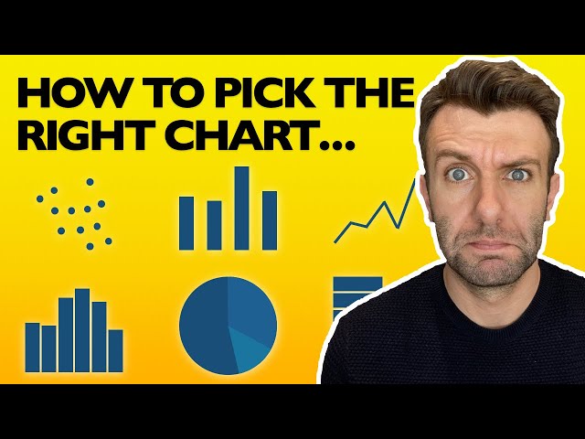
In this Chart, Graph and Data Visualization tutorial for beginners, find out everything you need to know to choose the right type of ...
260,661 views
In this video Rob, a Kaggle Grandmaster, quickly and humorously walks through each of the popular plotting and data ...
115,173 views
Show more