Upload date
All time
Last hour
Today
This week
This month
This year
Type
All
Video
Channel
Playlist
Movie
Duration
Short (< 4 minutes)
Medium (4-20 minutes)
Long (> 20 minutes)
Sort by
Relevance
Rating
View count
Features
HD
Subtitles/CC
Creative Commons
3D
Live
4K
360°
VR180
HDR
1,755 results
Demonstrates how to use the =COUNTIF function to create a frequency table for categorical data which can then be used to create ...
131 views
1y ago
Create a histogram in Excel from a frequency table using the Column Chart tool. Includes proper labeling, formatting, and using ...
130 views
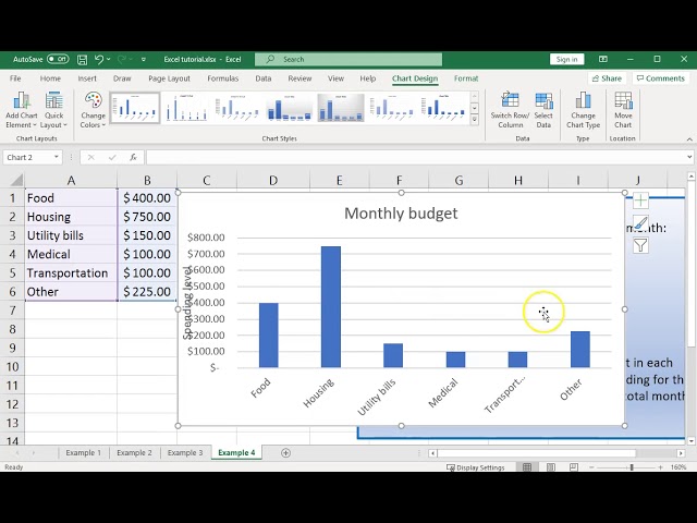
Using Excel to create and format a simple bar graph and do some numeric calculations.
3,897 views
6y ago
Using Excel to draw a frequency histogram using a bar chart with 0-gap width.
24,491 views
5y ago
This video covers the select data dialog box and how to create bubble charts. This video is part of an excel class in the Energy ...
689 views
12y ago
In this video, we will look at three different types of graphs in Excel - bar, line and scatter graphs. We will look at calculating the ...
101 views
Demonstrates how to create a frequency bar chart or a frequency pie chart from categorical data when you already have a ...
122 views
Do you want to know how to make a graph with Microsoft Access? First, create a query with the data for the chart. Then make a ...
126,381 views
This video shows the basics of how to create a table/figure/graph using Excel.
39,560 views
This video shows you how to create a graph using Excel of data acquired in a chemistry lab such as a calibration plot for first year.
18,936 views
- Let's go and make this graph using Microsoft Excel. It's similar in Google Sheets and Apple Numbers I believe. But I'm gonna use ...
200 views
4y ago
How to create a time series plot or graph in Excel 365 using the Line with markers tool. Also how to edit your graph if Excel plots ...
60 views
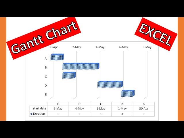
In this video drawing 3D #ganttchart in #excel is explained by #drmehrdadarashpour → #ganttdiagram #ganttchartexcel ❎ Excel ...
2,474 views
2y ago
Basics of graphing in Microsoft Excel. This video is licensed under CC-BY-SA.
303 views
Video ini akan membahas Cara Buat Dashboard Actual vs Target di Excel yang Paling MUDAH dengan menggunakan custom ...
3,135 views
Using Excel to create a pie chart, showing distribution of Skittles candy colors.
236 views
Gantt Diagrams for Agile Project Management in developing a minimum viable product! This step-by-step tutorial by Dr. Mehrdad ...
2,873 views
you can create a chart for ANOVA in Excel, it just takes a few steps.
813 views
See https://youtu.be/DVuydpJYZck for detailed instructions on this process. Data source: ...
67 views
How to calculate the 5 number summary (min, quartile 1, median, quartile 3, and max) in Excel and how to create boxplots in ...
192 views
Show more