Upload date
All time
Last hour
Today
This week
This month
This year
Type
All
Video
Channel
Playlist
Movie
Duration
Short (< 4 minutes)
Medium (4-20 minutes)
Long (> 20 minutes)
Sort by
Relevance
Rating
View count
Features
HD
Subtitles/CC
Creative Commons
3D
Live
4K
360°
VR180
HDR
520 results
Why do some maps and graphs keep millions of people watching? And what can data visualization practitioners learn from ...
590 views
4d ago
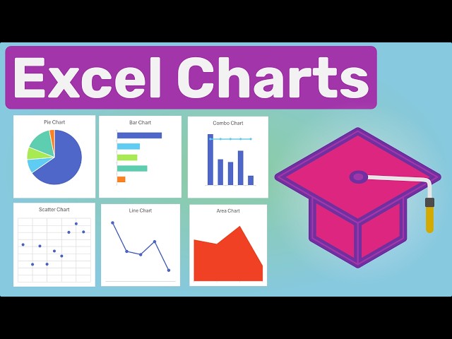
Learn how to create popular chart types in Microsoft Excel and choose the right chart for your data. In this tutorial, we cover Excel's ...
15 views
18h ago
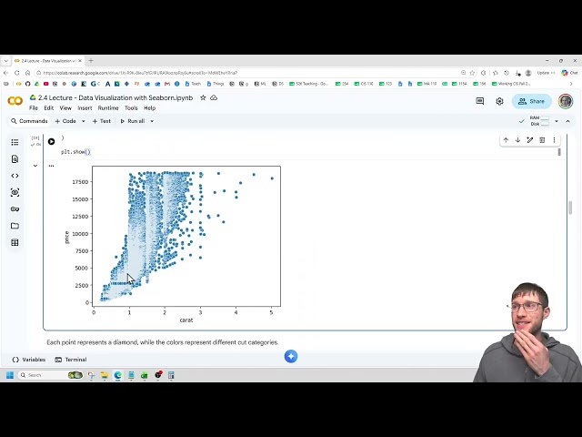
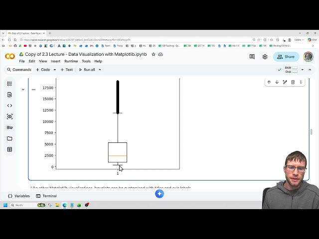
This video is part of both CIS 210 - Introduction to Machine Learning and CIS 230 - Programming for Data Science CIS 210 ...
10 views
3d ago
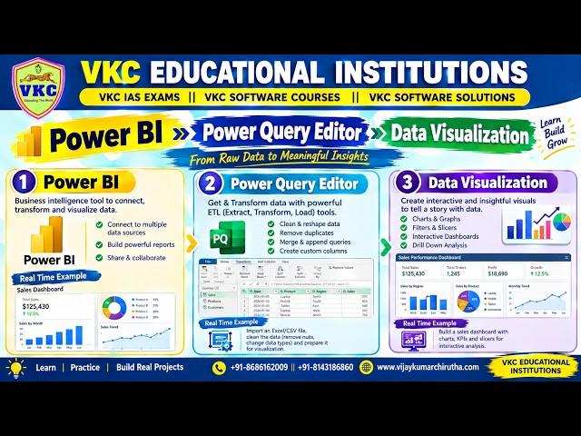
Data Analytics with AI - Power BI -- Power Query Editor -- Data Visualization.
29 views
5d ago
Webinar on Data Analysis with Python and Generative AI | Digital Skills Academy & SA Consulting Discover how Python, Data ...
26 views
Introduction to Statistical Data Visualization and Probability Distributions.
2 views
7d ago
Join me as I learn data skills, both technical and soft... completely in public. I'll make mistakes, work through them in real time, and ...
1 view
Streamed 15h ago
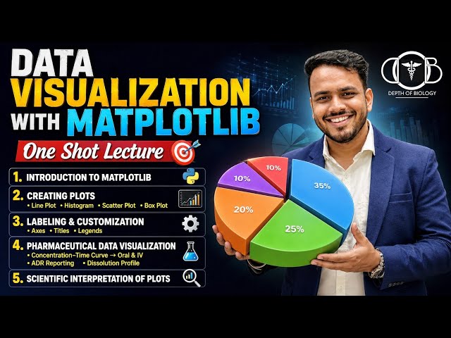
Data Visualization with Matplotlib | Creating line plot | Labeling axes,Legends & Interpretation In this One Shot Lecture, we cover ...
715 views
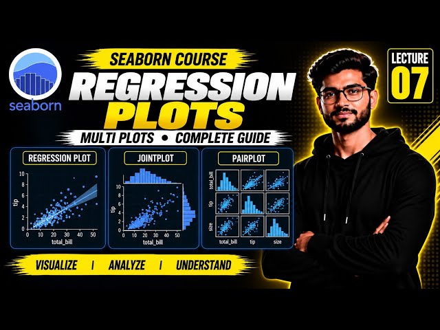
Seaborn Regression Plot | Seaborn Regression Plots | Seaborn Multi Plots | Seaborn JointPlot | Seaborn PairPlot | sns.regplot ...
198 views
Excel Charts Explained in Telugu with practical business examples! Learn how to create Excel charts from raw data, format and ...
248 views
2d ago
Learn Seaborn for creating powerful statistical visualizations and understand Python loops for repeating tasks efficiently. Explore ...
14 views
Python for Data Science — Day 12** Data visualization is an essential part of Data Science. In this session, we learn how to ...
7 views
1d ago
Lauren Klein joins me to talk about her new book, Data by Design (https://link.amazon/B01DQgByh) , co-authored with a team of ...
55 views
Microsoft Azure - Data Analyst Course ...
4,301 views
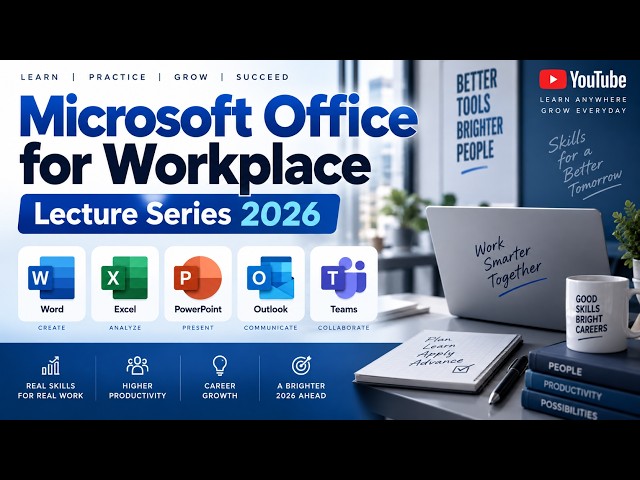
Microsoft Office for Workplace – Lecture Series 2026 Lecture 08 focuses on turning spreadsheet data into meaningful visual ...
5 views
6d ago
Learn how to create professional and easy-to-understand Charts in Microsoft Excel! Welcome to Part 15(A) of the Complete Excel ...
3 views
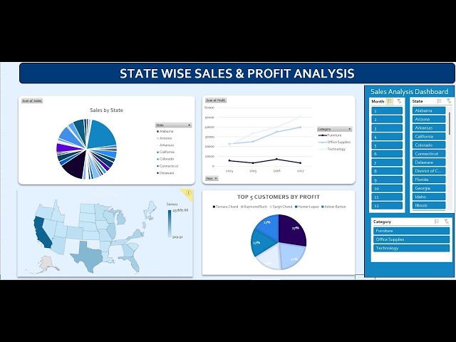
LIVE: USA Sales & Profit Dashboard in Excel | State-Wise Interactive Data Analysis Tutorial Description: Learn how to create an ...
151 views
Streamed 1d ago
There's a particular kind of exhaustion that comes with modern security work. It isn't a shortage of information but actually quite the ...
73 views
Join Andres Villalba for an exciting demonstration of real-time map tracking using Ext JS and Node.js. Learn to build ...
70 views
Show more