Upload date
All time
Last hour
Today
This week
This month
This year
Type
All
Video
Channel
Playlist
Movie
Duration
Short (< 4 minutes)
Medium (4-20 minutes)
Long (> 20 minutes)
Sort by
Relevance
Rating
View count
Features
HD
Subtitles/CC
Creative Commons
3D
Live
4K
360°
VR180
HDR
149 results
Sharing the full step-by-step tutorial? Watch the complete breakdown video linked right here on my channel! Click the linked ...
46 views
3h ago
In this video, I show you how to make a better line graph using Matplotlib. We go line-by-line to understand what is going on at ...
1 view
17h ago
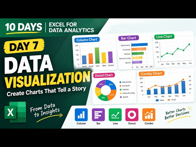
In Day 7 of my Excel for Data Analytics series, we're focusing on Data Visualization, turning raw data into clear and meaningful ...
3 views
22h ago
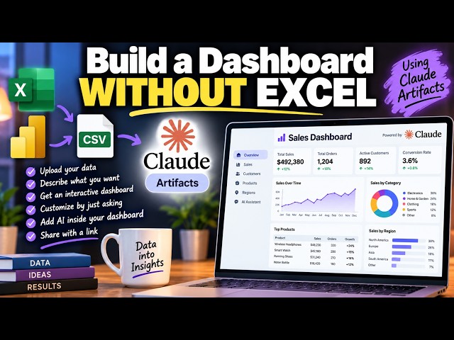
#ClaudeArtifacts #Claude #Dashboard #NoCode #AITools #ExcelDashboard #PowerBI #DataVisualization #Tutorial #AI ...
1,398 views
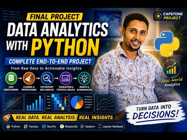
Welcome to the final project of our Data Analytics with Python playlist! This capstone project is designed to demonstrate how the ...
4h ago
Learn how Python, NumPy, Pandas, data visualization, and machine learning concepts come together to analyze data, uncover ...
258 views
2h ago
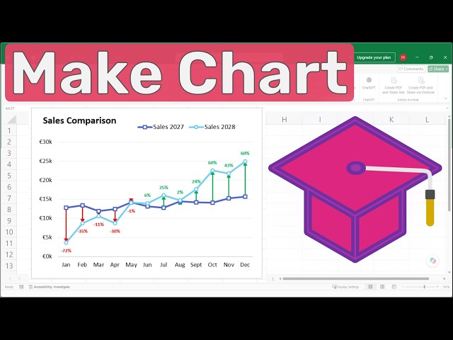
Learn how to create a Difference Chart in Excel to clearly visualize changes between two sets of data. In this step-by-step Excel ...
13 views
21h ago
Enroll for Data Science Course: https://intellipaat.com/data-scientist-course-training/ Book your Free ...
14,394 views
Streamed 17h ago
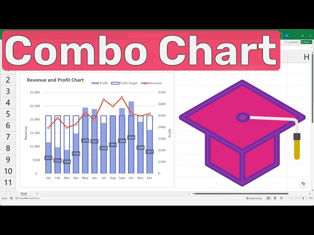
Learn how to create a Excel Combo Chart that combines a line chart and column charts to visualize revenue, profit, and profit ...
6 views
23h ago
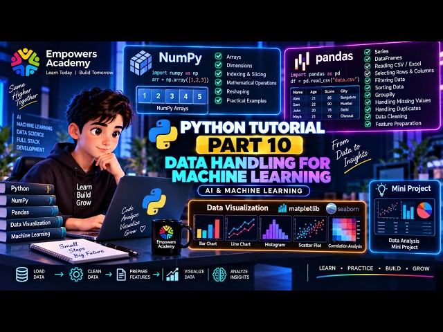
AI #MachineLearning #PythonProgramming Python Tutorial - Part 10: Data Handling for Machine Learning Welcome to Part 10 ...
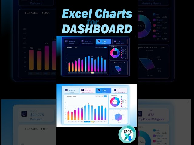
KPI Dashboard for Digital Marketing Data Visualization Template: ...
242 views
20h ago
Are you starting your journey in Data Analytics? Watch out for these 5 common mistakes that most beginners make! In this video ...
12 views
Are you planning to become a Data Analyst in 2026 - 2027 but confused about what to learn, in what order, and from where?
96 views
... and data visualization tips: https://www.youtube.com/@ChartExpo5115 Connect With Us: Twitter: https://www.x.com/ChartExpo_ ...
27 views
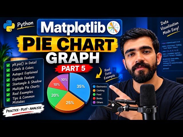
Learn how to create Pie Charts in Python using Matplotlib step by step in this Part 5 of the series In this video, you will ...
18 views
16h ago
The program covers key concepts such as Python programming, statistics, machine learning, data visualization, and SQL, helping ...
5,118 views
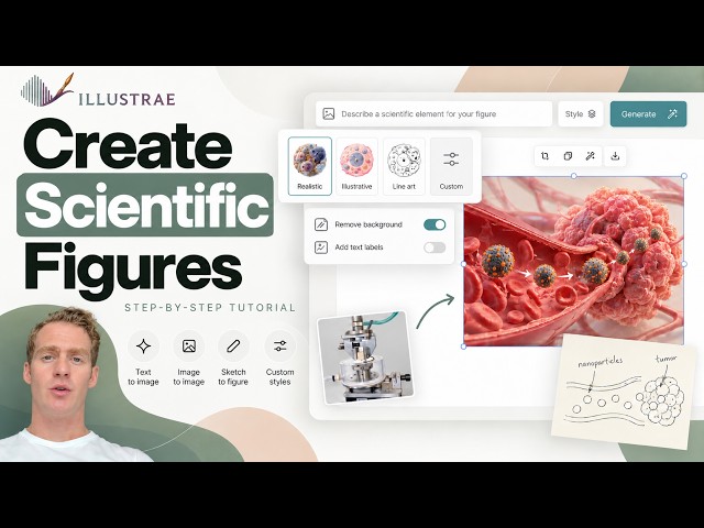
... #ResearchFigures #GraphicalAbstract #ScienceCommunication #AcademicResearch #ResearchTools #DataVisualization ...
11 views
6h ago
Michigan Engineering Professional Certificate in AI and Machine Learning ...
14,487 views
Streamed 13h ago
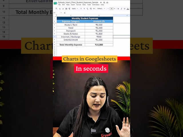
In this Google Sheets tip, learn how to create a chart in just a few simple steps. Simply select your data, go to Insert → Chart, and ...
300 views
... where I build a complete sales analytics dashboard from scratch, covering DAX, and data visualization. ⏱️ Timestamps 00:00 ...
Show more



![Complete Data Science Course FREE [2026] | Data Science Tutorial for Beginners | Intellipaat](/api/proxy/image?url=https%3A%2F%2Fi.ytimg.com%2Fvi%2FMPqoDNJGdcw%2Fsddefault.jpg)