ViewTube

ViewTube
Sign inSign upSubscriptions
Filters

Upload date

Type

Duration

Sort by

Features

Reset

105,909 results

Data Geek is my name
Python Data Visualization for Beginners | Create a Bar Chart with Seaborn

Learn how to create a colorful bar chart in Python using Seaborn and Matplotlib — step by step. In this beginner-friendly Python ...

12:11
Python Data Visualization for Beginners | Create a Bar Chart with Seaborn

190 views

1mo ago

HaiderWithCode
Turn Numbers Into Graphs — Matplotlib Basics for Beginners

... Real dataset example 07:30 - Recap Subscribe and hit the bell icon for more practical Python and data visualization tutorials.

7:46
Turn Numbers Into Graphs — Matplotlib Basics for Beginners

31 views

2w ago

Edcited
Data Visualization with Python (Part 1) | Complete Beginner Guide 📊🐍

Data Visualization with Python (Part 1): Beginner to Pro Guide! Welcome to Part 1 of our Data Visualization with Python ...

15:53
Data Visualization with Python (Part 1) | Complete Beginner Guide 📊🐍

214 views

3w ago

Corporate King
Lecture 2: Matplotlib Practical Working | Real Data Analysis & Visualization

matplotlib | matplotlib tutorial | matplotlib python | matplotlib practical working | matplotlib lecture 2 | matplotlib course | complete ...

1:19:51
Lecture 2: Matplotlib Practical Working | Real Data Analysis & Visualization

111 views

1mo ago

HaiderWithCode
The Right Way to Make Bar Charts in Python (Matplotlib Tutorial)

#Python #Matplotlib #DataVisualization #BarChart #DataScience #PythonTutorial #LearnPython #DataAnalysis.

12:06
The Right Way to Make Bar Charts in Python (Matplotlib Tutorial)

41 views

2w ago

iCT SHARE
Data Visualization (Full Course)

Sharing the full step-by-step tutorial? Watch the complete breakdown video linked right here on my channel! Click the linked ...

0:22
Data Visualization (Full Course)

174 views

1d ago

The Takeoff College
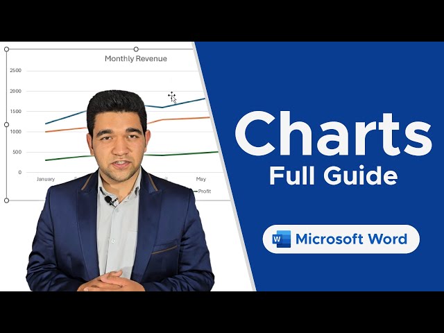
Charts in Microsoft Word — Beginner’s Guide to Data Visualization

Discover how to insert and edit Charts in Word to represent your data visually and make your documents stand out. Unlock the ...

4:12
Charts in Microsoft Word — Beginner’s Guide to Data Visualization

13 views

2w ago

Jotform
Best AI Data Visualization Tools in 2026

In this video we compare Jotform AI Data Assistant, Julius AI, Bricks, Zebra AI, Gemini in Google Sheets, ChatGPT, and Claude ...

13:19
Best AI Data Visualization Tools in 2026

4,327 views

8d ago

FAGGIO
Pie chart Tutorial | simple data visualization with Python

We've reached the final video in my Simple Visualizations with Seaborn series! For this bonus episode, we're looking at the pie ...

5:14
Pie chart Tutorial | simple data visualization with Python

10 views

4w ago

HaiderWithCode
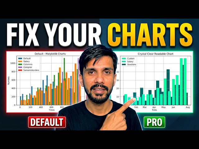
How to Make Readable Charts in Python (Matplotlib Tutorial)

Are your Matplotlib charts hard to read? In this tutorial, learn how to take your Python graphs from cluttered to clean and ...

11:57
How to Make Readable Charts in Python (Matplotlib Tutorial)

12 views

13d ago

Tech_Learning
Matplotlib Tutorial Part 2 | Python Data Visualization with Practical Examples

Learn **Matplotlib in Python** from the basics in this beginner-friendly **Python Data Visualization Tutorial**. In this Matplotlib ...

8:38
Matplotlib Tutorial Part 2 | Python Data Visualization with Practical Examples

3 views

5h ago

Maven Analytics
4 Common Data Visualization Mistakes and How to Fix Them | Data Visualization 101

Even though the goal of data visualization is to communicate clearly, there are some common mistakes you might be making that ...

6:02
4 Common Data Visualization Mistakes and How to Fix Them | Data Visualization 101

6,721 views

1mo ago

Full Course
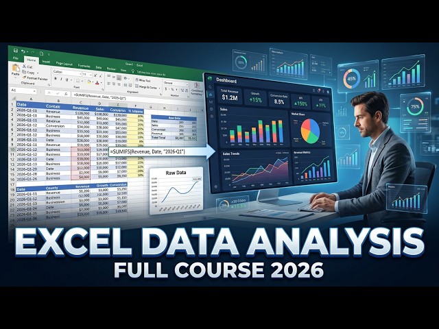
Excel Data Analysis Full Course 2026 | Complete Data Analysis & Visualization Masterclass

Stay Connected: Subscribe Now & Start Your Web Development Journey Today!

4:24:03
Excel Data Analysis Full Course 2026 | Complete Data Analysis & Visualization Masterclass

3,175 views

3w ago

Uplatz
Data Visualization and Chart Selection | Choosing the Right Chart for Your Data | Uplatz

Choosing the right chart can make complex data easier to understand, while the wrong visualization can confuse the audience or ...

11:20
Data Visualization and Chart Selection | Choosing the Right Chart for Your Data | Uplatz

31 views

2w ago

Coding Inspiration
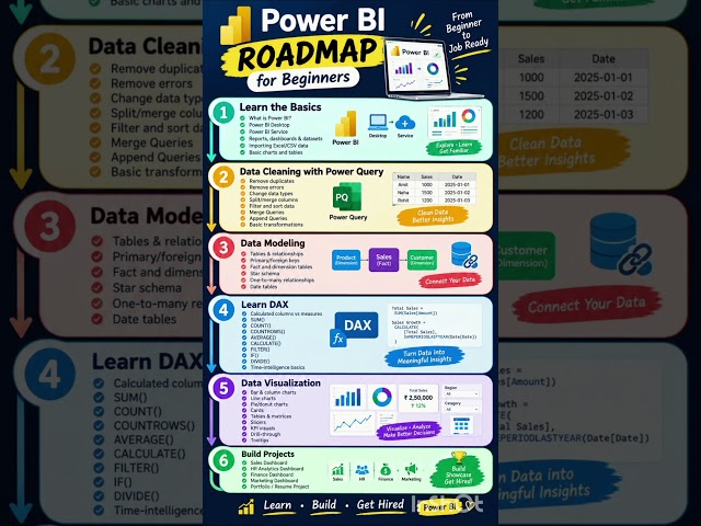
Power BI Roadmap 2026 📊 | Beginner to Job Ready #shorts

... Query ✓ Data Cleaning ✓ Data Modeling & Relationships ✓ DAX & Measures ✓ Data Visualization ✓ Interactive Dashboards ...

0:06
Power BI Roadmap 2026 📊 | Beginner to Job Ready #shorts

1,316 views

1d ago

Infinite Praveen
Data Visualization Mastery: Matplotlib, Seaborn & Plotly Tutorial

Trying to be good in this video. This is my Fourth video of You Tube about Data Visualization. I'm not fluent in English so sorry for ...

25:49
Data Visualization Mastery: Matplotlib, Seaborn & Plotly Tutorial

7 views

3w ago

Oxford Institute
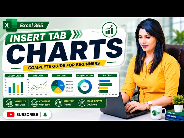
Excel Insert Tab – Charts Complete Tutorial | Create & Format Charts in Excel

Learn how to use the Charts section in Microsoft Excel with this complete step-by-step tutorial! In this video, you'll learn how to ...

9:53
Excel Insert Tab – Charts Complete Tutorial | Create & Format Charts in Excel

278 views

3w ago

FAGGIO
Seaborn Scatter Plot Tutorial | Simple Data Visualization with Python (Part 3)

Welcome to Part 3 of my Seaborn data visualization series! In Part 1, we introduced Seaborn and created a simple bar plot.

7:55
Seaborn Scatter Plot Tutorial | Simple Data Visualization with Python (Part 3)

81 views

1mo ago

Office Flow
How to create a pie chart in Figma (Full 2026 Guide)

In this video I will show how to create a pie chart in Figma, Figma pie chart tutorial, design data visualization graphics in Figma ...

2:19
How to create a pie chart in Figma (Full 2026 Guide)

3 views

1d ago

AGALA, WISDOM EMMANUEL
Analyzing a Cleaned Dataset Using Python Data Visualization, Graphs & Heatmap

In this video, I continue my Python Data Analytics journey by analyzing the dataset I cleaned in my previous video. I used Python ...

10:28
Analyzing a Cleaned Dataset Using Python Data Visualization, Graphs & Heatmap

125 views

4w ago

Show more